
I characterize myself as a visual person who loves analytics. Occasionally I go on visualization binges, consuming every infographic, visualization, and cool presentation I can find. Some of my latest joys…
Hans Rosling
Hans Rosling is a passionate and charismatic presenter. He obviously cares about numbers and makes understanding large concepts easy, and fun.
Hans Rosling’s 200 Countries, 200 Years, 4 Minutes, an update to his classic Ted talk
David McCandless
 David McCandless finds patterns and connections in data that most people might miss. His graphic visualizations are aesthetically simple, but conceptually powerful.
The beauty of data visualization Ted talk
Microsoft PivotViewer
Don’t ever let anyone tell you that Microsoft never does anything cool. PivotViewer is a powerful tool for viewing large datasets, especially image based ones. I haven’t seen too many real-world implementation, but a few proof-of-concept deployments point to PivotViewer’s potential.
http://www.silverlight.net/learn/pivotviewer/
PivotViewer sample app using NetFlix data
Wordle
Wordle isn’t new, but it is fun. Pull text in using several useful methods (try pulling in your Delicious bookmarks) and get a word-cloud you can customize the look of.
Visual Thesaurus
I fell in love with Visual Thesaurus last year during the re-architecting of istockphoto.com. See relationships between words. Find better words. Learn new words. Great for vocabulary creation in IA, and for word-geeks.
http://www.visualthesaurus.com/
Visual Thesaurus VocabGrabber is similar to Wordle — semantically more powerful but less pretty.
http://www.visualthesaurus.com/vocabgrabber/
If Web Browsers Were Celebrities
Aparently I am currently using the Samuel Jackson 5.0.3 browser.
http://walyou.com/if-web-browsers-were-celebrities-infographic/
BeeDocs Timeline 3D
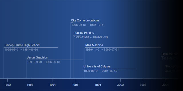 I’m going to use BeeDocs to map a product development roadmap. Export to PDF, movie, or Keynote. Importers built-in for some Apple apps, as well as a CSV importer. Applescript-able too.
10 Free Data Visualization Tools
A good resource linking to open tools you can use to build visualizations.
http://edelmandigital.com/2010/12/06/10-free-data-visualization-tools-2/
Google Charts/Interactive Charts/Visualization API
I occasionally use Google Charts. Simple and easy to use.
http://code.google.com/intl/en/apis/visualization/interactive_charts.html
The URL of the homepage of this site as a QRCode generated by Google Charts:
Visual Complexity

Wow. I haven’t even begun to explore the library of projects demonstrated in Visual Complexity—a collection of network visualization apps. Founded by Manuel Lima, Senior UX Designer at Microsoft Bing.
http://www.visualcomplexity.com/
RAMA (“Relational Artists Map”), for example, maps relationships between bands using last.fm data. A fun way to explore music. Using RAMA I found The Concretes, a swedish band that I am listening to right now.
Processing
Processing is an easy to use programming language and environment for building data-driven graphic applications. Awesome for visualization. Processing is the engine behind a lot of the examples at Visual Complexity
[pullshow id=”magic”]
I just this very moment discovered that a related project, Processing.js, lets you run your Processing code in any HTML5-capable modern browser using the tag and javascript. (Traditional Processing apps required Java.) “[pullthis id=”magic”]It’s not magic, but almost.[/pullthis]” I guess I know what I an doing this weekend. Geek-time.
