Last year, after I started geotagging my photos, I did a few visual art projects combining photography and GPS technology. I am fascinated by maps, how we imagine the world around us, how we communicated that world to others, etc.
A GPS receiver (including many smartphone apps) can record a GPS track — that is, a series of linked points recorded at regular intervals or distances as you move. Normally, these tracks are used for navigation — record where you have been so you can later retrace your route and thus find your way back home. These track files are also good for post-adventure analysis. Your can plot your speed, heading, elevation, etc. You can also use the point data in the track to geotag your photos so that you, and others, can see exactly where a particular photo was taken.
Beyond their practical uses, however, GPX tracks, when displayed as a line on a map, have an aesthetic value as well. They are a virtual mark on the land — the mark of an adventurer expressing some desire to explore. In this way they are not unlike the marks an artist makes on paper or canvas. Lines creating shapes, outlining objects, representing barriers overcome or avoided. Lines demarcating space and time. Tracings and recordings of life.
A Walk In The Park
After a long walk at Bowness Park last March, I overlaid photographs I had taken with the abstract and graphically rich tracings of my GPS tracks. Typically, one displays geo-located photos on a map — saying “this is where these photos were taken.”
But the map is not the terrain. The map is not the location.
Instead, I am displaying the map (in the form of the track overlay) on the photo. This gives the photo context. The image exists in concert with — because of — my movement across the land.
Photo Walking
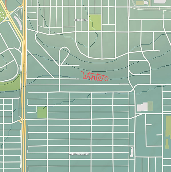
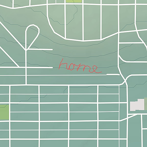
The other project I started, is a series of large scale conceptual drawings. By walking a path across the land tracing the shape of a word, I am making visible some thought, some meditative idea. The word — the path — is not visible to others even though it’s creation is a very concrete act. However, by capturing the path in the form of a GPS track, I am able to share the act with others. The track image, is combined with photos taking during the walk so the viewer can experience the original event.
I’m pretty picky about colour. I spend a lot of time fine-tuning my colour management workflow from camera to print. Of course making sure you have well calibrated devices is a critical step in ensuring colour accuracy. But what is calibration? Calibration is the process of tweaking your camera or scanner, monitor, and printer to consistently represent an image to the best of the equipment’s abilities within your viewing environment. I’ve dealt with digital camera calibration in the past. Today I will focus on the next link in the chain — computer monitor colour calibration.
Monitor Calibration Primer
While I will try to make this article as simple as possible, I do assume a certain familiarity with colour calibration terminology. I will deal only with LCD displays, because discussing CRT displays would be like learning about horse carriages in an automotive class — CRT technology is so 20th century. I also place the caveat that I only work with OS X operating systems and Apple Cinema Displays. While these procedures can certainly be transferred to other operating systems and display manufacturers, you will have to figure that out on your own.
Of course, computer monitor calibration has been dealt with by numerous articles in the past. Therefore I will focus on techniques or concepts which I think are novel, unique to my workflow, and helpful to others. Specifically, I will show you how to use your digital camera to assist with monitor calibration. I also touch on using Philips Hue lights to tailor your workspace lighting.
There seem to be two schools of thought regarding monitor calibration. One school says you should be setting up your monitor to match some theoretical viewing standard. The other school says you should be setting up your monitor to work well in the ambient lighting of your environment. I stand firmly in the latter school for two reasons: one, you can much more easily evaluate prints if your monitor matches the ambient light conditions of your workspace; and two, I find there is much less eye strain if your monitor is not excessively bright or dim compared to the ambient light and if the overall monitor colour temperature is as close as possible to the room ambient colour temperature. I will therefore show you how to achieve a calibration which matches your monitor to your work environment.
There are four primary variables that can be adjusted in relation to monitor calibration: brightness or luminance (both minimum and maximum); white point (temperature in degrees kelvin); gamma (overal output curve); and individual red, green, and blue colour response curves.
The monitor manufacturer’s default settings (based partly on ISO standards ISO 3664:2009 and ISO 12646:20081) are usually a maximum luminance between 80 and 120 candela, a white point temperature of 5000K or 6500K, and a gamma of 2.2. 6500K is the approximate colour temperature of noon-day summer sky lighting. A luminance value of 120 cd is equivalent to an average home interior.
The target gamma of 2.2 matches the sRGB specification which is the default colour space use by most cameras and HD televisions and is therefore probably the most appropriate choice.2
Throwing Out The Rulebook – Sort Of
For those rare people whose workspace is lit by dim daylight (an oxymoron to be sure) the manufacturer’s default will probably be fine. For everyone else, some tweaking, or even major adjustments to these defaults is required. Remember, calibration is about getting things to look consistent in your work environment. In order to do this you need to understand two things about your environment. One, how bright is your work area, and two, what is the colour temperature of the ambient light in your work area.
If you are a photographer and are selling or displaying prints of your work, then I would start by trying to set up your work environment to match the conditions most commonly found where your prints are shown. If you sell in a gallery, then create a bright space using the same types of lights that the gallery uses. If you hang your prints in your living room to share with friends and family, then match your office/studio lighting to that of your living room. Matching room lighting to the display area is not critical to the monitor calibration process, but it makes print evaluation much easier — you will be viewing your fresh prints under the same conditions as they will be displayed.
If you don’t do much printing, or if your prints will be displayed in a wide range of environments, then just set up the lighting around your computer so you are comfortable — moderately bright with standard incandescent lighting (or better yet, make the switch to LED).
If you primarily work on a laptop computer and in several different locations, then do the calibration under the most common working conditions.
Now, most of us are not going to end up with a 6500K work space illuminated by 120 candela worth of ambient lighting.
In my small home office, for instance, the two 60 watt tungsten bulbs in the diffuse ceiling fixture produce about 40 candela — nowhere near the standard 120 cd. If I set my monitor luminance to output white at 120 cd I would probably go blind from the brightness of the monitor compared to the ambient light.
On the other hand, an ambient brightness of 40 cd is quite dim. Setting the monitor luminance to 40 cd would also be problematic because LCD displays tend to have quite bad colour accuracy at lower brightness settings. I can dial my Cinema Displays down to 40 cd, but I loose about 10% of the sRGB gamut in doing so. The monitors also exhibit visible colour artifacts at this setting.
What to do? I started by adding several more incandescent bulbs in lamp fixtures throughout the room. I was aiming for a nice diffuse light with a luminance of about 60 cd.
The colour temperature of my office lighting was also nowhere near the 6500K default. In fact, using the Custom White Balance feature of my digital camera and the neutral card off my X-rite ColorChecker Passport, I measured the colour temperature of my office as 2300K under tungsten lighting. This is quite a warm (amber) colour. In fact it is quite warm compared to the ~2800K usually expected from 60 W tungsten incandescent lightbulbs. I attributed the warmth to three factors — the colour of the diffuser glass on the light fixture, the warm eggshell tone of the “white” walls, and reflections off the light birch wood furnishings.
Now, I would not mind matching my monitors to 2300K. I have the window mostly covered, keeping out excess sunlight, and thereby reducing colour temperature variation. However, the DataColor Spyder4 software that I use for monitor calibration only allows a minimum target white point value of 3000K. Using this setting, my monitors were still slightly blue compared to the room light, though much better than a setting of 6500K or even 5800K (the colour temperature of noon-day summer sun with out the influence of blue sky). However, after running my monitors calibrated to a white point of 3000K I was unsatisfied. The Apple Cinema Displays produced too many artifacts at this temperature. Still images and video displayed properly, but scrolling text exhibited a dreadful red ghosting that was just unacceptable.
In other words, you are unlikely to be able to properly calibrate a monitor to match the colour temperature of pure incandescent tungsten lighting.
In the end I swapped my tungsten bulbs with Philips Hue LED lights which can have their colour adjusted. I have played around with several colour temperatures and settled on 4800K (Hue’s Energize setting) as an acceptable compromise between warm home interior lighting and excessively blue daylight.
Calibrating Your Computer Monitor To Match Your Workspace Ambient Lighting Conditions
Calibrating your monitor to match your workspace ambient lighting conditions is a simple process requiring few specialized tools. In summary, you will: evaluate the brightness and colour temperature of your workspace lighting using your digital camera; calibrate your monitor using the measured settings; and double-check that the calibrated monitor matches your workspace lighting, again using your digital camera.
You will need:
a digital camera with custom white balance function (the ability to create a custom white balance from a photo, not just by entering degrees kelvin), histogram, manual and aperture priority modes, and the ability to save RAW files;
photo editing/viewing software which allows you to review the colour temperature setting stored in a RAW file (such as Adobe Camera Raw);
a grey card or white balance card (neutral photo card);
a bright white piece of paper (may be used in place of neutral photo card); and,
monitor calibration hardware and software that will accept white point and brightness/luminance target values (you could also us OS X’s built-in assistant)
Preparation:
Turn on your computer monitor and allow it to warm up at least 1/2 hour before starting the calibration. You can perform the workspace set-up and evaluation steps in the meantime.
Procedure:
Workspace Set-up
Turn on the room lights and allow them to warm up.
Your workspace should be moderately bright — not candlelight dim and not daylight glaring.
Try to avoid too much window light as this will cause the brightness and colour of the ambient light to vary too much throughout the day.
For more efficient lighting, neutral white walls and ceilings are preferred.
Do not allow bright direct light to fall on the monitor surface. Overall diffuse lighting is best.
I personally prefer and recommend a dark neutral virtual desktop background for all photographers and graphic designers.
Workspace Lighting Evaluation
Workspace Brightness Evaluation
Turn on your camera with the the following settings:
live view on (preferred)
histogram on
RAW image capture on
white balance appropriate for your workspace (probably tungsten or custom)
aperture priority mode
ISO 100
aperture ƒ/5.6
Use your camera to take a meter reading of the area in front of our computer (around the keyboard). This will give you an idea of the ambient light levels. You can use trust your camera’s evaluative metering mode for this, or you can meter the light falling on a grey card. Check the exposure with the camera histogram — there should be no clipping of the highlights or blacks. Do not allow the computer monitor to cast a strong light on the metered area during this step. If required, temporarily cover the monitor with a neutral coloured shirt or towel.
Compare the metered shutter speed with the following list.
2 sec., 4EV, 40 cd/m2, dim, candle light
1 sec., 5EV, 80 cd/m2, low, night home interior
1/2 sec., 6EV, 160 cd/m2, medium, bright home interior
1/8 sec., 8EV, 640 cd/m2, very high, very bright interior with fluorescent lights
You need enough light to achieve a shutter speed between 1 second and 1/8 of a second. Outside this range and your monitor will not be able to match the ambient light levels. You can either add more lights and do the evaluation again, or accept that your monitor brightness will differ front the ambient brightness and simply continue to step the Workspace Colour Temperature Evaluation step.
In this example, my camera is reading 2 seconds at ƒ/5.6 and ISO 100 (4EV or 40 cd/m2). Obviously my workspace is still quite dim and I would have a hard time matching my monitor luminance to the ambient brightness.
Workspace Colour Temperature Evaluation
For this evaluation you will use the same camera settings as above, but you will have to increase the ISO to 3200 or 6400 in order to capture a photograph without excessive camera shake (or use a tripod). You can also change the metering mode to manual if you prefer.
Once again, meter the area around your keyboard.
Place your neutral photo card or piece of paper on your keyboard, again taking precautions to prevent monitor light from casting on this area.
Use your camera’s custom white balance function to get a white balance reading from the card/paper. The custom white balance procedure varies by manufacturer and I will leave it to you to figure out. Once you have the custom white balance set, if your camera displays the colour temperature in degrees Kelvin then you can skip the next step.
Take a photo with the custom white balance. It doesn’t matter what is in the frame — you just need to record the colour temperature in a photograph so you can retrieve it. To that end, make sure you are shooting in RAW mode. Load the RAW file into your photo viewer/editor and note the colour temperature that was used.
Will the measured colour temperature work with your monitor? A measurement between 4000K and 6500K should be fine. If the reading is below this range then the monitor probably will suffer colour artifacts of some sort. This is sad, because in my experience home lighting is usually in the 2600K to 3500K range. Office lighting is probably in the 3400K to 6500K range. Why manufacturers can’t or won’t make a monitor that is capable of good performance in the home office environment I do not know. If your ambient colour temperature is below 3500K you have three choices: 1) calibrate your monitor to the ambient colour temperature and see if the colour performance is acceptable to you; 2) calibrate to a higher/cooler colour temperature and accept that your monitor and ambient light will not match (print evaluation will be more difficult); 3) change the colour of your ambient lighting by switching to “cool white” tungsten bulbs, switching to halogen lighting, or using colour changing LED lights like Philips Hue (you need a bulb that produces a good “white”).
Some common colour temperatures:
2800K = 60 watt incandescent tungsten bulb
3200K = halogen
3400K = photoflood
4800K = daylight blue photoflood
5400K = average summer sunlight at noon
6500K = average summer sunlight with the effect of the blue sky
8000K = summer shade on a blue sky day
Hue recipe colour temperatures:
Relax = 2200K
Reading = 2800K
Concentrate = 3700K
Energize = 4800K
I am currently using Philips Hue bulbs in my office with one of the standard Philips recipes — Energize — which has a measured temperature of about 4800K.
Monitor Calibration
If your workspace ambient light brightness and colour temperature are in an acceptable range, then you can move on to calibrating your monitor.
Launch your calibration software and follow the on screen instructions. Use whatever mode allows you to set a target white balance and target brightness/luminance.
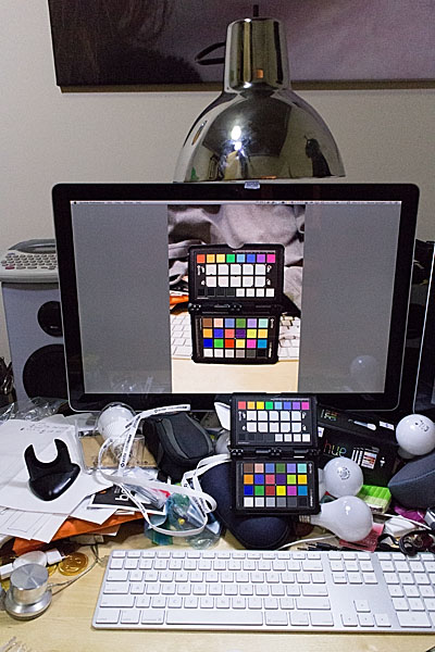
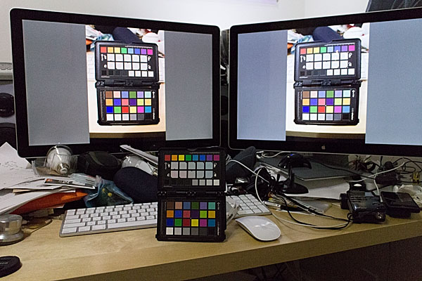
In my case I am using Spyder4Elite and I set the target white point to 4800K and the target white luminance to 60 candela (brighter than my room, but the darkest my monitor will tolerate) in the Expert Console (see the screenshot). Alternatively, you can use the calibration tool in the Displays panel in System Preferences (turn on Expert Mode) on OS X. In my experience a hardware calibrator is easier to use and more accurate, but visual calibration using Apple’s Display Calibrator Assistant is acceptable.
The left monitor shows the Spyder4 result. The right monitor shows the Display Calibrator Assistant result — slightly warm.
Calibration evaluation
Now it is time to evaluate the results of calibrating your monitor to your workspace ambient light conditions.
Calibration Brightness Evaluation
Open an empty document on your monitor. You can use an empty word processing document or empty Photoshop document. What you want is a pure white background that fills most of the monitor. Another option is to set your desktop background temporarily to solid white.
Point your camera towards the white part of the monitor and adjust the exposure settings so the camera histogram peak corresponding to the monitor white is near, but not touching, the right edge of the histogram.
Now place a piece of white paper in front of the monitor or on your keyboard.
Maintaining the camera exposure settings, point the camera so that both the white document on the monitor and white piece of paper are in the frame.
Compare where the highlight peaks occur in the camera histogram. Ideally, the computer screen maximum brightness and paper maximum brightness should coincide. If the peak from the paper occurs somewhere between the middle of the histogram on the left and the monitor white spike on the right, then this is probably still acceptable, though your monitor is slightly brighter than the ambient light. If the paper is brighter than the monitor, then something went wrong during calibration and you need to start over. If the paper spike appears to the left of the mid-point of the histogram, then the contrast between the monitor and ambient brightness is quite high and will likely lead to eye fatigue and difficulty evaluating prints.
Calibration Colour Temperature Evaluation
Place a colourful photographic print or colour chart of some sort on your keyboard. I use the Xrite ColorChecker Passport for this step. Any card or photo with a broad spectrum of colours will suffice.
Photograph the colour sample using the same camera settings as in the Workspace Colour Temperature Evaluation step and the measured ambient colour temperature/white balance setting.
Load the colour sample photograph you captured in step 2 into your photo viewer/editor software. Expand the image to fill the monitor.
Take one final photograph framing both the physical colour sample on your desk and the virtual colour sample photograph displayed on your monitor in step 3. Base the exposure settings on the brightness of the monitor image.
There should be little if any colour cast between the physical sample and the virtual one. If the room ambient brightness is lower than the monitor brightness then the physical sample will be darker — too dark and it will be difficult to evaluate any colour differences (this is the same trouble you will encounter when trying to evaluate prints!) If the room and monitor brightnesses are quite close then your eyes should actually have difficulty determine which sample was on the desk and which one was on displayed on the monitor. If you set the calibration target white point to the same as the measured white balance, but the virtual sample and physical sample colours differ significantly, then something went wrong somewhere and you will have to start over.
Conclusion
It should be apparent that using your digital camera to assist in monitor calibration has a few benefits. It is a readily accessible tool for measuring both brightness and colour temperature. Today’s photographic sensors are very good, but they are still not as adaptive or dynamic as the human eye. This is actually a benefit in this case, as the photographic image captured by your camera can highlight brightness and colour differences between the ambient workspace light and your computer monitor for which your brain might simply compensate.
Philips Hue lights seem to be a good, if expensive, way to tailor your workspace lighting conditions. They are high quality LED bulb and if you are making the switch to LED you might as well pay the extra money to get a much more advanced lighting system. I already had Hue installed in parts of my home and was planning to switch over my office lighting anyway. It is easy to set up different light recipes and to switch between them while you tailor your workspace lighting.
1. http://www.metalvortex.com/chart/
2. sRGB is based in part on the output capabilities of CRT televisions, the most common display technology at the time of sRGB’s introduction. CRTs did not have a particularly large gamut and therefore could not represent a very wide range of colours. AdobeRGB is a much larger colour space, which many cameras are capable of shooting. If you are primarily producing prints within your own studio environment then you might want to investigate switching to AdobeRGB throughout your workflow. This will however cause some colour compression when you go to display images on the Internet because the vast majority of web browsers assume sRGB images. Some web browsers, such as Safari, will respect embedded colour profiles, but embedding colour profiles increases the image file size and therefore load times. It is also a gamble whether or not photo sharing websites will maintain the embedded profiles when creating thumbnail images. For these reasons, I stick with the inferior, but painless, sRGB colour space throughout my workflow.
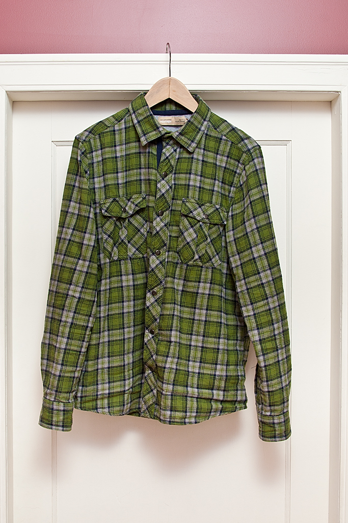
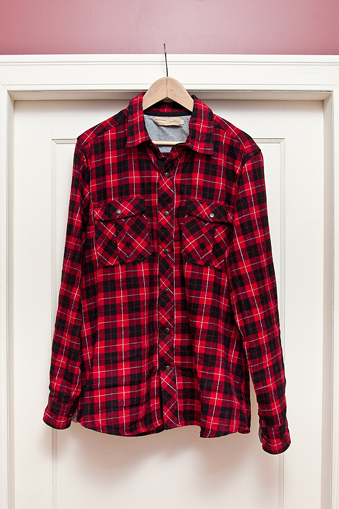
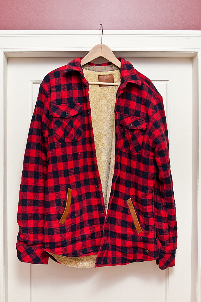
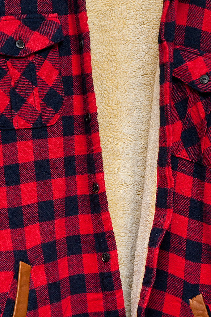
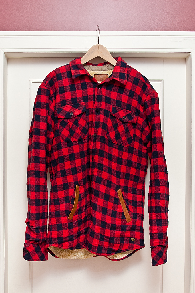
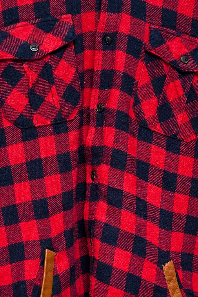
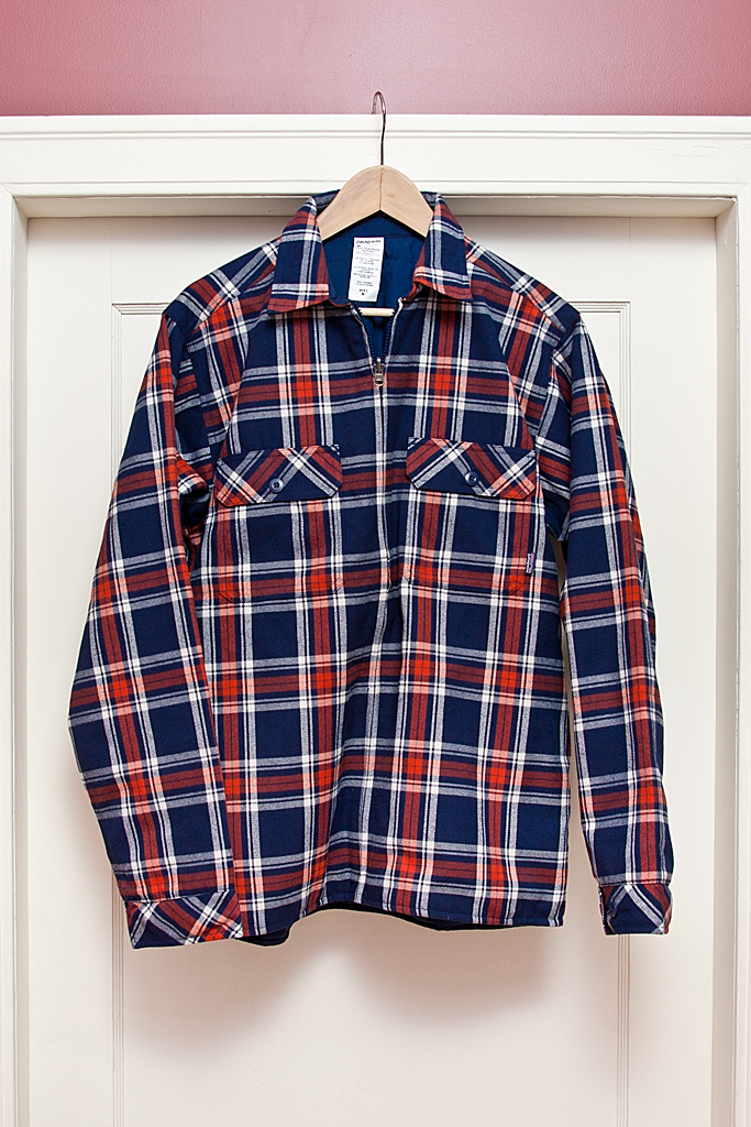
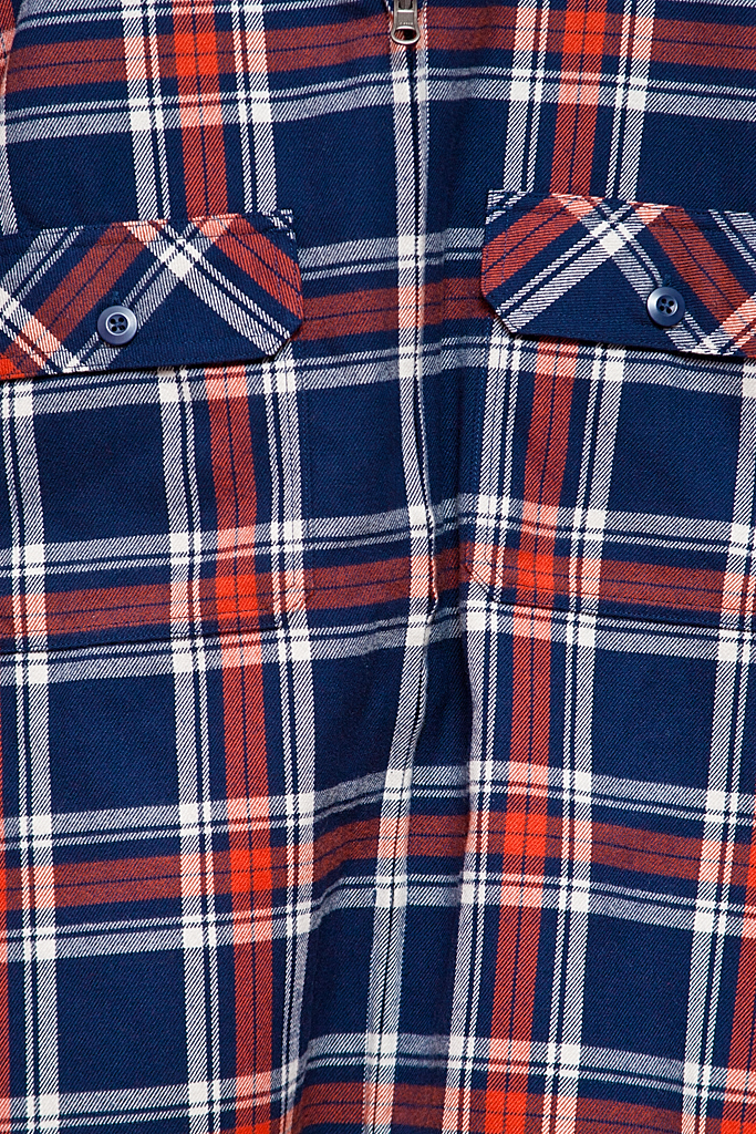
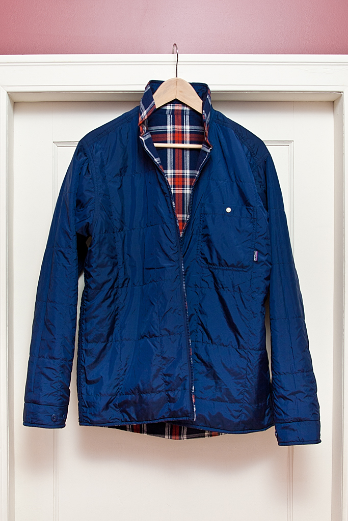
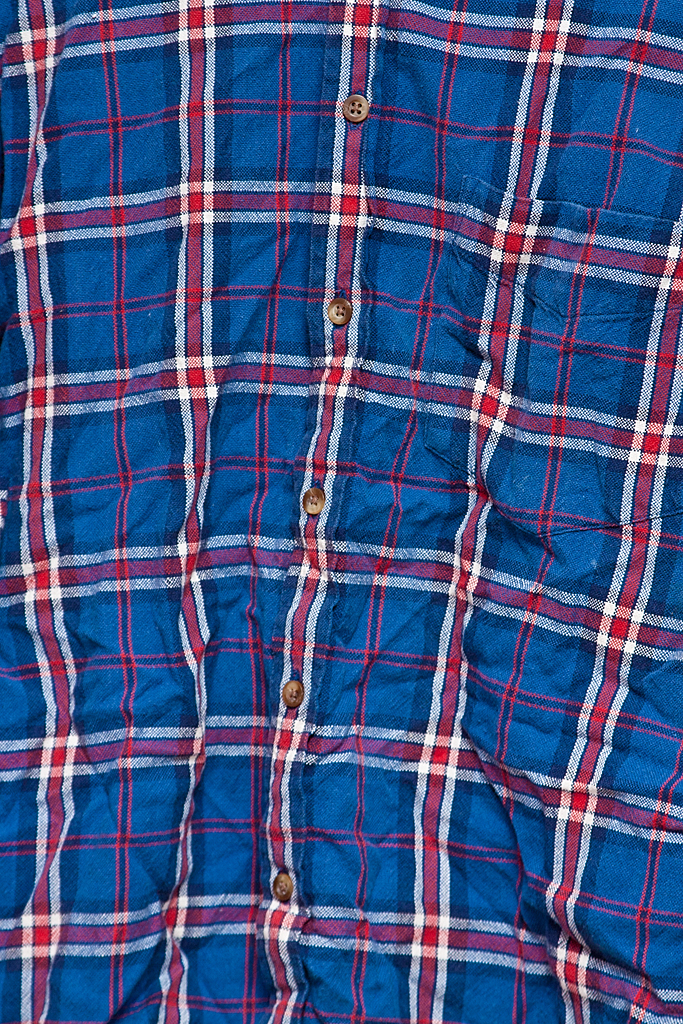
I’m so happy that plaid flannel shirts are back in this year. Nothing completes this late-Fall, early-Winter, time of year better than a soft warm flannel shirt. Whether you are curling up by the fireplace to read, or swinging an axe in the woodlot, a flannel shirt is your best companion. One of the main benefits of plaid flannel is its timelessness — it’s never really out of style. And, unlike denim, new flannel shirts feel great right off the store rack, and old shirts just keeping looking even better.
My current collection of classic plaid flannel shirts:
Green, grey, navy blue by Denver Hayes from Mark’s
I finished a new “sculpture” today. Okay, it’s mostly just a log I found in the river and which had been cut down by a beaver. When I was a kid my dad had a beaver-chewed piece of wood which he turned into art by affixing a brass plaque which read “Canada’s First Sculpture”. Very post-modern.
I found my log in a pile of driftwood on the Bow River near my house. I’ve had it in my basement for a few years. Every so often I would look at it and think about what I would make with it. I pulled out the log a few weeks ago and had it sitting near the stairs so it would always be in my periphery. I always need to think about a piece for a good long while before it starts to take shape.
I considered putting a brass plaque on my log, in homage to my father. I was at the mall this week and almost went into the engraving shop to order something up, but I still couldn’t think what I wanted it to say.
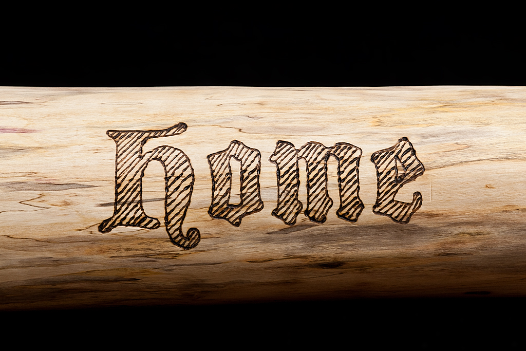
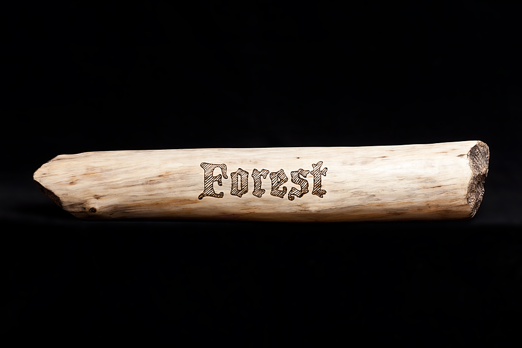
When thinking about the log, my mind always bent to where it came from and to the industrious rodent who cut it. What kind of tree did it come from? Why did it drift away? How long had it been in the river? Single words, like forest, and wood, where all that came to mind.
Then last evening, after a long day out at the cabin clearing the snow from the road, and collecting wood, my muscles weary, and my mind tired, I walked past the log sitting on the floor. As I looked at it I plainly saw the words forest and home in large, dark, block letters on the surface of the log. I had my idea. I tried out a few different typestyles on my computer and settled on Blackmoor, a blackletter font, for its blocky yet calligraphic shapes. I would use a wood-burner to brand the words into the log.
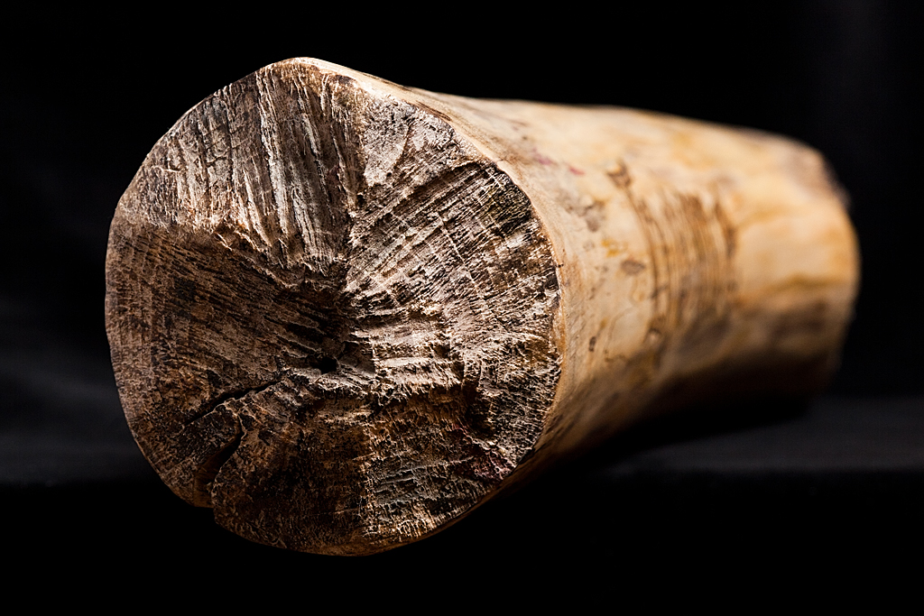
At first I had it in my mind that I would do very little to alter the surface of the log. However, looking closer at it on my workbench, I realized that the log was, well, rather dirty. Driftwood is not treated well. I used a wire-wheel on a small grinder to remove the surface dirt. I wasn’t satisfied. I sanded away the remaining dirt and grinder marks. As I did so interesting coloration came to the surface: purple algae, yellow wood, brown bark remnants. I smoothed the log with a spokeshave and then sanded and buffed the log to a glossy shine. It was really coming together. I used a wire brush on the ends of the log to remove the deeply entrenched dirt while trying to preserve the beaver’s dental marks that are the logs signature.
With a clean log, its wooden heart now fully exposed, I started carving the words onto alternate sides using a wood-burner. I love the smell of burning wood. The smoke smell lingering in the air and on my hands.
In the last step of transforming the log into a work of art I polished the surface with carnuba wax, again being careful to only lightly touch the gnawed ends.
I’m quite happy with the finished piece. It will sit nice on a cabinet, coffee table, or even the floor. The wood is natural, the words graphic and societal. Something that began life as a part of the forest, was cut down by an industrious animal for food or shelter, escaped in the chaotic mess of spring floods, was found amongst the debris and detritus of neglected nature in the centre of the Big City, and was turned into a symbol of usefulness and a reminder of the gifts that surround us.
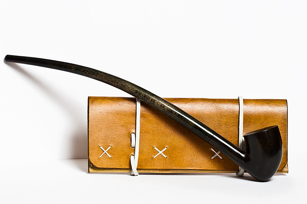
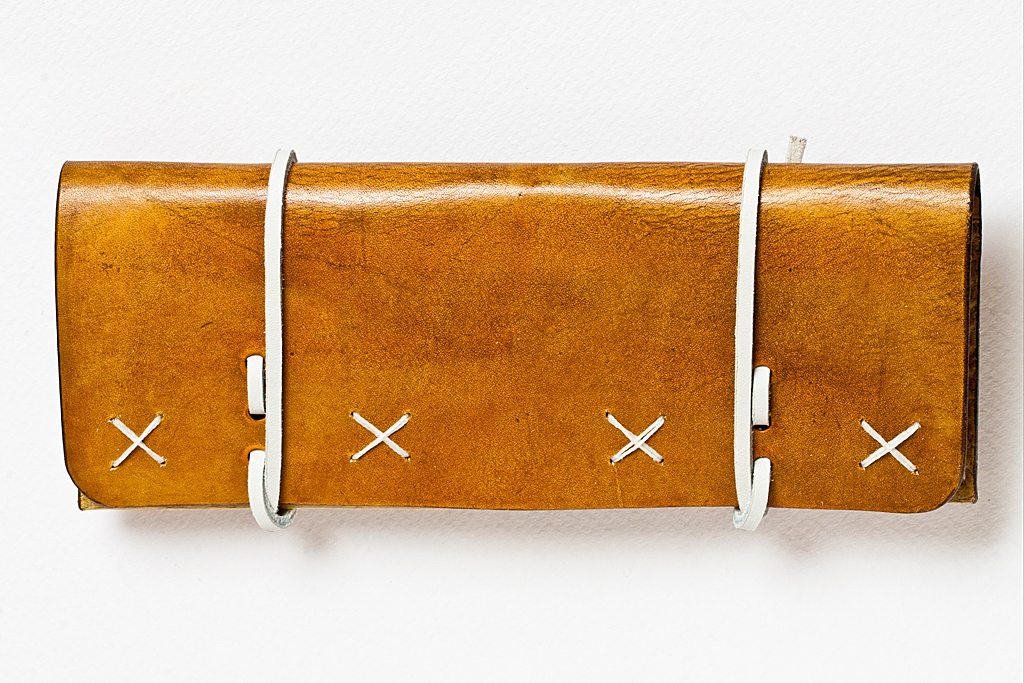
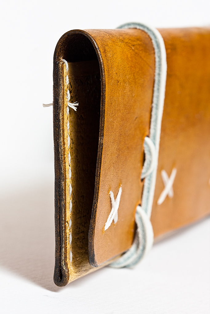
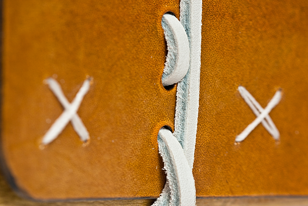
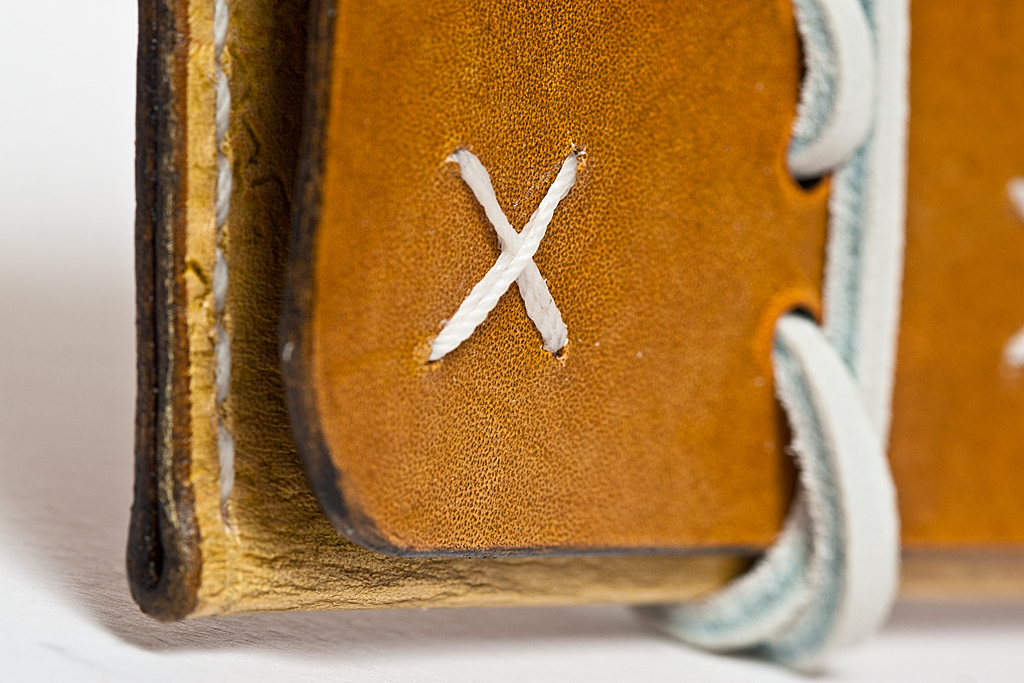
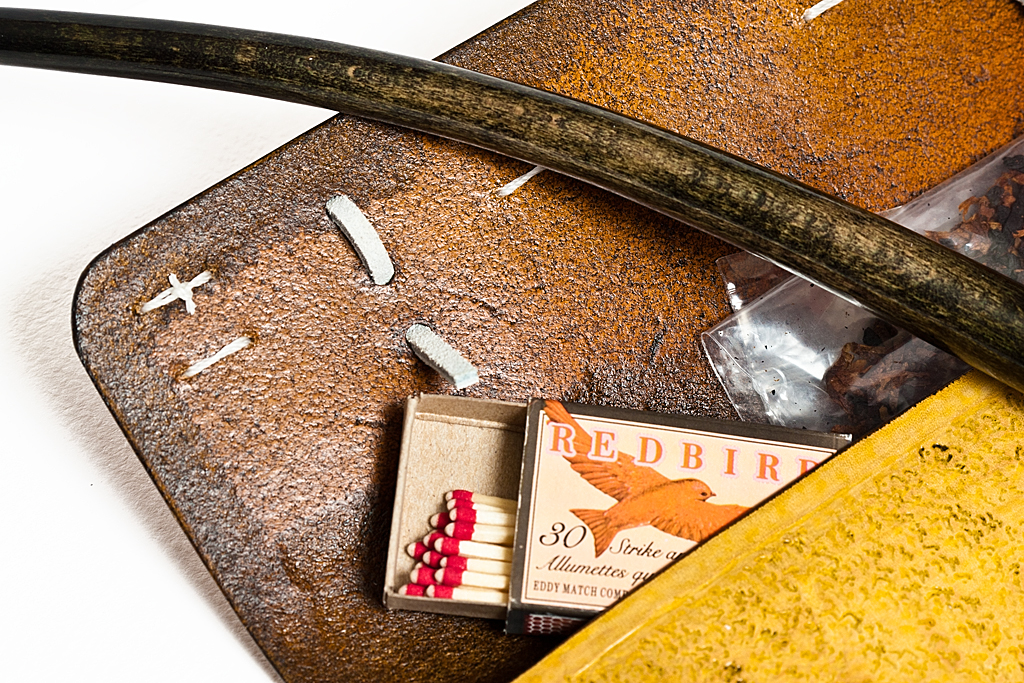
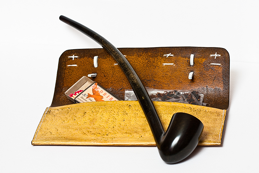
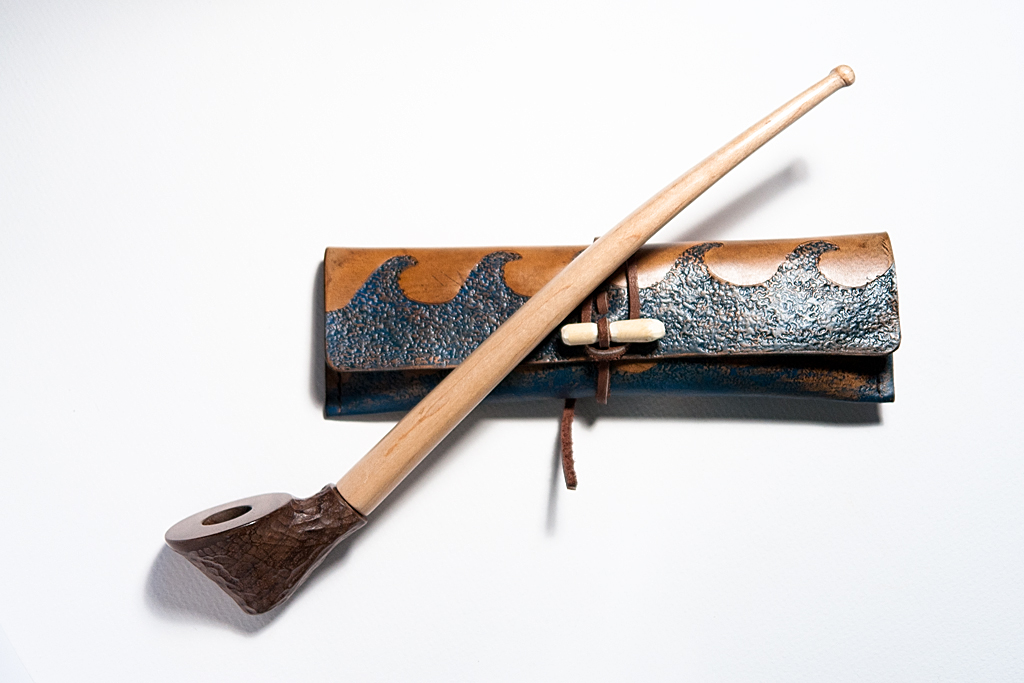
Pipes and leather were meant to go together. Since I started collecting, I’ve been making leather tobacco pouches as companion pieces for each of my pipes. Each one follows a theme correlated to the style of pipe.
This evening I finished a new leather tobacco pouch as a companion to my Gandolf replica Lord of The Rings churchwarden. I’ve named this new pouch White Wizard. It is lightly stained a warm tan colour, hand-stitched with white waxed linen thread, and closed with two white leather thongs. The style is warm and unpretentious, with simple accents to give a sense of refinement. The leather has an antique finish to show that it has seen many miles and pipes.
I’m quite happy with the result. Now, I need to make a tamper to go with Gandolf and White Wizard. I also need to make tobacco pouches for the remaining three replica pipes in my Lord of The Rings set.
This week I discovered a new axe company (in the way that Columbus “discovered” the New World, but that’s another story). Base Camp X produces handmade axes with wonderful contemporary designs. They are Canadian. And, right now, they are selling a version of their Pioneer axe and giving $100 for each axe sold to Breast Cancer Research. You heard that right — an axe that is helping to find a cure. Like Gransfors Brüks axes, Base Camp X axes are not cheap. But considering how much they are passing on to a good cause, you can think of your purchase of the lovely pink-handled Artemis as a donation of sorts. At least that’s how you can justify it to your loved one. Right, sweetie?
This will be my first Base Camp X axe. If the quality is what I expect, I imagine I will be ordering more. The Pathfinder and Cruiser axes look divine.
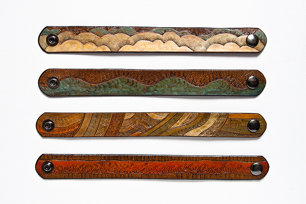
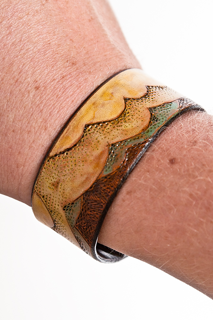
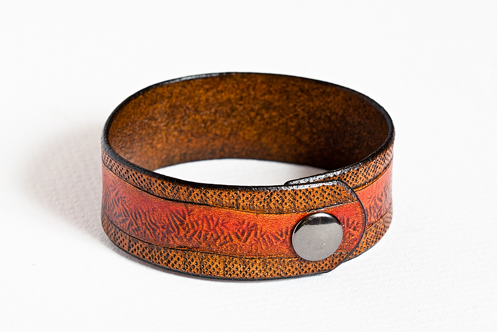
This evening, I finished making a series of leather bracelets I’m calling “Earth, Air, Water, and Fire”. The bracelets, 1″ x 9″ x 3/32″, are hand-tooled with graphic designs, each representing a different natural element. They are hand-painted and finished with a light antique gel. They close with a snap.
P.s., lately I’ve been lighting the photographs posted on this site using a simple tungsten photo bulb and reflector. Last week the bulb burned out. To photograph the bracelets I had to use a studio strobe light which had been packed away in a closet for years (I haven’t done much serious studio work for a while). While setting up the strobe, I reached into its case and found my long missing light meter! It’s a Sekonic L-508, with incident and ambient light meters and a 1°–4° zoom spot function. I’ve been looking for it for so long. It was required equipment when I was shooting large format, years ago. Today, with the preview on digital cameras, handheld light meters are almost unnecessary. I still like to use one for studio work though, even if just for nostalgic reasons.
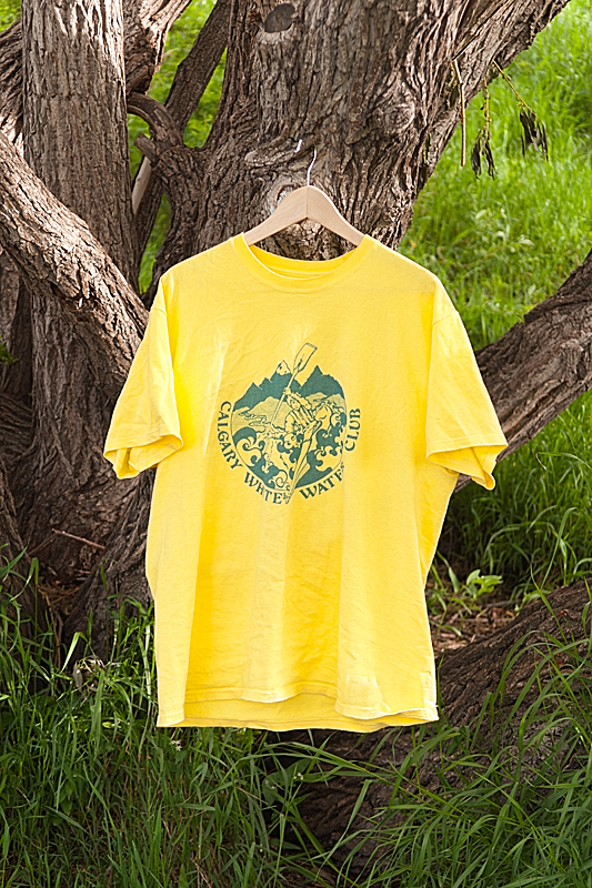
In high school I did a bit of silkscreen printing. T-shirts mostly. After high school my graphic arts teacher gave me his four-color silkscreen press. In university I continued my passion for silkscreening, taking several silkscreen printing classes while working on my Bachelor of Fine Arts. But my love of graphic printing was formed way before either university or high school. It all started with my dad.
My dad was an artist and a teacher. When I was very young he was the graphic arts teacher at the high school I would later attend. I remember him painting in his basement studio, or hunched over his drafting table designing logos for our hockey teams or the local whitewater kayaking club. I was deeply impacted by his visual sensibilities. His graphic sense has always informed my own work and I’m proud of that.
Today, my silkscreen press gathers dust in the corner of my basement workshop. Tubs of dried up ink hide under my work bench. Silkscreens are stacked somewhere deep in a storage room.
I wish I had the time to devote to printing, but I don’t. I love the process and I love the result, but just don’t have the time.
Thankfully, there is an alternative to ink and squeegees. On-line printing services, like Zazzle, are just a click away and make it way too easy to have your personal designs reproduced on just about any article you desire.
Zen
One day long ago, before I moved away from home, I was working in the darkroom my father had build under the basement stairs. At that time (about 2001) it was more of a storage closet than anything else. Tucked on a shelf underneath the enlarger I found a box containing some of the old logo designs my dad had created. I made digital scans of the designs with the thought that someday I would print them on t-shirts or stickers.
A couple of years ago I decided to get some shirts printed on-line. I used my dad’s designs and made some t-shirts and hoodies as Christmas gifts for the family. Everyone loved them. This spring I made a few new designs of my own and had them printed. I get lots of nice complements on my shirts.
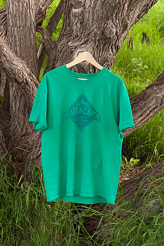
Unfortunately, the design I get the most comments on is not my own. If you were a teenager in Canada in the mid-Eighties, then you might remember the brand Beaver Canoe. They never sold much more than t-shirts and sweatshirts, and I can only recall them making one graphic, but for a while they were a real Canadian institution. Beaver Canoe stores disappeared in the the late-Eighties, but the intellectual property continues to be owned by Roots (the company that makes the Canadian Olympic Team uniforms, among other things), and this spring they once again started selling a few Beaver Canoe products. A typical reaction from thirty-somethings upon seeing me wearing one of my homemade Beaver Canoe reproduction t-shirts: “OMG! I haven’t seen a Beaver Canoe shirt in like forever, eh.”
The other fun design is one of my dad’s. I guess he was in his ironic phase when he came up with the idea to make all us kids t-shirts with the words “University of Bowness” printed on them. Bowness is the community in Calgary where I grew up. Bowness was traditionally a blue collar neighbourhood, with a rough and tumble reputation, known for its Hell’s Angel’s biker gang clubhouse, and rather tough hockey teams. Not many people from Bowness went to university, and the small community, which still feels like a 1950’s Alberta village, was certainly never home to one. Typical reaction from anyone who sees me wearing my “University of Bowness” t-shirt and who knows anything about Calgary: “University of Bowness!?”
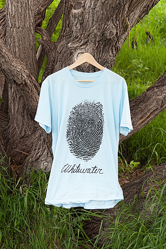
As I write this, I’m stylin’ my dad-designed, blue-on-yellow “Calgary Whitewater Club” t-shirt.
Below is a gallery of some of the shirts and hoodies I’ve had printed recently. Enjoy.
In my previous post I wrote about a new series of pipes I have been thinking about. The idea is simple: if a troll made a pipe what would it look like?
The Design Process
According to the hilarious Norwegian film, Troll Hunter, the combination of concrete and charcoal is irresistible to trolls. My first sketch resembled two dirty rocks. Trolls are not very bright, so I figure one wouldn’t spend much time making a pipe look very nice.
My second sketch was of a fallen tree, roots and all, with a bird house/hole as the pipe bowl (presumably the birds moved out when the troll tore the tree from the ground). The tree pipe would be smoked by a larger variety of troll. They would probably smoke a combination of tobacco stolen from a barn, charcoal, and shredded tires (which they also find irresistible).
My next series of sketches more closely resembled traditional pipe shapes — horns to be exact (sometimes called hunters). Imagine: a troll kills a bunch of sheep, or a a few goats; after the meal the remnants of ruminants are lying around; the troll grabs a horn and settles down for a nice after dinner smoke. Yum. Unfortunately (or fortunately, depending on your point of view), I don’t have a ready supply of animal horns laying around so I could not easily replicate this scenario.
A New Pipe Shape
Thinking of other shapes a troll’s pipe might take, I glanced out my window toward the pile of firewood in my backyard. I’d been to the cabin recently and cut some small, two to three inch diameter, downed aspen for firewood. The greenwood, bark still attached, struck me as having troll pipe potential. I grabbed a piece and headed down to my shop.
I made a quick sketch. I didn’t want to shape the wood too much — just lop off a piece and drill a bowl chamber. But what kind of stem and how to attach it. For a complete unrelated woodworking project I need to install some spindle legs with a tapered tenon. I decided to use this joint for the stem tenon. In fact I decide to use the same taper for the bit end too.
The pipe came together very quickly. Within an hour and a half I had the bowel shaped, all the holes bored, the bit formed, and everything buffed with carnuba wax.
The finished product follows this brief: a young Mountain King troll breaks into your cabin; among other things it breaks up your kitchen chairs and scatters your fireplace wood all over; after eating all of your cat food it leaves, taking with it a chair leg, a piece of firewood, and a tin of tobacco. Later, it makes a pipe with the absconded wood. What does the pipe look like? Hint, the pipe could also function as a bludgeoning device.
The finished pipe very closely resembled the carvers mallet sitting on my workbench, so, “mallet” is what I call this new pipe shape.
Smoking
The green poplar wood bowl and maple stem smoked quite well, surprisingly. I think it will take a while to break in though. The mallet shape, while a little to unwieldily to hang between my teeth (a real troll could probably manage), rests wonderful in the palm of my hand, the thumb and middle finger wrapping around the barrel, and the index finger cupping the end. When packed and lit the mallet can be temporarily set on the end face while you tend to other business (troll business, I suppose).
I smoked the same Royal Coachman tobacco I have been smoking in my Brigham Voyageur. I’m becoming less a fan of this blend as time goes on. Time for a visit to Epicure to pick up something different. I’m not yet a connoisseur of tobacco so it might be hit and miss for a while. I can’t yet describe what I do or don’t like about a particular blend. Some ingredient in Royal Coachman just doesn’t agree with me. If you have any hints, let me know.
Today I probably won’t be making pipes. Today I will be making pies (similar spelling, but moderately different result). Pumpkin and apple. Not troll. It’s (Canadian) Thanksgiving today. Happy Thanksgiving. Happy pipes. Happy trolls.
P.s. Whatever becomes of this pipe, I will always have fond memories of it because it was while smoking the Troll Mallet for the first time that I figured out how to blow smoke rings!
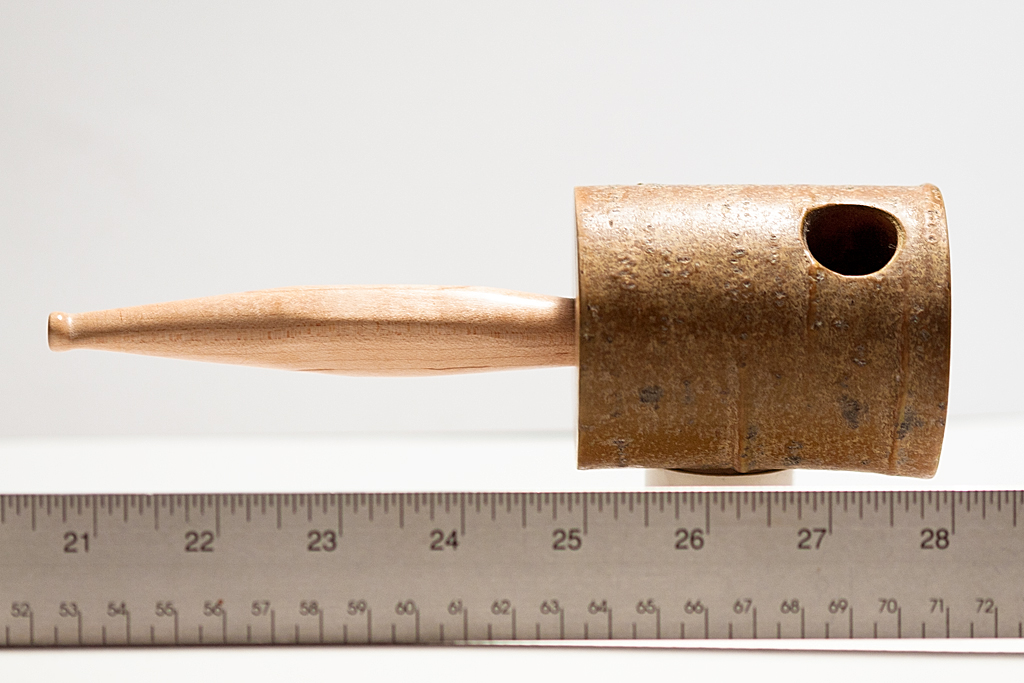
In a previous post I admitted my new guilty pleasure — pipes. Besides the taste and smell of pipe tobacco, and the romance of smoking a pipe, I am also drawn to the aesthetics of the pipe shape for it’s own sake. Last weekend I made my very first pipe. I recently watched the Lord of The Rings trilogy (“LoTR”) and had become enamoured with the long-stem churchwarden-style pipes smoked by all the main characters. I decided to make my own.
Making
As with all pipes, the stem of a churchwarden is as important an element in the pipe’s design as the stummel (bowl and shank). Sadly, in the pipe world, the shape and finish of the stummel get most of the attention. In all my on-line research, I could find very little information about how to drill a small hole (1/8 inch or less) in a long (12 inch) piece of wood. I had some thin scraps laying around from another project so I opted for a bent laminate stem. The stem is maple and the draft hole was manufactured as part of the lay-up process (i.e., the stem consists of a top skin, two sidewalls, and a bottom skin). I managed the final rounding of the stem with a spokeshave, file (for the bit), and sand paper. Because I do not (yet) have a lathe, I opted to join the stem to the shank using a hollow dowl — it was easier to drill a mortise in the stem than to carve a tight round tenon.
The bowl is a conical shape that blends simply into the round shank. I didn’t model this shape on any pre-existing pipes. It just seemed natural and fits my hand nicely. I wasn’t to trying to replicate a specific pipe from LoTR either. I just wanted something that might look like it was carved from available materials in the wild by an experienced but refined adventurer. [pullthis]This is not your father’s billiard[/pullthis].
[pullshow]
The bowl was roughed out on the bandsaw and then hand carved, primarly with bent gouge and shallow fishtail gouge chisels (I recently acquired a basic set of round carving tools by Henry Taylor). I sandblasted a light texture in the chiselled hollows (a sand blasting cabinet is on my shopping list). The chiselled ridges and flat bowl top and bottom were smoothed and polished with tripoli and diamond compounds. The bowl and stem were brought to a nice shine with carnuba wax. I didn’t use any dies on this particular pipe — it’s au naturel.
I chose walnut for the stummel for several reason: 1) it is very hard; 2) I had some on hand; 3) I haven’t ordered any briar yet; 4) it provides a nice contrast to the maple stem. Most modern pipe bowls are made from briar, though other woods have been popular in the past (particularly orchard woods). Some eastern European pipemakers still produce pipes with cherry and pear wood (Mr. Brog in Poland, and Golden Gate in the Ukraine, for example). The current eastern European predilection for non-briar pipes may be motivated by sentiment, but in the past woods like cherry and pear were used out of necessity — during communist times it was nearly impossible to import briar.
Smoking
It was a joy to make my first pipe, the Ranger. Other than the stem, which took a bit of thought, the entire piece came together quite easily. Ranger smokes very nicely. The long stem provides a very cool smoke, and I had fewer relights than with my Brigham Voyageur. I’m still breaking it in, but so far the flavour is very pleasant. The draft hole is perhaps a bit too large (not much resistance), but that could be fixed with retrofit in the tenon. It will be a while before I know how the walnut will hold up to the heat. I’m also a bit (no pun intended) concerned about how the bit will hold up over to time. If the bit wears out prematurely I can retrofit a vulcanite replacement without substantially altering the stem. This is not meant to be an everyday smoker. At 12 3/4 inches long its more of a showpiece to be smoked for fun.
Pipe Dreaming
In a nice instance of serendipity, Ranger has been paired with a leather tobacco pouch I made several months ago — Rivendell — and a tobacco called Bilbo’s Pipe. I swear, I am not huge Tolkienite or anything like that. Aesthetics are both conscious and unconscious, requiring both effort and effortlessness, and when things are meant to come together, they will. (P.s., don’t tell my wife yet, but I recently ordered a full set of four LoTR replica pipes from The Danish Pipeshop.)
I think for now I am done exploring this line. In fact, I’ve started sketching a new series of concepts partly based on a more recent movie destined to become a cult classic — the Norwegian film Troll Hunter(you have to watch it — Blair Witch meets District 9, and its not based on a f@cking comic book). This new idea also came to me after seeing Michail Revyagin’s brilliant Troll Bulldog, though my concepts are not likely to end up as sophisticated. My jumping off point is a simple question — if a troll made a pipe, what would it look like. Not pretty, I assure you.
The Road goes ever on and on,
Down from the door where it began.
Now far ahead the road has gone,
And I must follow, if I can,
Pursuing it with eager feet,
Until it joins some larger way
Where many paths and errands meet.
And whither then? I cannot say.


 In my case I am using Spyder4Elite and I set the target white point to 4800K and the target white luminance to 60 candela (brighter than my room, but the darkest my monitor will tolerate) in the Expert Console (see the screenshot). Alternatively, you can use the calibration tool in the Displays panel in System Preferences (turn on Expert Mode) on OS X. In my experience a hardware calibrator is easier to use and more accurate, but visual calibration using Apple’s Display Calibrator Assistant is acceptable.