
I’m pretty picky about colour. I spend a lot of time fine-tuning my colour management workflow from camera to print. Of course making sure you have well calibrated devices is a critical step in ensuring colour accuracy. But what is calibration? Calibration is the process of tweaking your camera or scanner, monitor, and printer to consistently represent an image to the best of the equipment’s abilities within your viewing environment. I’ve dealt with digital camera calibration in the past. Today I will focus on the next link in the chain — computer monitor colour calibration.
Monitor Calibration Primer
While I will try to make this article as simple as possible, I do assume a certain familiarity with colour calibration terminology. I will deal only with LCD displays, because discussing CRT displays would be like learning about horse carriages in an automotive class — CRT technology is so 20th century. I also place the caveat that I only work with OS X operating systems and Apple Cinema Displays. While these procedures can certainly be transferred to other operating systems and display manufacturers, you will have to figure that out on your own.
Of course, computer monitor calibration has been dealt with by numerous articles in the past. Therefore I will focus on techniques or concepts which I think are novel, unique to my workflow, and helpful to others. Specifically, I will show you how to use your digital camera to assist with monitor calibration. I also touch on using Philips Hue lights to tailor your workspace lighting.
There seem to be two schools of thought regarding monitor calibration. One school says you should be setting up your monitor to match some theoretical viewing standard. The other school says you should be setting up your monitor to work well in the ambient lighting of your environment. I stand firmly in the latter school for two reasons: one, you can much more easily evaluate prints if your monitor matches the ambient light conditions of your workspace; and two, I find there is much less eye strain if your monitor is not excessively bright or dim compared to the ambient light and if the overall monitor colour temperature is as close as possible to the room ambient colour temperature. I will therefore show you how to achieve a calibration which matches your monitor to your work environment.
There are four primary variables that can be adjusted in relation to monitor calibration: brightness or luminance (both minimum and maximum); white point (temperature in degrees kelvin); gamma (overal output curve); and individual red, green, and blue colour response curves.
The monitor manufacturer’s default settings (based partly on ISO standards ISO 3664:2009 and ISO 12646:20081) are usually a maximum luminance between 80 and 120 candela, a white point temperature of 5000K or 6500K, and a gamma of 2.2. 6500K is the approximate colour temperature of noon-day summer sky lighting. A luminance value of 120 cd is equivalent to an average home interior.
The target gamma of 2.2 matches the sRGB specification which is the default colour space use by most cameras and HD televisions and is therefore probably the most appropriate choice.2
Throwing Out The Rulebook – Sort Of
For those rare people whose workspace is lit by dim daylight (an oxymoron to be sure) the manufacturer’s default will probably be fine. For everyone else, some tweaking, or even major adjustments to these defaults is required. Remember, calibration is about getting things to look consistent in your work environment. In order to do this you need to understand two things about your environment. One, how bright is your work area, and two, what is the colour temperature of the ambient light in your work area.
If you are a photographer and are selling or displaying prints of your work, then I would start by trying to set up your work environment to match the conditions most commonly found where your prints are shown. If you sell in a gallery, then create a bright space using the same types of lights that the gallery uses. If you hang your prints in your living room to share with friends and family, then match your office/studio lighting to that of your living room. Matching room lighting to the display area is not critical to the monitor calibration process, but it makes print evaluation much easier — you will be viewing your fresh prints under the same conditions as they will be displayed.
If you don’t do much printing, or if your prints will be displayed in a wide range of environments, then just set up the lighting around your computer so you are comfortable — moderately bright with standard incandescent lighting (or better yet, make the switch to LED).
If you primarily work on a laptop computer and in several different locations, then do the calibration under the most common working conditions.
Now, most of us are not going to end up with a 6500K work space illuminated by 120 candela worth of ambient lighting.
In my small home office, for instance, the two 60 watt tungsten bulbs in the diffuse ceiling fixture produce about 40 candela — nowhere near the standard 120 cd. If I set my monitor luminance to output white at 120 cd I would probably go blind from the brightness of the monitor compared to the ambient light.
On the other hand, an ambient brightness of 40 cd is quite dim. Setting the monitor luminance to 40 cd would also be problematic because LCD displays tend to have quite bad colour accuracy at lower brightness settings. I can dial my Cinema Displays down to 40 cd, but I loose about 10% of the sRGB gamut in doing so. The monitors also exhibit visible colour artifacts at this setting.
What to do? I started by adding several more incandescent bulbs in lamp fixtures throughout the room. I was aiming for a nice diffuse light with a luminance of about 60 cd.
The colour temperature of my office lighting was also nowhere near the 6500K default. In fact, using the Custom White Balance feature of my digital camera and the neutral card off my X-rite ColorChecker Passport, I measured the colour temperature of my office as 2300K under tungsten lighting. This is quite a warm (amber) colour. In fact it is quite warm compared to the ~2800K usually expected from 60 W tungsten incandescent lightbulbs. I attributed the warmth to three factors — the colour of the diffuser glass on the light fixture, the warm eggshell tone of the “white” walls, and reflections off the light birch wood furnishings.
Now, I would not mind matching my monitors to 2300K. I have the window mostly covered, keeping out excess sunlight, and thereby reducing colour temperature variation. However, the DataColor Spyder4 software that I use for monitor calibration only allows a minimum target white point value of 3000K. Using this setting, my monitors were still slightly blue compared to the room light, though much better than a setting of 6500K or even 5800K (the colour temperature of noon-day summer sun with out the influence of blue sky). However, after running my monitors calibrated to a white point of 3000K I was unsatisfied. The Apple Cinema Displays produced too many artifacts at this temperature. Still images and video displayed properly, but scrolling text exhibited a dreadful red ghosting that was just unacceptable.
In other words, you are unlikely to be able to properly calibrate a monitor to match the colour temperature of pure incandescent tungsten lighting.
In the end I swapped my tungsten bulbs with Philips Hue LED lights which can have their colour adjusted. I have played around with several colour temperatures and settled on 4800K (Hue’s Energize setting) as an acceptable compromise between warm home interior lighting and excessively blue daylight.
Calibrating Your Computer Monitor To Match Your Workspace Ambient Lighting Conditions
Calibrating your monitor to match your workspace ambient lighting conditions is a simple process requiring few specialized tools. In summary, you will: evaluate the brightness and colour temperature of your workspace lighting using your digital camera; calibrate your monitor using the measured settings; and double-check that the calibrated monitor matches your workspace lighting, again using your digital camera.
You will need:
- a digital camera with custom white balance function (the ability to create a custom white balance from a photo, not just by entering degrees kelvin), histogram, manual and aperture priority modes, and the ability to save RAW files;
- photo editing/viewing software which allows you to review the colour temperature setting stored in a RAW file (such as Adobe Camera Raw);
- a grey card or white balance card (neutral photo card);
- a bright white piece of paper (may be used in place of neutral photo card); and,
- monitor calibration hardware and software that will accept white point and brightness/luminance target values (you could also us OS X’s built-in assistant)
Preparation:
- Turn on your computer monitor and allow it to warm up at least 1/2 hour before starting the calibration. You can perform the workspace set-up and evaluation steps in the meantime.
Procedure:
Workspace Set-up
- Turn on the room lights and allow them to warm up.
- Your workspace should be moderately bright — not candlelight dim and not daylight glaring.
- Try to avoid too much window light as this will cause the brightness and colour of the ambient light to vary too much throughout the day.
- For more efficient lighting, neutral white walls and ceilings are preferred.
- Do not allow bright direct light to fall on the monitor surface. Overall diffuse lighting is best.
- I personally prefer and recommend a dark neutral virtual desktop background for all photographers and graphic designers.
Workspace Lighting Evaluation
Workspace Brightness Evaluation
Turn on your camera with the the following settings:
- live view on (preferred)
- histogram on
- RAW image capture on
- white balance appropriate for your workspace (probably tungsten or custom)
- aperture priority mode
- ISO 100
- aperture ƒ/5.6
- Use your camera to take a meter reading of the area in front of our computer (around the keyboard). This will give you an idea of the ambient light levels. You can use trust your camera’s evaluative metering mode for this, or you can meter the light falling on a grey card. Check the exposure with the camera histogram — there should be no clipping of the highlights or blacks. Do not allow the computer monitor to cast a strong light on the metered area during this step. If required, temporarily cover the monitor with a neutral coloured shirt or towel.
- Compare the metered shutter speed with the following list.
- 2 sec., 4EV, 40 cd/m2, dim, candle light
- 1 sec., 5EV, 80 cd/m2, low, night home interior
- 1/2 sec., 6EV, 160 cd/m2, medium, bright home interior
- 1/4 sec., 7EV, 320 cd/m2, high, indoor sports stadium
- 1/8 sec., 8EV, 640 cd/m2, very high, very bright interior with fluorescent lights
You need enough light to achieve a shutter speed between 1 second and 1/8 of a second. Outside this range and your monitor will not be able to match the ambient light levels. You can either add more lights and do the evaluation again, or accept that your monitor brightness will differ front the ambient brightness and simply continue to step the Workspace Colour Temperature Evaluation step.

In this example, my camera is reading 2 seconds at ƒ/5.6 and ISO 100 (4EV or 40 cd/m2). Obviously my workspace is still quite dim and I would have a hard time matching my monitor luminance to the ambient brightness.
Workspace Colour Temperature Evaluation
For this evaluation you will use the same camera settings as above, but you will have to increase the ISO to 3200 or 6400 in order to capture a photograph without excessive camera shake (or use a tripod). You can also change the metering mode to manual if you prefer.
- Once again, meter the area around your keyboard.
- Place your neutral photo card or piece of paper on your keyboard, again taking precautions to prevent monitor light from casting on this area.
- Use your camera’s custom white balance function to get a white balance reading from the card/paper. The custom white balance procedure varies by manufacturer and I will leave it to you to figure out. Once you have the custom white balance set, if your camera displays the colour temperature in degrees Kelvin then you can skip the next step.
- Take a photo with the custom white balance. It doesn’t matter what is in the frame — you just need to record the colour temperature in a photograph so you can retrieve it. To that end, make sure you are shooting in RAW mode. Load the RAW file into your photo viewer/editor and note the colour temperature that was used.

Will the measured colour temperature work with your monitor? A measurement between 4000K and 6500K should be fine. If the reading is below this range then the monitor probably will suffer colour artifacts of some sort. This is sad, because in my experience home lighting is usually in the 2600K to 3500K range. Office lighting is probably in the 3400K to 6500K range. Why manufacturers can’t or won’t make a monitor that is capable of good performance in the home office environment I do not know. If your ambient colour temperature is below 3500K you have three choices: 1) calibrate your monitor to the ambient colour temperature and see if the colour performance is acceptable to you; 2) calibrate to a higher/cooler colour temperature and accept that your monitor and ambient light will not match (print evaluation will be more difficult); 3) change the colour of your ambient lighting by switching to “cool white” tungsten bulbs, switching to halogen lighting, or using colour changing LED lights like Philips Hue (you need a bulb that produces a good “white”).
Some common colour temperatures:
- 2800K = 60 watt incandescent tungsten bulb
- 3200K = halogen
- 3400K = photoflood
- 4800K = daylight blue photoflood
- 5400K = average summer sunlight at noon
- 6500K = average summer sunlight with the effect of the blue sky
- 8000K = summer shade on a blue sky day
Hue recipe colour temperatures:
- Relax = 2200K
- Reading = 2800K
- Concentrate = 3700K
- Energize = 4800K
I am currently using Philips Hue bulbs in my office with one of the standard Philips recipes — Energize — which has a measured temperature of about 4800K.
Monitor Calibration

If your workspace ambient light brightness and colour temperature are in an acceptable range, then you can move on to calibrating your monitor.
Launch your calibration software and follow the on screen instructions. Use whatever mode allows you to set a target white balance and target brightness/luminance.
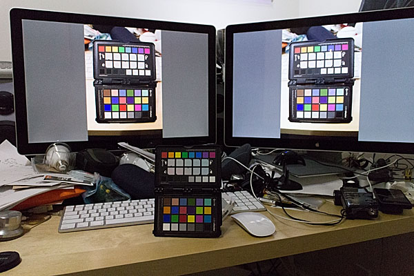
 In my case I am using Spyder4Elite and I set the target white point to 4800K and the target white luminance to 60 candela (brighter than my room, but the darkest my monitor will tolerate) in the Expert Console (see the screenshot). Alternatively, you can use the calibration tool in the Displays panel in System Preferences (turn on Expert Mode) on OS X. In my experience a hardware calibrator is easier to use and more accurate, but visual calibration using Apple’s Display Calibrator Assistant is acceptable.

The left monitor shows the Spyder4 result. The right monitor shows the Display Calibrator Assistant result — slightly warm.
Calibration evaluation
Now it is time to evaluate the results of calibrating your monitor to your workspace ambient light conditions.
Calibration Brightness Evaluation
- Open an empty document on your monitor. You can use an empty word processing document or empty Photoshop document. What you want is a pure white background that fills most of the monitor. Another option is to set your desktop background temporarily to solid white.
- Point your camera towards the white part of the monitor and adjust the exposure settings so the camera histogram peak corresponding to the monitor white is near, but not touching, the right edge of the histogram.
- Now place a piece of white paper in front of the monitor or on your keyboard.
- Maintaining the camera exposure settings, point the camera so that both the white document on the monitor and white piece of paper are in the frame.
- Compare where the highlight peaks occur in the camera histogram. Ideally, the computer screen maximum brightness and paper maximum brightness should coincide. If the peak from the paper occurs somewhere between the middle of the histogram on the left and the monitor white spike on the right, then this is probably still acceptable, though your monitor is slightly brighter than the ambient light. If the paper is brighter than the monitor, then something went wrong during calibration and you need to start over. If the paper spike appears to the left of the mid-point of the histogram, then the contrast between the monitor and ambient brightness is quite high and will likely lead to eye fatigue and difficulty evaluating prints.

Calibration Colour Temperature Evaluation
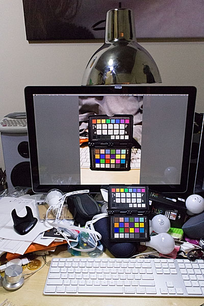
- Place a colourful photographic print or colour chart of some sort on your keyboard. I use the Xrite ColorChecker Passport for this step. Any card or photo with a broad spectrum of colours will suffice.
- Photograph the colour sample using the same camera settings as in the Workspace Colour Temperature Evaluation step and the measured ambient colour temperature/white balance setting.
- Load the colour sample photograph you captured in step 2 into your photo viewer/editor software. Expand the image to fill the monitor.
- Take one final photograph framing both the physical colour sample on your desk and the virtual colour sample photograph displayed on your monitor in step 3. Base the exposure settings on the brightness of the monitor image.
- There should be little if any colour cast between the physical sample and the virtual one. If the room ambient brightness is lower than the monitor brightness then the physical sample will be darker — too dark and it will be difficult to evaluate any colour differences (this is the same trouble you will encounter when trying to evaluate prints!) If the room and monitor brightnesses are quite close then your eyes should actually have difficulty determine which sample was on the desk and which one was on displayed on the monitor. If you set the calibration target white point to the same as the measured white balance, but the virtual sample and physical sample colours differ significantly, then something went wrong somewhere and you will have to start over.

Conclusion
It should be apparent that using your digital camera to assist in monitor calibration has a few benefits. It is a readily accessible tool for measuring both brightness and colour temperature. Today’s photographic sensors are very good, but they are still not as adaptive or dynamic as the human eye. This is actually a benefit in this case, as the photographic image captured by your camera can highlight brightness and colour differences between the ambient workspace light and your computer monitor for which your brain might simply compensate.
Philips Hue lights seem to be a good, if expensive, way to tailor your workspace lighting conditions. They are high quality LED bulb and if you are making the switch to LED you might as well pay the extra money to get a much more advanced lighting system. I already had Hue installed in parts of my home and was planning to switch over my office lighting anyway. It is easy to set up different light recipes and to switch between them while you tailor your workspace lighting.
1. http://www.metalvortex.com/chart/
2. sRGB is based in part on the output capabilities of CRT televisions, the most common display technology at the time of sRGB’s introduction. CRTs did not have a particularly large gamut and therefore could not represent a very wide range of colours. AdobeRGB is a much larger colour space, which many cameras are capable of shooting. If you are primarily producing prints within your own studio environment then you might want to investigate switching to AdobeRGB throughout your workflow. This will however cause some colour compression when you go to display images on the Internet because the vast majority of web browsers assume sRGB images. Some web browsers, such as Safari, will respect embedded colour profiles, but embedding colour profiles increases the image file size and therefore load times. It is also a gamble whether or not photo sharing websites will maintain the embedded profiles when creating thumbnail images. For these reasons, I stick with the inferior, but painless, sRGB colour space throughout my workflow.
