nos·tal·gia
näˈstaljə,nəˈstaljə/
noun
- a sentimental longing or wistful affection for the past, typically for a period or place with happy personal associations.
I consider nostalgia to be bourgeois and dangerous. Bourgeois, because only persons from a fairly well-off social class would long for the past. Dangerous, because this longing for the past can come at the expense of the present, or even the future. Think of the stereotypical 30-year-old pining nostalgically for his glory days as a high school football star. So sad.
To me, the epitome of nostalgia in photography comes in the form of digital photographs that have been post-processed to achieve the look of film photographs. I get the impression that this nostalgia is, ironically, practiced most adamantly by millennials who did not actually live or photograph in the film era. As an ironic device nostalgia fits squarely in the hipster oeuvre.
I do admit, that during a certain period in my revival as a photographer (specifically 2010-2013) I used the iPhone Hipstamatic camera as my snapshot tool of choice. It was not the film-replicating filters that primarily attracted me to Hipstamatic, but instead the simplicity of the interface and the ability to easily put together camera and lens combinations that matched certain moods or experiences. It meant I could shoot a lot, achieve the look I wanted, and not do any post-processing in the little spare time I had. (The iPhone and Hipstamatic were also part of a broader revolution in camera functionality and instant image sharing. Traditional digital cameras weren’t keeping up.)

The true film look revival came slightly later though, primarily thanks to VSCO Cam. It’s a look I generally abhor, as photographs done in it tend to be monotonous. Thankfully, as the digital film look rose to prominence I moved on to better things and better cameras.
But what is the the film look. There probably is no formal definition, but I include some or all of the following parameters (in the order of decreasing importance):
- low contrast, achieved by crushing the blacks, raising the black point, and lowering the white point;
- slightly desaturated;
- vignetting;
- flare;
- soft corners.
Essentially the film look is low contrast, low dynamic range, low fidelity.
(Film photographs that have been digitize are often presented with similar qualities, but actual film photography is a different genre entirely, and I confine my discussion here to images originally captured with a modern digital camera. I have a tumblr blog of old film scans: vintage-slides.tumblr.com)

Notwithstanding my general dislike for the overuse of the simulacrum film look, there are times when this post-processing technique can be useful. I prefer these under-cooked images to ones with grossly over-cooked post-processing, and for scenes with wide dynamic range, the film look is one way to tame contrast in a relatively pleasing way.
I shoot in RAW format, and usually maximize dynamic range, contrast, and saturation as much as possible. That is, I don’t over do my post-processing, but I don’t under do it either. I try to squeeze as much information as I can out of modern imaging devices: cameras, lenses, monitors, and printers.
Occasionally though, I think some images could be well served rendered with the film look, either because of lighting conditions or the choice of subject matter. I too am not immune to nostalgia it seems.
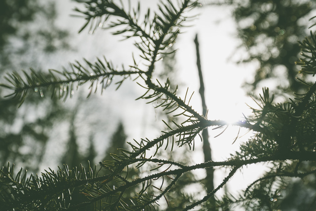
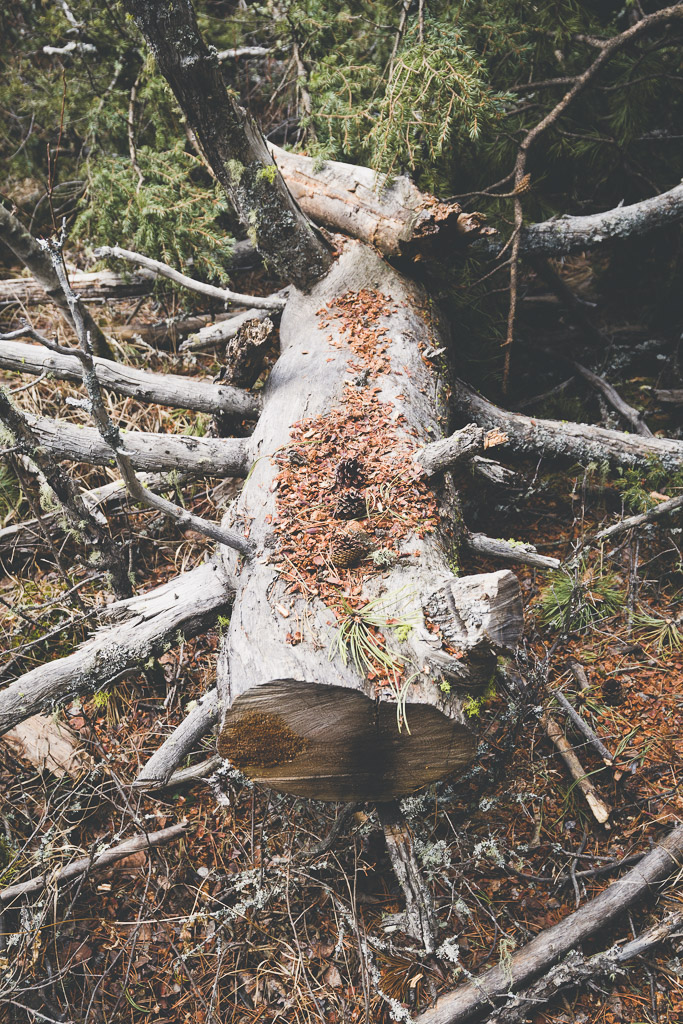
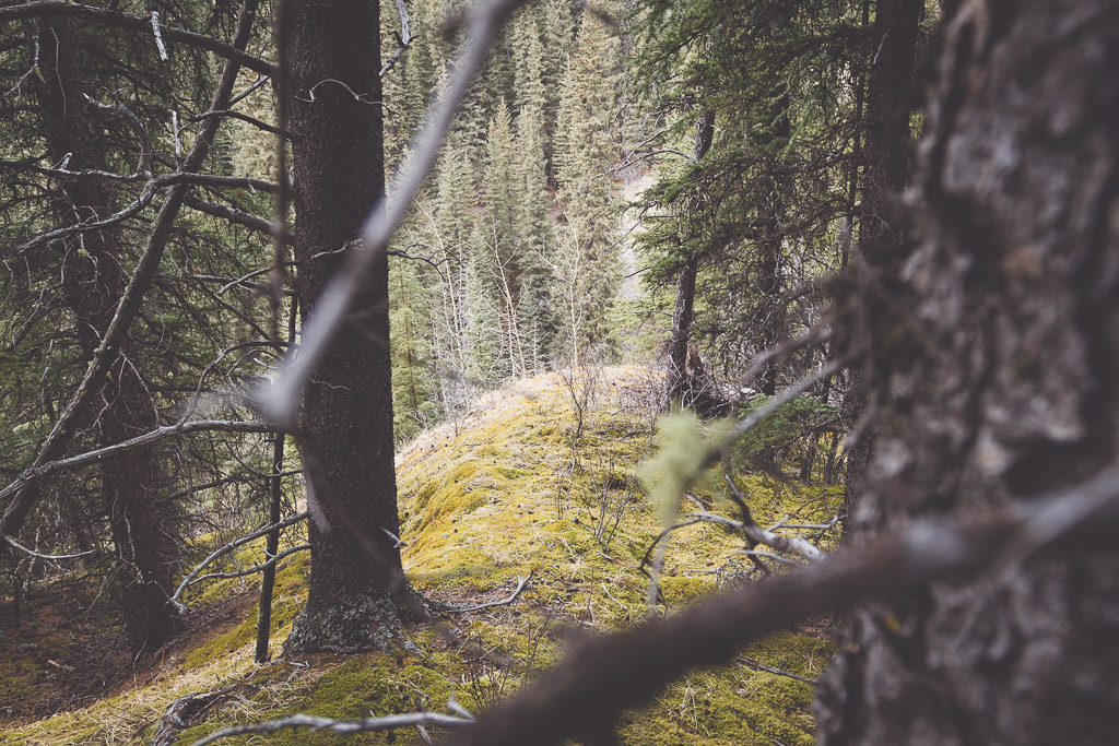
Recently, after spending a day working on our family cabin, I stole a few moments to escape the plumbing and to go for a much deserved walk around the property. Armed with the latest in digital photography apparatuses (a Canon EOS M5 and Canon EF 16-35mm f/4 L IS USM) I immediately decided that the resultant images would be processed with the film look. (I’d recently been inspired by the work of Flickr member Dahlia Ambrose). Moving fast and working quickly, in 45 minutes and over 1.5 kilometres I captured about 70 photographs — a much higher pace than would have been realistic when I really was shooting with film.
Several days later, I sat down at the computer and paired the selection down to about 30 images. Below are some of the post-processing steps I take to achieve the film look in Lightroom. (Some images are given a black and white treatment which I call noir after one of my favourite filters in Snapseed, but otherwise the black and white processing is very similar to that of the colour images).
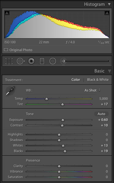
Basic Adjustments
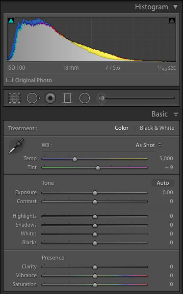
I start by doing my usual post-processing steps to arrive at a true-to-life representation of the original scene. These workflow steps are common to every single keeper RAW photograph I take regardless of the final intended use or treatment.
- Apply custom camera calibration (created for each specific camera and lighting situation using a ColorChecker Passport target)
- Apply lens correction profile (to remove distortion, vignetting, and chromatic aberration)
- Set white and black point (eliminate clipping and maximize dynamic range)
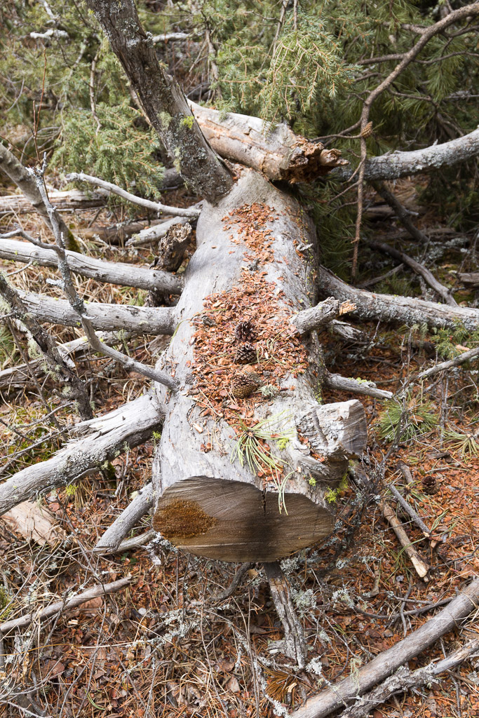
- Adjust scene brightness and contrast (I shoot using the “expose to the right” methodology, though this example image was slightly underexposed to guarantee I did not blow out any of the shiny grey log).


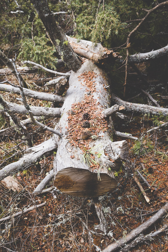
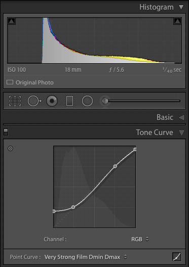
Apply Custom Film Preset
I have a predefined set of custom film presets that contain the following:
- Tone curve to modify black and white points, and crush the blacks
- Vignetting (I have standardized on four levels of vignetting across all my post processing, in descending order of frequency of use: 0 none, -8 mild, -18 strong, -28 very strong)
- Desaturate (-10)
When I applying moderate vignetting I usually also increase the overall image brightness (either via the exposure slider for ad hoc work or the tone curve for presets) to maintain the same average scene brightness. That is, as I darken the image corners I also lighten the image centre to compensate.
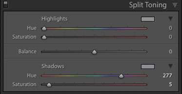
Add Split Toning
Some images are done after applying the film preset, others benefit from mild split toning (that is, adding a colour cast to the blacks, the highlights, or both).
Rather than trying to emulate a specific film stock I use basic colour theory to determine the split tone colours. For example, if the dominate subject is bright green (e.g., foliage), I will add a slight purple or magenta cast to the shadows. This helps accentuate the main subject. There are no hard rules about this though and I do the split toning on an image by image basis.
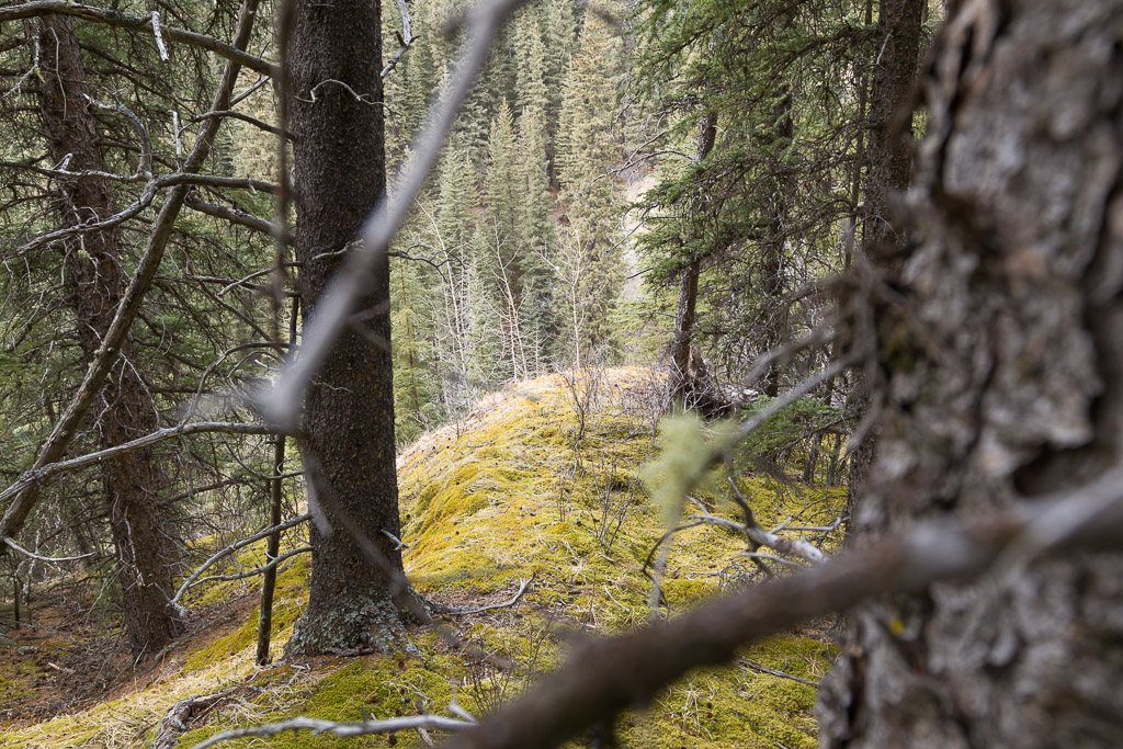
A Second Example


Flickr Gallery