Last year, after I started geotagging my photos, I did a few visual art projects combining photography and GPS technology. I am fascinated by maps, how we imagine the world around us, how we communicated that world to others, etc.
A GPS receiver (including many smartphone apps) can record a GPS track — that is, a series of linked points recorded at regular intervals or distances as you move. Normally, these tracks are used for navigation — record where you have been so you can later retrace your route and thus find your way back home. These track files are also good for post-adventure analysis. Your can plot your speed, heading, elevation, etc. You can also use the point data in the track to geotag your photos so that you, and others, can see exactly where a particular photo was taken.
Beyond their practical uses, however, GPX tracks, when displayed as a line on a map, have an aesthetic value as well. They are a virtual mark on the land — the mark of an adventurer expressing some desire to explore. In this way they are not unlike the marks an artist makes on paper or canvas. Lines creating shapes, outlining objects, representing barriers overcome or avoided. Lines demarcating space and time. Tracings and recordings of life.
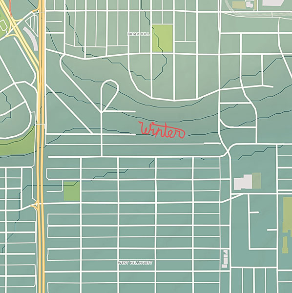
A Walk In The Park
After a long walk at Bowness Park last March, I overlaid photographs I had taken with the abstract and graphically rich tracings of my GPS tracks. Typically, one displays geo-located photos on a map — saying “this is where these photos were taken.”
But the map is not the terrain. The map is not the location.
Instead, I am displaying the map (in the form of the track overlay) on the photo. This gives the photo context. The image exists in concert with — because of — my movement across the land.
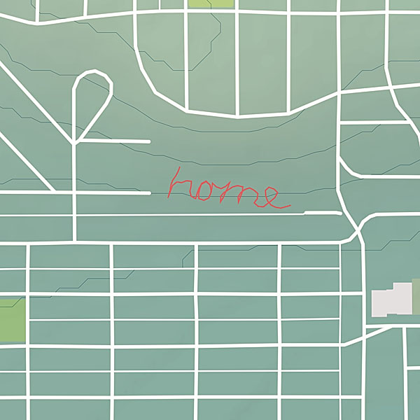
Photo Walking
The other project I started, is a series of large scale conceptual drawings. By walking a path across the land tracing the shape of a word, I am making visible some thought, some meditative idea. The word — the path — is not visible to others even though it’s creation is a very concrete act. However, by capturing the path in the form of a GPS track, I am able to share the act with others. The track image, is combined with photos taking during the walk so the viewer can experience the original event.
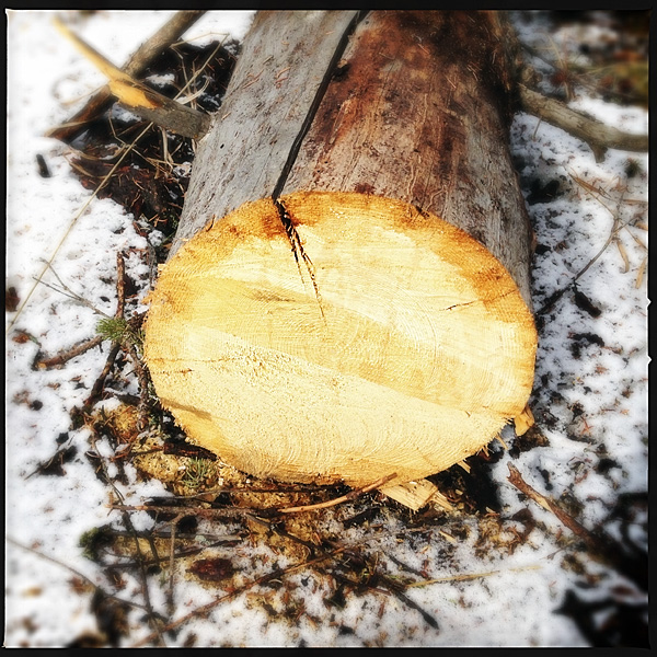
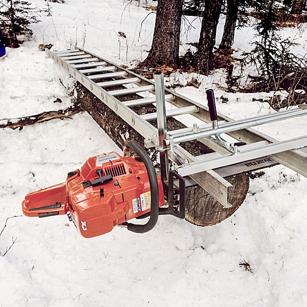
I’ve had a Granberg Alaskan Chainsaw Mill MKIII for a little over a year now, but apparently haven’t posted anything about it here. This isn’t going to be a detailed review or anything like that. I just wanted to post some pictures of my set-up. I will say that the Granberg mill is a well made, robust, easy to use piece of equipment. For what it is — a portable chainsaw mill — I have no complaints. Highly recommended.
I do wish that Granberg’s EZ Rails (which can be used to make the first cut) were cheaper. I am mostly using my mill to make lumber for timber-frame construction. As such I often need beams of 14′ or longer. The 9′ plus 5′ EZ Rails would cost me about $400.
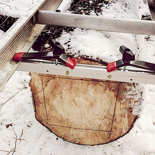
I initially made my own level-adjusting rails using 2x4s and some aluminum stock. However, the 2x4s have warped and I no longer use them. Instead, I made new rail brackets with integral quick clamps (see the photos) that work with an aluminum ladder. This set-up works quite well, though I am limited to milling logs about 13′ in length by the 14’/28′ extension ladder parts I currently have (I could get a 16’/32′ ladder, but can’t justify the $300 expense). I always find that the set-up for the first cut takes quite a bit of time. And since I am making squared timbers, I have to do the first-cut set-up twice.
I run my mill with a Husqvarna 395 XP (7 hp) chainsaw, a 36″ bar, and skip-tooth chain. Before I got the bigger saw, I ran the mill with a Husqvarna 545 (3.35 hp) chainsaw, a 24″ bar, and a chain modified for ripping. However the 545 didn’t have enough power to efficiently get through logs bigger than 8″ diameter. The 395 has plenty of power and I will probably never need the capacity of the 36′ bar/mill as trees just don’t grow that big on our property.
Another Day In The Office
I took these photos yesterday. The temperature was about 7°C. There was zero wind, a bluebird sky, and ravens soaring through the trees. The snow is very deep this year (near mid-thigh in some places) and I had a bit of trouble getting the quad into the bush to get at the log I wanted to work on. I managed though. I like the system I have for hauling the ladder, mill, saws, and other tools in my quad trailer.
After milling the log I covered it up so it is not exposed to weather. It is down a small hill and I will have to wait a few months until the snow melts a bit to winch it out of there.
Another day at the office
Layout and leveling
Ladder/rail clamps
Ready for the first cut
The finished 8″ x 8″ beam
Summary
[table th=”0″] Item,Granberg Alaskan Chainsaw Mill MKIII Price,C$255 Availability,granberg.com or leevalley.com Pros,”portable, well made, robust, easy to use” Cons,”slow set-up for first cut, expensive accessories” Summary,Highly recommended Rating,[rating=4]
[/table]
This is a follow up to my initial review of the Opinel No. 7 carbon-steel folding knife. I have been using this knife for about 10 days now. I’ve kept it with me almost constantly throughout this time (except while sleeping and showering) and I’ve tried to use it as much as possible. Here are my impressions.
A Good Everyday Knife
As I noted in my initial review, it took a bit of tuning up before I was happy with this knife. After that initial work though, this knife has been a pleasure to carry and use. I appreciate its lightness, and rarely notice that it is in my pocket. The handle is very comfortable, though I do feel the No. 8 would fit my hand better.
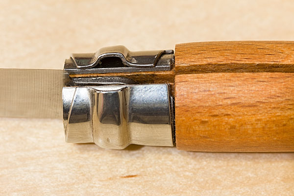
Opening, Closing, and Locking
The folding mechanism is very smooth. I actually like that it does not have a spring tension lock like the type found on most folders, Swiss Army knives, etc. the lack of spring resistance means that the folding action of the Opinel is very smooth — almost effortless. Engaging the fingernail opener slot is sometimes difficult, but almost not necessary. Just disengage the hinge lock, and pull the blade open with your thumb and forefinger.
The fastest method of engaging and disengaging the hinge lock is with a quick swipe of the thumb of your knife holding hand. This is fast, but the lock mechanism does tend to dig into the pad of the thumb. On the plus side, I am getting a nice callous on my thumb.
Blade Performance and Maintenance
I have used the knife to cut just about every material I have encountered over the previous ten days: packing tape, cardboard, envelopes, cheese, bread, pâté, plastic, wood, epoxy, string, etc.
Though a bit short, the blade excelled in the kitchen and for simple food prep tasks. I would not hesitate to keep this knife as a permanent addition to my hiking/skiing lunch bag kit.
The blade performed very good in wood, doing light carving tasks. It was also great for opening packages, etc.
Blade damage after cutting moderately hard material
I did find that the blade tends to lose its edge quite quickly. After cutting anything even moderately hard, the edge is noticeable marred and wanting a quick sharpen. The good news is that the carbon-steel is easy to touch up. Plan to keep a small diamond file around if you get an Opinel carbon knife. A dull knife is dangerous as you have to exert more force and therefore increase the likelyhood of slipping.
One of the first impressions I had about this knife is that its blade is quite thin and flexible. It has a single bevel grind that goes all the way from the edge to the back of the blade (“full-flat” grind). In use, the blade does not flex as much as I thought it might, but still it would not be the best knife choice for heavier work. I have a Leatherman and a medium-size Wenger folder that I wouldn’t hesitate to use carving heavy wood, cutting rope, repairing a canoe, etc., but I would avoid using an Opinel in these cases.
I’ve been pretty good about cleaning and maintaining the blade over my short usage period with this knife. If I used the knife with food and had to clean it with water, I dried it well and applied a thin coat of olive oil (because that is what sits on our kitchen counter all the time). I have had no problem with rust spots or tarnishing. I am curious to see how the carbon-steel holds up over the long term.
Summary and Specifications
Opinel folding knives seem to be a real bargain. The No. 7 is a compact and lightweight folder that would be a good everyday knife. You won‘t even notice it in your pocket, and it will stand up to most typical tasks you will encounter. If you need a serious work knife, consider something else, or try one of the larger Opinel sizes. If you are hard on gear and don‘t feel up to the task of maintaining a carbon-steel blade, then consider getting the Opinel stainless-steel version instead.
[table th=”0″] Item,Opinel No. 7 Carbon-steel Folding Knife Price,C$15 Materials,”Beechwood handle, carbon-steel blade, stainless-steel lock” Length,”77 mm (3 in) blade, 177 mm (7 in) overall, 100 mm (4 in) closed” Weight,”37 g (1.3 oz)” Availability,mec.ca or leevalley.com Pros,”lightweight, comfortable handle, easy to open/close/lock, easy to sharpen, nice aesthetic” Cons,”factory finish needs some tuning-up, carbon-steel requires more care, requires sharpening often, light-duty blade, handle is small in average male hand” Summary,A good value folding-knife for everyday light-duty use. Rating,[rating=4]
[/table]
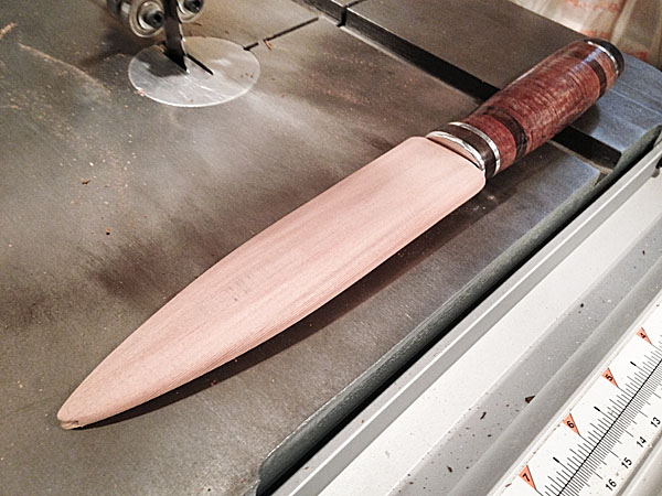
I became a fan of fixed blade knives rather late in life and have started to experiment with different handle materials. I never really understood the appeal or construction of leather knife handles, but I became intrigued and decided to make my own.
A leather knife handle is actually made from a stack of compressed, glued, and shaped leathers “washers”. The form and feel of the handle comes from the leather, but the strength comes from the tang and the rigid bolster and butt/pommel reinforcements.
I used a commercially available 6″ carbon-steel blade blank from Morakniv as the basis of this knife. Most leather handled knives I have seen are of the hunting-knife variety, so I decided that a larger knife would be better.
For the most part, I followed an excellent tutorial in the British Blades forum. I deviated a bit from the tutorial by hiding the tang under the butt cap and securing the butt cap with two 1 1/4″ #14 screws. This was not my original plan, but I had trouble riveting the butt cap to the tang. I sanded the screw heads flush with the butt, though two small depressions from the driver holes remain visible — not the most professional job, but a strong and fully serviceable arrangement.
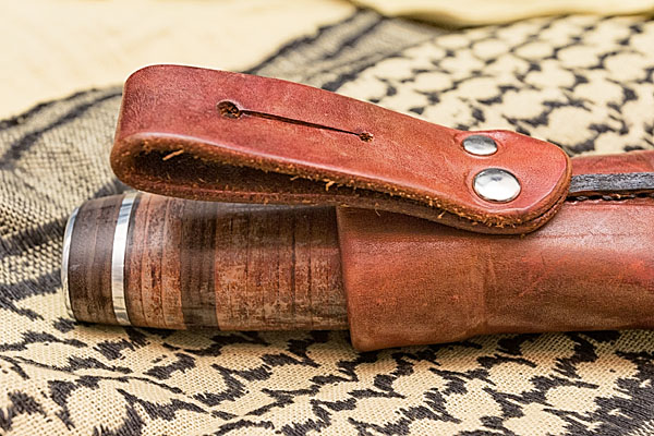
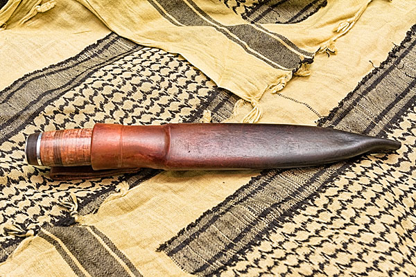
Today I finished making the leather sheath. I like a Scandinavian-style sheath, which is stitched at the back and holds the knife with simple friction rather than a complicated snap and/or strap.
The sheath is lined with a hand-carved cedar blade guard. After seeing an interesting comparison of the performance of various sheath materials in wet and frozen conditions I decided to make a drain-hole at the tip of this blade guard. If water gets in the sheath, it will simply drain out the bottom. I also applied a good coat of paraffin wax to the blade guard interior to discourage moisture build-up. The devil is in the details, as they say.
I tried to match the coloration of the sheath with the knife handle. I first dyed the sheath brown, applied a bit of yellow dye, and then applied USMC black dye. The black dye I applied sparingly only to the tip of the sheath, and then with a cloth, blended it into the brown. I repeated this a few times until I had a nice smooth blend from solid black at the tip to warm brown at the top.
I hand stitch all my sheaths. Normally I make my needle holes with an awl, but on this sheath I used my recently purchased hand sewing punch. This is a great tool and created even and consistent stitching holes. I still had to use a fid/awl to slightly enlarge the insides of the holes so I could easily pass the needles, but in general the punch really sped up the hand-sewing process.
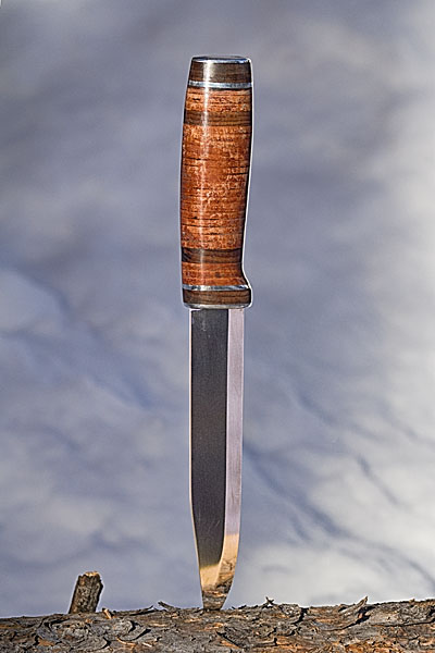
Though it had some challenges I really enjoyed this project. I like the lively feel of the leather handle surface. I compared it to a 6″ Buck plastic handled knife I have which feels dead by comparison. I am also, once again, very happy with the combination of the knife and the sheath. I got into knife making from working with leather, so it makes sense that I put a high value on the sheath.
I like to give my knives a name. I will call this one Gandalf The Mad, after the unscrupulous and cruel Viking Chief from the Thorgal comic book series. It gave me some trouble, has a complex and dark exterior, but also a spark of power and nobility.
I have been seeing Opinel knives appearing on my Tumblr dashboard for a while now. I recently wrote about my experiences with my wife’s Opinel when we first met. Needless to say I wasn’t impressed with Opinel at the time. But a lot of people seem to be using them so I decided to get one for myself to put it through its paces. Opinel knives — hipster accessory or serious tool with a history?
Opinel knives have been manufactured in France by a family owned company continuously since 1890. Long recognized for its simple utilitarian design, the classic Opinel knife is available in 12 sizes. The standard knife employs a carbon-steel blade and beechwood handle. The folding mechanism incorporates a rotating lock-collar which, when activated, prevents the blade from opening or closing accidentally. A stainless-steel version and alternative handle materials are also available.
I picked up a No. 7 Opinel yesterday from MEC for $15 dollars. (Lee Valley is another good source of Opinel knives for Canadian buyers.)
The No. 7 size, with a 3″ (7.5 cm), blade seems like a good compromise between utility and compactness. This would be a good everyday pocket knife or backpacking knife. The larger No. 8 size might be a better shop or camp knife. I usually prefer a slightly larger knife if for no reason other than having a larger handle which often fits my hand better. The No. 7 handle feels fine in my hand though.
I am not sure about other retailers, but MEC sells this Opinel knife in a sealed plastic clamshell package. I hate this form of package as it seems very wasteful and is extremely difficult to open.
[pullshow id=”pq1″]After I got the package open I had to remove a magnetic ant-theft sticker attached to the handle. Of course a sticky residue remained on the handle afterward and I had to resort to scrubbing the handle with mineral spirits to get it clean. Stickers on products is another pet peeve of mine. If a manufacturer sticks a hard-to-remove label, etc., on their product they are basically saying they don’t care about the customer or the products they sell.
Inspecting the knife for the first time, I was [pullthis id=”pq1″]impressed by its lightness, and by the quality of the wooden handle and simple locking mechanism[/pullthis]. The blade was okay, though the edge was basically blunt for the the entire length of the curved tip. I also did not like the subtle grinding marks left on the sides of the blade. But what should I expect from such an inexpensive tool? The back of the blade had extremely sharp 90° edges which were not pleasant to handle, either when opening/closing the blade or when holding the knife in my pocket.
A bit of extra attention to detail and Opinel knives could be very nice right out of the box. But [pullthis id=”pq2″]as they are sold, they need a bit of a tune-up[/pullthis].
[pullshow id=”pq2″]I spent the better part of an hour today, filing the tip to a sharp edge, sharpening the knife with an oil stone and leather strop, easing the profile of the back of the blade with a bench belt sander, and polishing the blade with some buffing wheels and abrasive compound. With a properly sharpened blade and a more comfortable blade back profile, the knife feels and performs better. I oiled the blade and lock mechanism and now it feels like I have a quality product to work with.
I will be carrying this knife around for the next few weeks and I will post an updated review after working with it for a while.
I’m pretty picky about colour. I spend a lot of time fine-tuning my colour management workflow from camera to print. Of course making sure you have well calibrated devices is a critical step in ensuring colour accuracy. But what is calibration? Calibration is the process of tweaking your camera or scanner, monitor, and printer to consistently represent an image to the best of the equipment’s abilities within your viewing environment. I’ve dealt with digital camera calibration in the past. Today I will focus on the next link in the chain — computer monitor colour calibration.
Monitor Calibration Primer
While I will try to make this article as simple as possible, I do assume a certain familiarity with colour calibration terminology. I will deal only with LCD displays, because discussing CRT displays would be like learning about horse carriages in an automotive class — CRT technology is so 20th century. I also place the caveat that I only work with OS X operating systems and Apple Cinema Displays. While these procedures can certainly be transferred to other operating systems and display manufacturers, you will have to figure that out on your own.
Of course, computer monitor calibration has been dealt with by numerous articles in the past. Therefore I will focus on techniques or concepts which I think are novel, unique to my workflow, and helpful to others. Specifically, I will show you how to use your digital camera to assist with monitor calibration. I also touch on using Philips Hue lights to tailor your workspace lighting.
There seem to be two schools of thought regarding monitor calibration. One school says you should be setting up your monitor to match some theoretical viewing standard. The other school says you should be setting up your monitor to work well in the ambient lighting of your environment. I stand firmly in the latter school for two reasons: one, you can much more easily evaluate prints if your monitor matches the ambient light conditions of your workspace; and two, I find there is much less eye strain if your monitor is not excessively bright or dim compared to the ambient light and if the overall monitor colour temperature is as close as possible to the room ambient colour temperature. I will therefore show you how to achieve a calibration which matches your monitor to your work environment.
There are four primary variables that can be adjusted in relation to monitor calibration: brightness or luminance (both minimum and maximum); white point (temperature in degrees kelvin); gamma (overal output curve); and individual red, green, and blue colour response curves.
The monitor manufacturer’s default settings (based partly on ISO standards ISO 3664:2009 and ISO 12646:20081) are usually a maximum luminance between 80 and 120 candela, a white point temperature of 5000K or 6500K, and a gamma of 2.2. 6500K is the approximate colour temperature of noon-day summer sky lighting. A luminance value of 120 cd is equivalent to an average home interior.
The target gamma of 2.2 matches the sRGB specification which is the default colour space use by most cameras and HD televisions and is therefore probably the most appropriate choice.2
Throwing Out The Rulebook – Sort Of
For those rare people whose workspace is lit by dim daylight (an oxymoron to be sure) the manufacturer’s default will probably be fine. For everyone else, some tweaking, or even major adjustments to these defaults is required. Remember, calibration is about getting things to look consistent in your work environment. In order to do this you need to understand two things about your environment. One, how bright is your work area, and two, what is the colour temperature of the ambient light in your work area.
If you are a photographer and are selling or displaying prints of your work, then I would start by trying to set up your work environment to match the conditions most commonly found where your prints are shown. If you sell in a gallery, then create a bright space using the same types of lights that the gallery uses. If you hang your prints in your living room to share with friends and family, then match your office/studio lighting to that of your living room. Matching room lighting to the display area is not critical to the monitor calibration process, but it makes print evaluation much easier — you will be viewing your fresh prints under the same conditions as they will be displayed.
If you don’t do much printing, or if your prints will be displayed in a wide range of environments, then just set up the lighting around your computer so you are comfortable — moderately bright with standard incandescent lighting (or better yet, make the switch to LED).
If you primarily work on a laptop computer and in several different locations, then do the calibration under the most common working conditions.
Now, most of us are not going to end up with a 6500K work space illuminated by 120 candela worth of ambient lighting.
In my small home office, for instance, the two 60 watt tungsten bulbs in the diffuse ceiling fixture produce about 40 candela — nowhere near the standard 120 cd. If I set my monitor luminance to output white at 120 cd I would probably go blind from the brightness of the monitor compared to the ambient light.
On the other hand, an ambient brightness of 40 cd is quite dim. Setting the monitor luminance to 40 cd would also be problematic because LCD displays tend to have quite bad colour accuracy at lower brightness settings. I can dial my Cinema Displays down to 40 cd, but I loose about 10% of the sRGB gamut in doing so. The monitors also exhibit visible colour artifacts at this setting.
What to do? I started by adding several more incandescent bulbs in lamp fixtures throughout the room. I was aiming for a nice diffuse light with a luminance of about 60 cd.
The colour temperature of my office lighting was also nowhere near the 6500K default. In fact, using the Custom White Balance feature of my digital camera and the neutral card off my X-rite ColorChecker Passport, I measured the colour temperature of my office as 2300K under tungsten lighting. This is quite a warm (amber) colour. In fact it is quite warm compared to the ~2800K usually expected from 60 W tungsten incandescent lightbulbs. I attributed the warmth to three factors — the colour of the diffuser glass on the light fixture, the warm eggshell tone of the “white” walls, and reflections off the light birch wood furnishings.
Now, I would not mind matching my monitors to 2300K. I have the window mostly covered, keeping out excess sunlight, and thereby reducing colour temperature variation. However, the DataColor Spyder4 software that I use for monitor calibration only allows a minimum target white point value of 3000K. Using this setting, my monitors were still slightly blue compared to the room light, though much better than a setting of 6500K or even 5800K (the colour temperature of noon-day summer sun with out the influence of blue sky). However, after running my monitors calibrated to a white point of 3000K I was unsatisfied. The Apple Cinema Displays produced too many artifacts at this temperature. Still images and video displayed properly, but scrolling text exhibited a dreadful red ghosting that was just unacceptable.
In other words, you are unlikely to be able to properly calibrate a monitor to match the colour temperature of pure incandescent tungsten lighting.
In the end I swapped my tungsten bulbs with Philips Hue LED lights which can have their colour adjusted. I have played around with several colour temperatures and settled on 4800K (Hue’s Energize setting) as an acceptable compromise between warm home interior lighting and excessively blue daylight.
Calibrating Your Computer Monitor To Match Your Workspace Ambient Lighting Conditions
Calibrating your monitor to match your workspace ambient lighting conditions is a simple process requiring few specialized tools. In summary, you will: evaluate the brightness and colour temperature of your workspace lighting using your digital camera; calibrate your monitor using the measured settings; and double-check that the calibrated monitor matches your workspace lighting, again using your digital camera.
You will need:
a digital camera with custom white balance function (the ability to create a custom white balance from a photo, not just by entering degrees kelvin), histogram, manual and aperture priority modes, and the ability to save RAW files;
photo editing/viewing software which allows you to review the colour temperature setting stored in a RAW file (such as Adobe Camera Raw);
a grey card or white balance card (neutral photo card);
a bright white piece of paper (may be used in place of neutral photo card); and,
monitor calibration hardware and software that will accept white point and brightness/luminance target values (you could also us OS X’s built-in assistant)
Preparation:
Turn on your computer monitor and allow it to warm up at least 1/2 hour before starting the calibration. You can perform the workspace set-up and evaluation steps in the meantime.
Procedure:
Workspace Set-up
Turn on the room lights and allow them to warm up.
Your workspace should be moderately bright — not candlelight dim and not daylight glaring.
Try to avoid too much window light as this will cause the brightness and colour of the ambient light to vary too much throughout the day.
For more efficient lighting, neutral white walls and ceilings are preferred.
Do not allow bright direct light to fall on the monitor surface. Overall diffuse lighting is best.
I personally prefer and recommend a dark neutral virtual desktop background for all photographers and graphic designers.
Workspace Lighting Evaluation
Workspace Brightness Evaluation
Turn on your camera with the the following settings:
live view on (preferred)
histogram on
RAW image capture on
white balance appropriate for your workspace (probably tungsten or custom)
aperture priority mode
ISO 100
aperture ƒ/5.6
Use your camera to take a meter reading of the area in front of our computer (around the keyboard). This will give you an idea of the ambient light levels. You can use trust your camera’s evaluative metering mode for this, or you can meter the light falling on a grey card. Check the exposure with the camera histogram — there should be no clipping of the highlights or blacks. Do not allow the computer monitor to cast a strong light on the metered area during this step. If required, temporarily cover the monitor with a neutral coloured shirt or towel.
Compare the metered shutter speed with the following list.
2 sec., 4EV, 40 cd/m2, dim, candle light
1 sec., 5EV, 80 cd/m2, low, night home interior
1/2 sec., 6EV, 160 cd/m2, medium, bright home interior
1/8 sec., 8EV, 640 cd/m2, very high, very bright interior with fluorescent lights
You need enough light to achieve a shutter speed between 1 second and 1/8 of a second. Outside this range and your monitor will not be able to match the ambient light levels. You can either add more lights and do the evaluation again, or accept that your monitor brightness will differ front the ambient brightness and simply continue to step the Workspace Colour Temperature Evaluation step.
In this example, my camera is reading 2 seconds at ƒ/5.6 and ISO 100 (4EV or 40 cd/m2). Obviously my workspace is still quite dim and I would have a hard time matching my monitor luminance to the ambient brightness.
Workspace Colour Temperature Evaluation
For this evaluation you will use the same camera settings as above, but you will have to increase the ISO to 3200 or 6400 in order to capture a photograph without excessive camera shake (or use a tripod). You can also change the metering mode to manual if you prefer.
Once again, meter the area around your keyboard.
Place your neutral photo card or piece of paper on your keyboard, again taking precautions to prevent monitor light from casting on this area.
Use your camera’s custom white balance function to get a white balance reading from the card/paper. The custom white balance procedure varies by manufacturer and I will leave it to you to figure out. Once you have the custom white balance set, if your camera displays the colour temperature in degrees Kelvin then you can skip the next step.
Take a photo with the custom white balance. It doesn’t matter what is in the frame — you just need to record the colour temperature in a photograph so you can retrieve it. To that end, make sure you are shooting in RAW mode. Load the RAW file into your photo viewer/editor and note the colour temperature that was used.
Will the measured colour temperature work with your monitor? A measurement between 4000K and 6500K should be fine. If the reading is below this range then the monitor probably will suffer colour artifacts of some sort. This is sad, because in my experience home lighting is usually in the 2600K to 3500K range. Office lighting is probably in the 3400K to 6500K range. Why manufacturers can’t or won’t make a monitor that is capable of good performance in the home office environment I do not know. If your ambient colour temperature is below 3500K you have three choices: 1) calibrate your monitor to the ambient colour temperature and see if the colour performance is acceptable to you; 2) calibrate to a higher/cooler colour temperature and accept that your monitor and ambient light will not match (print evaluation will be more difficult); 3) change the colour of your ambient lighting by switching to “cool white” tungsten bulbs, switching to halogen lighting, or using colour changing LED lights like Philips Hue (you need a bulb that produces a good “white”).
Some common colour temperatures:
2800K = 60 watt incandescent tungsten bulb
3200K = halogen
3400K = photoflood
4800K = daylight blue photoflood
5400K = average summer sunlight at noon
6500K = average summer sunlight with the effect of the blue sky
8000K = summer shade on a blue sky day
Hue recipe colour temperatures:
Relax = 2200K
Reading = 2800K
Concentrate = 3700K
Energize = 4800K
I am currently using Philips Hue bulbs in my office with one of the standard Philips recipes — Energize — which has a measured temperature of about 4800K.
Monitor Calibration
If your workspace ambient light brightness and colour temperature are in an acceptable range, then you can move on to calibrating your monitor.
Launch your calibration software and follow the on screen instructions. Use whatever mode allows you to set a target white balance and target brightness/luminance.
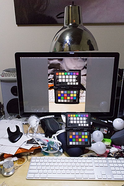
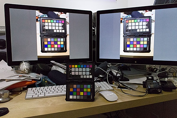
In my case I am using Spyder4Elite and I set the target white point to 4800K and the target white luminance to 60 candela (brighter than my room, but the darkest my monitor will tolerate) in the Expert Console (see the screenshot). Alternatively, you can use the calibration tool in the Displays panel in System Preferences (turn on Expert Mode) on OS X. In my experience a hardware calibrator is easier to use and more accurate, but visual calibration using Apple’s Display Calibrator Assistant is acceptable.
The left monitor shows the Spyder4 result. The right monitor shows the Display Calibrator Assistant result — slightly warm.
Calibration evaluation
Now it is time to evaluate the results of calibrating your monitor to your workspace ambient light conditions.
Calibration Brightness Evaluation
Open an empty document on your monitor. You can use an empty word processing document or empty Photoshop document. What you want is a pure white background that fills most of the monitor. Another option is to set your desktop background temporarily to solid white.
Point your camera towards the white part of the monitor and adjust the exposure settings so the camera histogram peak corresponding to the monitor white is near, but not touching, the right edge of the histogram.
Now place a piece of white paper in front of the monitor or on your keyboard.
Maintaining the camera exposure settings, point the camera so that both the white document on the monitor and white piece of paper are in the frame.
Compare where the highlight peaks occur in the camera histogram. Ideally, the computer screen maximum brightness and paper maximum brightness should coincide. If the peak from the paper occurs somewhere between the middle of the histogram on the left and the monitor white spike on the right, then this is probably still acceptable, though your monitor is slightly brighter than the ambient light. If the paper is brighter than the monitor, then something went wrong during calibration and you need to start over. If the paper spike appears to the left of the mid-point of the histogram, then the contrast between the monitor and ambient brightness is quite high and will likely lead to eye fatigue and difficulty evaluating prints.
Calibration Colour Temperature Evaluation
Place a colourful photographic print or colour chart of some sort on your keyboard. I use the Xrite ColorChecker Passport for this step. Any card or photo with a broad spectrum of colours will suffice.
Photograph the colour sample using the same camera settings as in the Workspace Colour Temperature Evaluation step and the measured ambient colour temperature/white balance setting.
Load the colour sample photograph you captured in step 2 into your photo viewer/editor software. Expand the image to fill the monitor.
Take one final photograph framing both the physical colour sample on your desk and the virtual colour sample photograph displayed on your monitor in step 3. Base the exposure settings on the brightness of the monitor image.
There should be little if any colour cast between the physical sample and the virtual one. If the room ambient brightness is lower than the monitor brightness then the physical sample will be darker — too dark and it will be difficult to evaluate any colour differences (this is the same trouble you will encounter when trying to evaluate prints!) If the room and monitor brightnesses are quite close then your eyes should actually have difficulty determine which sample was on the desk and which one was on displayed on the monitor. If you set the calibration target white point to the same as the measured white balance, but the virtual sample and physical sample colours differ significantly, then something went wrong somewhere and you will have to start over.
Conclusion
It should be apparent that using your digital camera to assist in monitor calibration has a few benefits. It is a readily accessible tool for measuring both brightness and colour temperature. Today’s photographic sensors are very good, but they are still not as adaptive or dynamic as the human eye. This is actually a benefit in this case, as the photographic image captured by your camera can highlight brightness and colour differences between the ambient workspace light and your computer monitor for which your brain might simply compensate.
Philips Hue lights seem to be a good, if expensive, way to tailor your workspace lighting conditions. They are high quality LED bulb and if you are making the switch to LED you might as well pay the extra money to get a much more advanced lighting system. I already had Hue installed in parts of my home and was planning to switch over my office lighting anyway. It is easy to set up different light recipes and to switch between them while you tailor your workspace lighting.
1. http://www.metalvortex.com/chart/
2. sRGB is based in part on the output capabilities of CRT televisions, the most common display technology at the time of sRGB’s introduction. CRTs did not have a particularly large gamut and therefore could not represent a very wide range of colours. AdobeRGB is a much larger colour space, which many cameras are capable of shooting. If you are primarily producing prints within your own studio environment then you might want to investigate switching to AdobeRGB throughout your workflow. This will however cause some colour compression when you go to display images on the Internet because the vast majority of web browsers assume sRGB images. Some web browsers, such as Safari, will respect embedded colour profiles, but embedding colour profiles increases the image file size and therefore load times. It is also a gamble whether or not photo sharing websites will maintain the embedded profiles when creating thumbnail images. For these reasons, I stick with the inferior, but painless, sRGB colour space throughout my workflow.
8:30 AM — Snowing heavily. Wind steady at 30km/h from the NW.
8:35 AM — Traffic heading towards downtown Calgary is a parking lot. Traffic heading towards the mountains is non-existent.
9:03 AM — Scott Lake Hill. No more blizzard. And in the mountains, blue sky!
10:28 AM — Elk Pass parking lot. -20°C and windy. I change my boots and numb my hands. The wind chill coming up from the outhouse seat is significant.
10:47 AM — Starting to warm up as I climbing the steep hill towards Fox Creek, one ski in front of the other. Warming hands tingle with pain as the blood begins to flow again.
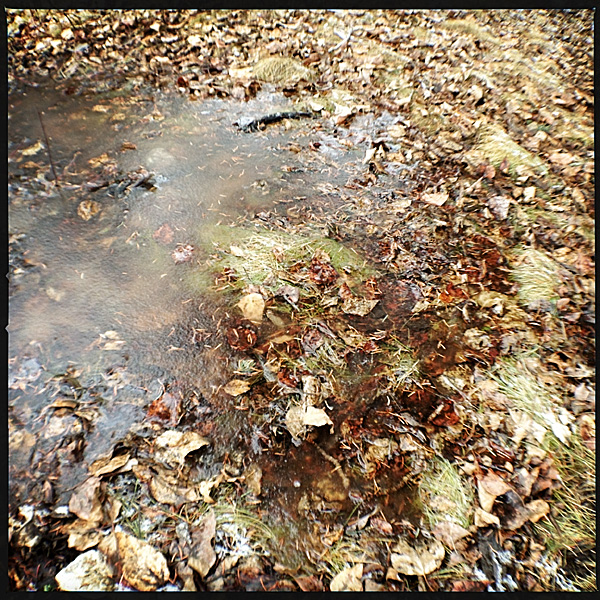
11:06 AM — Survey the alterations to Fox Creek caused by the hundred-year floods. Signs say “Flood Damage,” but I don’t think that nature damages itself. Renewal.
11:40 AM — Detour through the pillowy soft drifts of Fox Creek meadow. Breaking trail through powder is so much more aesthetically pleasing than slipping along on the arctic, styrofoam, track-set, ski trail.
12:01 PM — At Blueberry Hill junction. Too out of shape and too cold to go up the hill today. Will head to the low Elk Pass instead. No lunch break. Just a quick piece of chocolate and a swig of water.
12:40 PM — Elk Pass and the Alberta/BC border. I want to take a picture of the sign at the border but my camera is frozen. “If you want to see scenes like this again,” I think to myself, “then just get out skiing more often.” Less is more.
12:48 PM — Eyelashes starting to freeze closed.
12:55 PM — Good skating along the groomed Powerline trail. But nature, ceaseless, and moving, is reclaiming the path. Drifts every three to five meters. The unsintered drift snow grabs at my skis, throwing me off balance. I learn to unweight as I glide over the drifts. On the steepest part of the Powerline trail the drifts are bigger. The biggest offer an 8 to 12 inch jump every 10 or so meters. Yahoo! This is why I still use my old Nordic-Norm leather boots, cable bindings, and circa 1988 skinny Fischer telemark backcountry skis instead of upgrading to more modern cross-country ski gear. Anachronistic? Maybe. Versatile? Yes. Fun? Hell yeah!
1:02 PM — Alpine-style parallel turns carve me down the steep hard slope back to Fox Creek. One steep ascent and then one more flowing, windchill downhill take me to the parking lot.
1:20 PM — Start truck. Change clothes. Put damp gloves and jackets in front of the heat vents to dry out. Scarf down my paté sandwhich and some hot tea. Hit the road. As my body warms my mind starts to make plans to do it all again in a day or so.
I received an e-mail today from my sister, soliciting some showshoe buying advice.
Hubby & I would like to get snowshoes this year, but looking at the MEC site I’m not sure what type we should get. There’s “trail”, “mountain” and “off trail”. We want these primarily for getting around our farmland and possibly out at the cabin. If we really get into it, maybe some mountain trails… and here’s a stupid question, do you need any particular footwear or just winter boots? I’ve got my winter boots, but Hubby doesn’t have any (yet). Will the bindings need to be fitted to a particular boot or are they fairly adjustable. All new territory for me.
In the interest of making the world a better place I decided I would share my response…
You probably want those big wooden snowshoes that are 4 feet long and weigh 40 pounds. Just kidding. Maybe.
Choices, Choices
Here are the definitions for MEC’s snowshoe categories (I had to write these, because MEC does not provide these definitions on their site):
Trail are smaller and nimbler, but less supportive on snow, less robust, less secure, have less traction, etc. Not meant for too much up and down. This category might include “jogging/running” snowshoes, which never made sense to me. Probably not what you want.
Off-trail are larger and more supportive as well as more robust — an all-around shoe. These should have good built-in crampons under the ball and heel of the foot and possibly a heel lift for travel in steeper terrain.
Mountain, similar to off-trail but intended for climbing approaches and steeper terrain, so will have the most robust binding. Will have a heel lift which allows your foot to assume a flat footfall position even on steep ascents, thus saving your calve muscles. Good crampons too.
To make things more confusing, there are women’s snowshoes. Probably a little lighter and or smaller in general. And cute kids shoes too.
Flotation provided by a shoe varies with the surface area of the decking. The amount of flotation you require depends on your weight (in your winter boots and all your layers), the weight of your pack, and the snow conditions. You need more flotation in freshly fallen powder than in wet, heavy snow. Depending on conditions, there can be as much as 70kg of variation for the same shoe.
Merrell Women’s Thermo Arc 8 Waterproof
Boots for Snowshoeing (or should that be Snowbooting?)
Any of the slightly more technically-oriented winter boots that MEC carries should be fine (like these Merrells). Snowshoe bindings use plastic or rubber straps to secure to a wide range of foot sizes and boot shapes. I use heavy leather backpacking boots in which I can get a large pair of warm socks. My wife uses smaller Sorel boots. My big “-70°” Wind River winter boots would probably be too clumsy and hard to fit in the bindings. It would be a good idea to take your boots with you when buying the shoes.
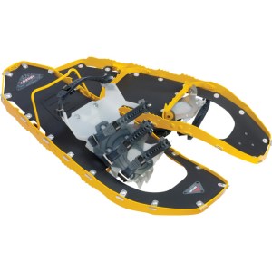
My Top Snowshoe Picks
My wife and I have MSR Evo 22 snowshoes. These have a plastic deck and are very light. There are several Evo models with the only difference being the bindings. We have the Ascent version which has the most secure binding, but is a bit slower to use. The Tour binding looks good too — the toe strap is set once for your boot size and then you just slip your toe in on subsequent uses so it is a bit faster to put on. The generic Evo binding version doesn’t seem as secure and lacks a heel lift.
MSR Evo Ascent 22 Snowshoes
(Technical aside: The Ascent straps and back two Tour straps are the same, but if you compare them closely in the store you will see a small difference. The Tours are supplied with a little aluminium stud which helps keep the strap from coming undone or flopping around. The Ascent used to come with these studs but they don’t anymore. You can get the MSR field maintenance kit which comes with three studs and put those studs on critial/problem straps, or you can just get the Evo Tour binding. The plastic strap keepers on the Ascent are okay, but studs are better in my experience. Regardless, I would get the maintenance kit anyway so you have some spare parts.)
Evo are a unisex 22 inch shoe and have very good flotation and traction. MSR also sell a tail extension which increase the length by 6″, thus improving flotation. We have these but don’t always use them. They are best for powdery snow or when carrying a big pack. I use them more often than my wife because I am heavier. Hubby would probably benefit from them.
I have also seen the MSR Lightning in action. Seems like a good shoe. These have an aluminium side rail which also functions as a traction device, and is covered with a rubber deck. Binding options are the same as the Evo line, but the Ascent are available in 22″ and 25″ versions and men’s and women’s -specific models. Extension tails (5″) are also available for Lightnings. Lightenings are a few grams lighter and more expensive than Evos.
MSR Lightning Ascent 22 Snowshoes
The U of C Outdoor Centre rents out Lightenings. MEC also does rentals so you can probably try-before-you buy. I think the cost of one rental can be credited towards your purchase once you decide what to get. I’d probably rent from MEC since you would buy there anyway.
The other brand MEC carries is Atlas, with which I have no experience.
(Maintenance tip: it is a good idea to rinse and dry your snowshoes off thoroughly before putting them away in storage. Most components are rust-proof, but the crampons are generally of some ferrous metal and will rust. Think of it this way — the last thing you usually do at the end of a hike is walk to your car though a parking area that probably has at least some corrosive road salt deposited on it.)
I don’t know why, but any of the snowshoe designs that use tubular frames have never appealed to me.
Poles for Snowshoing (Or should that be Snowpoling?)
And now to add to the confusion, you probably want some snowshoe poles too.
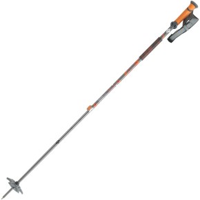
Black Diamond Traverse Poles
The adjustable Black Diamond Traverse poles are probably quite good (I have an older version which I love):
I like Black Diamond because of their FlickLock cam adjustment device. Doesn’t jam and doesn’t slip. Easy to use with gloves on.
The Voilé Backcountry Poles have three sections so they collapse down to 65cm versus 95cm for the Black Diamonds, which is nice if trunk or storage space is at a premium or if you want to stash the poles in your pack on some gnarly terrain.
Finally, I would buy bags to store your snowshoes and poles. We have one of each of the MSR and older MEC bags. They are both good. MSR is more padded, but older MEC is longer and fits Evo with extension tails installed. The new 2013 MEC bag comes in three lengths.
Snowshoeing can be a lot of fun and a great way to get outside when it is cold and all you want to do is hibernate. I used to really dislike snowshoers.
When the snowshoeing “fad” started my impression was that it was opening up the winter terrain to a bunch of inexperienced and uneducated yahoos who were walking all over the cross-country ski tracks and ruining the trails. I started snowshoeing with my wife as a way to get into places that were a bit beyond her novice skiing ability (as she gets more skiing experience). Snowshoes are at their best when used to go places you just wouldn’t go on skis — canyons, heavily wooded hills — and in marginal snow conditions.
I still get erked when snowshoers ruin the ski tracks, so please, if you are going to start snowshoeing, please take some time to familiarize yourself with backcountry etiquette first.
Don’t walk or snowshoe on ski tracks.
Don’t park on the trail (move to the side to take a break).
Keep the trails clean.
Leave the dog at home.
Yield to skiers coming downhill.
When nature calls, completely burn or carry out used paper and sanitary supplies.
And finally, make sure you make the day out in winter wonderland an enjoyable one by having plenty of warm clothes, some snacks, warm tea, and appropriate safety equipment along. Albert Parks has published a good backcountry winter survival guide, because knowledge is the best defence.
I have never been too big on bringing electronic gadgets into the backcountry. This year however, I started using a GPS on all my canoeing and kayaking trips. On one trip, a friend brought along a Goal Zero solar charger. It seemed to work great. Reviews of Goal Zero chargers always state how bombproof these products are. Compare that to almost every other portable solar panel which get very bad reviews for durability.
On our 12 day trip on the Churchill River I decided to take the Goal Zero Nomad 7 solar panel along. I used it a few times to top up my iPhone battery, and was prepared to use it to charge GPS batteries, but I ended up having plenty of spares along.
I didn’t take the solar panel on my other trips, and instead just brought the Guide 10 battery pack. This handy unit allows you to charge AA and AAA batteries from the solar panel or from any USB port (car charger, wall outlet, computer, etc.) It also acts as a external battery pack for charging a cellphone. Unlike many USB battery boost packs, the Guide 10 contains AA Ni-MH batteries which you can remove and use in any other device.
(Note: The Nomad 7 will charge my iPhone 5 directly in perfectly sunny conditions, but any interruption and charging stops. Charging the iPhone with the solar panel running through the Guide 10 battery pack works great. Or you can just charge your iPhone with the battery pack and recharge the battery pack later with the solar panel or a USB source.)
Things I use electrical power for in the back country:
GPS — My GPS can run for 25 hours on 3 AA batteries. With a full charge I can run the GPS all day for 4 to 5 days. I like to record a track as I paddle and be able to mark waypoints at any time. I turn off the GPS in camp and at lunch. For a two week trip it is easier to to carry two extra sets of batteries than to carry the solar panel. I also always carry maps and a compass.
Headlamp — My Petzl Tikka XP headlamp will last a whole summer season on a set of 3 AAA battiers. I used to use alkaline batteries, but have switched to rechargeable Ni-MH. I carry an extra set of 3 AAA batteries for my headlamp. In the winter I might switch back to alkaline batteries.
iPhone — I rarely use the iPhone in the backcountry. Where I travel I almost never have a signal. On several trips I have left my books and journal at home and planned to use my iPhone instead. But I still prefer to read a paper book in the tent and write in a paper journal. I do carry the Guide 10 battery pack with 4 fully-charged AA batteries to recharge my iPhone if needed.
Camera(s) — I carry a minimum of one camera on all trips. I often carry a waterproof camera and a better quality point-and-shoot with manual controls. Sometimes I also bring along my Canon EOS M mirrorless camera and a few lenses. The problem is, camera batteries contain a lot of juice and it would take 12 plus hours to charge a camera battery with a portable solar panel. Also, camera battery chargers are almost always 110-220 VAC. USB charging solutions are rare, so for now I am forced to carry extra batteries. Of course each camera has its on battery size. Even for my three Canon cameras, I need three different batteries. I carry at least one spare for each camera. That usually lasts me two weeks if I am conservative. A third battery gives me a bigger buffer.
Our group also always has a satellite phone along. We generally only use it in emergencies, so one set of batteries is plenty. Starting this year, there were a lot of SPOT personal locators taken on trips. I haven’t gotten there yet. If I did more solo tripping, I might consider one, but I prefer a bit of isolation. Knowing that I am basically 100% responsible for my own actions keeps me conservative.
I am still figuring this all out. On shorter trips, carrying the solar panel doesn’t make sense. On our Stikine River trip the solar panel would never have worked in the coastal cloudy/rainy conditions. The Guide 10 battery pack/charger is indispensable though. I carry it on all trips longer than a weekend and in my car on extended road trips. For a trip longer than two weeks, I would definitely leave behind a set of AA batteries and bring the Nomad 7 solar panel along instead.
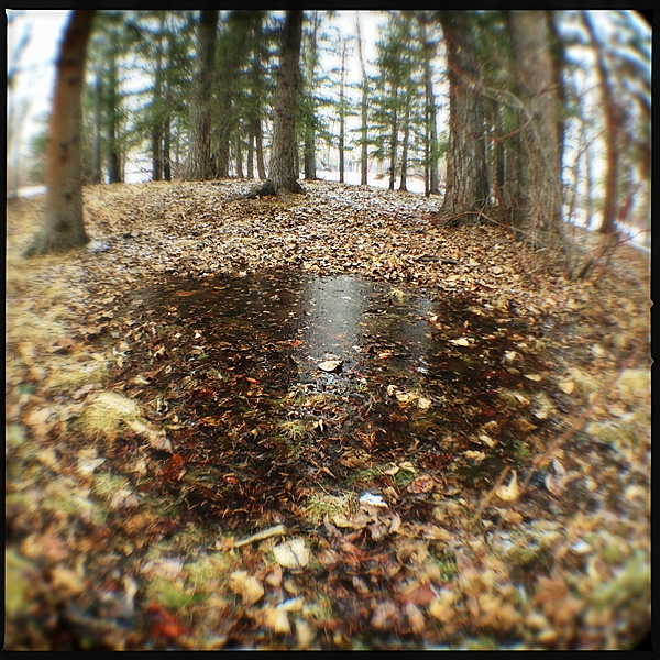
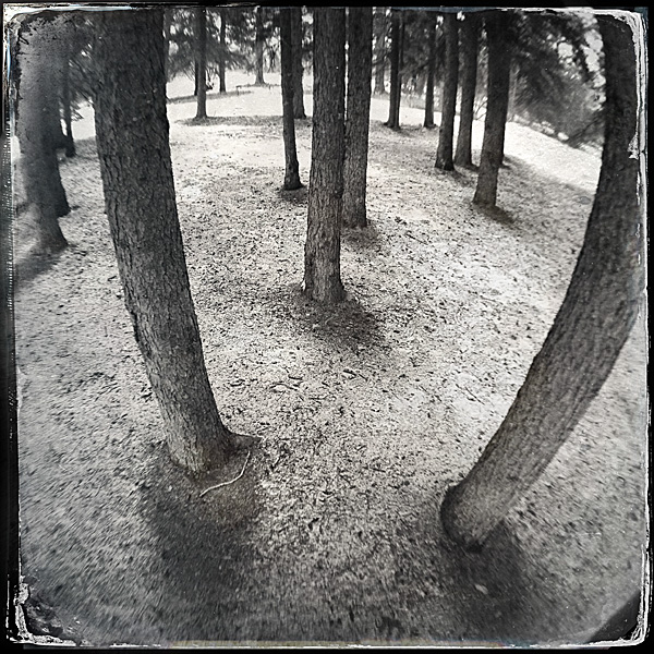
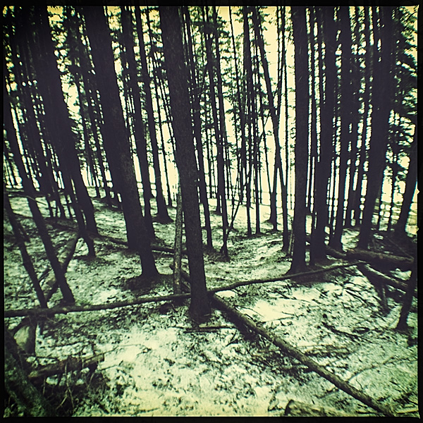
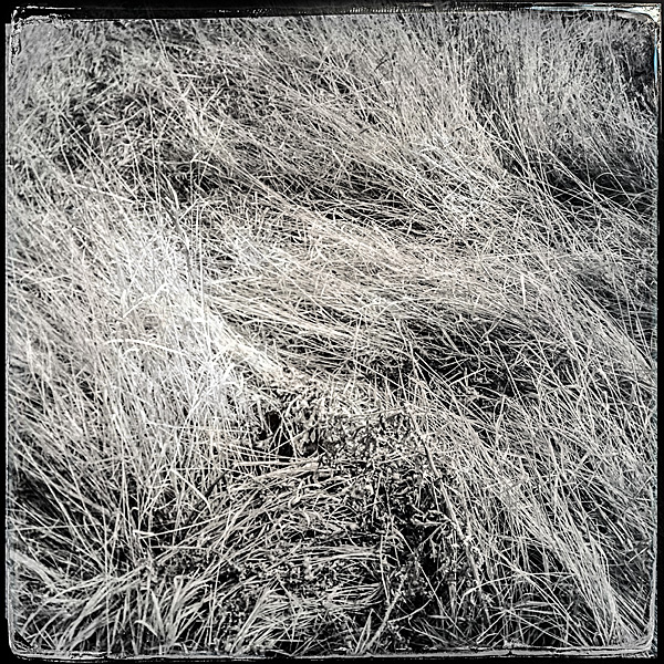
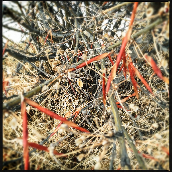
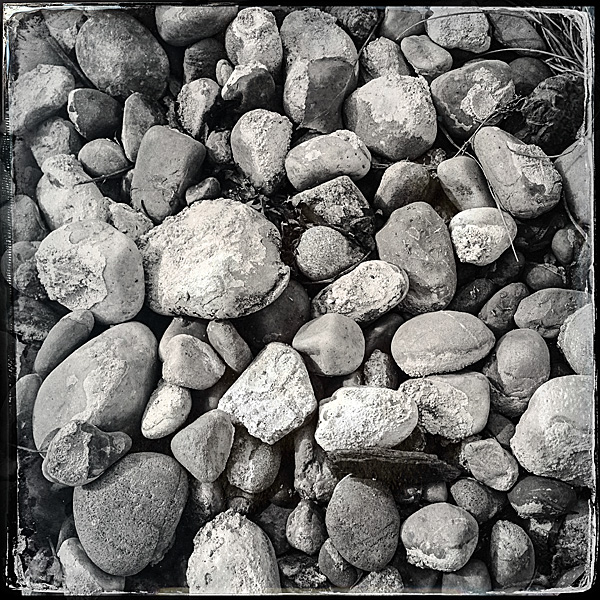
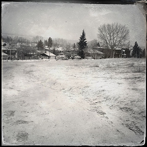
I went for a walk at Bowness Park yesterday. Bowness Park is a major regional park in Calgary. In the mid-twentieth century it was part of the small village of Bowness and was a weekend getaway for city dwellers looking for some rest and relaxation. In 1963, the village and the park were merged into the growing metropolis. The park remains a relaxing destination.
The main park is covered by manicured lawns, open forests, walking paths, picnic areas, and a well-known lagoon. Adjacent to the park is the Bowness Forest, a wild and natural treed land clinging to a precipitous hillside adjacent to the Bow River.
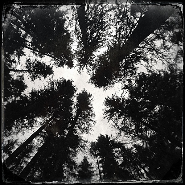
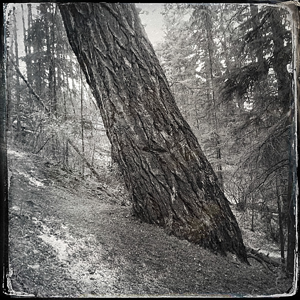
The natural area is home to one of two stands of Rocky Mountain Douglas Fir trees in Calgary — the eastern most stands of this magnificent conifer species. The Bowness grove, known officially as Wood’s Douglas Fir Tree Sanctuary, is a provincial Heritage Place listed in the Alberta Heritage Registry:
The inland variety of the Rocky Mountain Douglas fir is a majestic, imposing tree; the largest species of tree in Alberta, it can measure over 1 metre in diameter and rise up to 45 metres tall. With a potential lifespan of up to 400 years, the Rocky Mountain Douglas fir tree is also one of the most enduring tree species in Alberta. Some trees in the sanctuary are several centuries old.
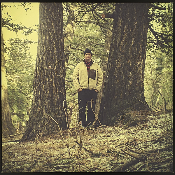
On the very chilly second day of Spring, 2013, I made the grove of Douglas Fir trees my destination. I have started a project to locate and photography the Calgary trees listed as Heritage Trees by the Heritage Tree Foundation of Alberta, and these Douglas Fir Trees are on this list. So, with fairly rough GPS co-ordinates (the trees are discernible in Google satellite images), I headed into the park to explore, enjoy nature, and snap a few pictures.
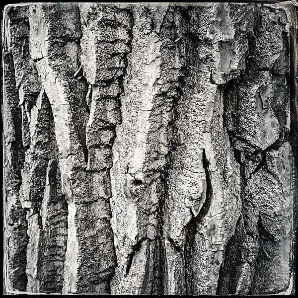
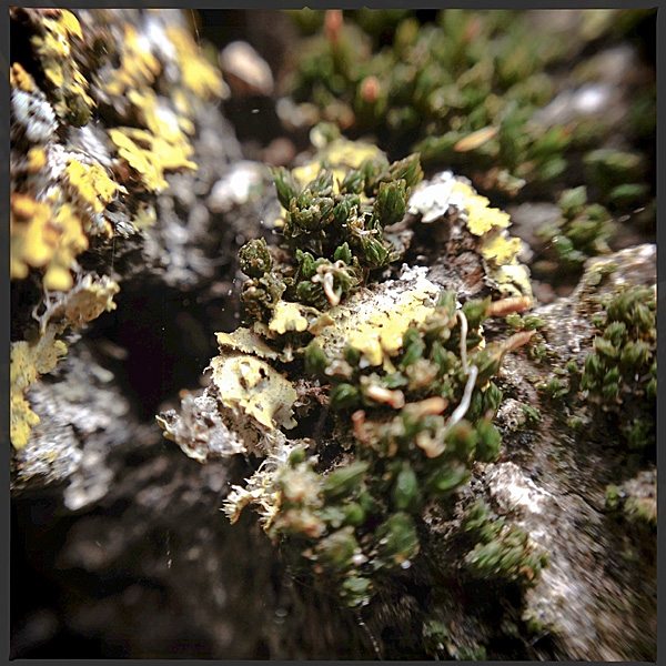
Having spent most of my childhood free-time roaming wild in the Bowness forest I knew that it was dense and dark place. I knew that nothing but an ultra-wide lens would be capable of capturing the entirety of the massive Douglas Firs. However, I wanted to travel light so I just took my iPhone 5 and ōlloclip 3-in-1 fisheye/wide-angle/macro adapter. As It turns out, the space is so confined and the trees are so large that there really is no way to photography the entirety of these trees.
Bowness Park is currently undergoing renovations and the nearest parking lot is quite far from the Doulas Fir grove. That is for the best I suppose. I got a lot of nice shots walking to and from the grove, so I was happy.
The Douglas Fir trees appear in photos 23 to 29, and 31.


 In my case I am using Spyder4Elite and I set the target white point to 4800K and the target white luminance to 60 candela (brighter than my room, but the darkest my monitor will tolerate) in the Expert Console (see the screenshot). Alternatively, you can use the calibration tool in the Displays panel in System Preferences (turn on Expert Mode) on OS X. In my experience a hardware calibrator is easier to use and more accurate, but visual calibration using Apple’s Display Calibrator Assistant is acceptable.