I have been seeing Opinel knives appearing on my Tumblr dashboard for a while now. I recently wrote about my experiences with my wife’s Opinel when we first met. Needless to say I wasn’t impressed with Opinel at the time. But a lot of people seem to be using them so I decided to get one for myself to put it through its paces. Opinel knives — hipster accessory or serious tool with a history?
Opinel knives have been manufactured in France by a family owned company continuously since 1890. Long recognized for its simple utilitarian design, the classic Opinel knife is available in 12 sizes. The standard knife employs a carbon-steel blade and beechwood handle. The folding mechanism incorporates a rotating lock-collar which, when activated, prevents the blade from opening or closing accidentally. A stainless-steel version and alternative handle materials are also available.
I picked up a No. 7 Opinel yesterday from MEC for $15 dollars. (Lee Valley is another good source of Opinel knives for Canadian buyers.)
The No. 7 size, with a 3″ (7.5 cm), blade seems like a good compromise between utility and compactness. This would be a good everyday pocket knife or backpacking knife. The larger No. 8 size might be a better shop or camp knife. I usually prefer a slightly larger knife if for no reason other than having a larger handle which often fits my hand better. The No. 7 handle feels fine in my hand though.
I am not sure about other retailers, but MEC sells this Opinel knife in a sealed plastic clamshell package. I hate this form of package as it seems very wasteful and is extremely difficult to open.
[pullshow id=”pq1″]After I got the package open I had to remove a magnetic ant-theft sticker attached to the handle. Of course a sticky residue remained on the handle afterward and I had to resort to scrubbing the handle with mineral spirits to get it clean. Stickers on products is another pet peeve of mine. If a manufacturer sticks a hard-to-remove label, etc., on their product they are basically saying they don’t care about the customer or the products they sell.
Inspecting the knife for the first time, I was [pullthis id=”pq1″]impressed by its lightness, and by the quality of the wooden handle and simple locking mechanism[/pullthis]. The blade was okay, though the edge was basically blunt for the the entire length of the curved tip. I also did not like the subtle grinding marks left on the sides of the blade. But what should I expect from such an inexpensive tool? The back of the blade had extremely sharp 90° edges which were not pleasant to handle, either when opening/closing the blade or when holding the knife in my pocket.
A bit of extra attention to detail and Opinel knives could be very nice right out of the box. But [pullthis id=”pq2″]as they are sold, they need a bit of a tune-up[/pullthis].
[pullshow id=”pq2″]I spent the better part of an hour today, filing the tip to a sharp edge, sharpening the knife with an oil stone and leather strop, easing the profile of the back of the blade with a bench belt sander, and polishing the blade with some buffing wheels and abrasive compound. With a properly sharpened blade and a more comfortable blade back profile, the knife feels and performs better. I oiled the blade and lock mechanism and now it feels like I have a quality product to work with.
I will be carrying this knife around for the next few weeks and I will post an updated review after working with it for a while.
I’m pretty picky about colour. I spend a lot of time fine-tuning my colour management workflow from camera to print. Of course making sure you have well calibrated devices is a critical step in ensuring colour accuracy. But what is calibration? Calibration is the process of tweaking your camera or scanner, monitor, and printer to consistently represent an image to the best of the equipment’s abilities within your viewing environment. I’ve dealt with digital camera calibration in the past. Today I will focus on the next link in the chain — computer monitor colour calibration.
Monitor Calibration Primer
While I will try to make this article as simple as possible, I do assume a certain familiarity with colour calibration terminology. I will deal only with LCD displays, because discussing CRT displays would be like learning about horse carriages in an automotive class — CRT technology is so 20th century. I also place the caveat that I only work with OS X operating systems and Apple Cinema Displays. While these procedures can certainly be transferred to other operating systems and display manufacturers, you will have to figure that out on your own.
Of course, computer monitor calibration has been dealt with by numerous articles in the past. Therefore I will focus on techniques or concepts which I think are novel, unique to my workflow, and helpful to others. Specifically, I will show you how to use your digital camera to assist with monitor calibration. I also touch on using Philips Hue lights to tailor your workspace lighting.
There seem to be two schools of thought regarding monitor calibration. One school says you should be setting up your monitor to match some theoretical viewing standard. The other school says you should be setting up your monitor to work well in the ambient lighting of your environment. I stand firmly in the latter school for two reasons: one, you can much more easily evaluate prints if your monitor matches the ambient light conditions of your workspace; and two, I find there is much less eye strain if your monitor is not excessively bright or dim compared to the ambient light and if the overall monitor colour temperature is as close as possible to the room ambient colour temperature. I will therefore show you how to achieve a calibration which matches your monitor to your work environment.
There are four primary variables that can be adjusted in relation to monitor calibration: brightness or luminance (both minimum and maximum); white point (temperature in degrees kelvin); gamma (overal output curve); and individual red, green, and blue colour response curves.
The monitor manufacturer’s default settings (based partly on ISO standards ISO 3664:2009 and ISO 12646:20081) are usually a maximum luminance between 80 and 120 candela, a white point temperature of 5000K or 6500K, and a gamma of 2.2. 6500K is the approximate colour temperature of noon-day summer sky lighting. A luminance value of 120 cd is equivalent to an average home interior.
The target gamma of 2.2 matches the sRGB specification which is the default colour space use by most cameras and HD televisions and is therefore probably the most appropriate choice.2
Throwing Out The Rulebook – Sort Of
For those rare people whose workspace is lit by dim daylight (an oxymoron to be sure) the manufacturer’s default will probably be fine. For everyone else, some tweaking, or even major adjustments to these defaults is required. Remember, calibration is about getting things to look consistent in your work environment. In order to do this you need to understand two things about your environment. One, how bright is your work area, and two, what is the colour temperature of the ambient light in your work area.
If you are a photographer and are selling or displaying prints of your work, then I would start by trying to set up your work environment to match the conditions most commonly found where your prints are shown. If you sell in a gallery, then create a bright space using the same types of lights that the gallery uses. If you hang your prints in your living room to share with friends and family, then match your office/studio lighting to that of your living room. Matching room lighting to the display area is not critical to the monitor calibration process, but it makes print evaluation much easier — you will be viewing your fresh prints under the same conditions as they will be displayed.
If you don’t do much printing, or if your prints will be displayed in a wide range of environments, then just set up the lighting around your computer so you are comfortable — moderately bright with standard incandescent lighting (or better yet, make the switch to LED).
If you primarily work on a laptop computer and in several different locations, then do the calibration under the most common working conditions.
Now, most of us are not going to end up with a 6500K work space illuminated by 120 candela worth of ambient lighting.
In my small home office, for instance, the two 60 watt tungsten bulbs in the diffuse ceiling fixture produce about 40 candela — nowhere near the standard 120 cd. If I set my monitor luminance to output white at 120 cd I would probably go blind from the brightness of the monitor compared to the ambient light.
On the other hand, an ambient brightness of 40 cd is quite dim. Setting the monitor luminance to 40 cd would also be problematic because LCD displays tend to have quite bad colour accuracy at lower brightness settings. I can dial my Cinema Displays down to 40 cd, but I loose about 10% of the sRGB gamut in doing so. The monitors also exhibit visible colour artifacts at this setting.
What to do? I started by adding several more incandescent bulbs in lamp fixtures throughout the room. I was aiming for a nice diffuse light with a luminance of about 60 cd.
The colour temperature of my office lighting was also nowhere near the 6500K default. In fact, using the Custom White Balance feature of my digital camera and the neutral card off my X-rite ColorChecker Passport, I measured the colour temperature of my office as 2300K under tungsten lighting. This is quite a warm (amber) colour. In fact it is quite warm compared to the ~2800K usually expected from 60 W tungsten incandescent lightbulbs. I attributed the warmth to three factors — the colour of the diffuser glass on the light fixture, the warm eggshell tone of the “white” walls, and reflections off the light birch wood furnishings.
Now, I would not mind matching my monitors to 2300K. I have the window mostly covered, keeping out excess sunlight, and thereby reducing colour temperature variation. However, the DataColor Spyder4 software that I use for monitor calibration only allows a minimum target white point value of 3000K. Using this setting, my monitors were still slightly blue compared to the room light, though much better than a setting of 6500K or even 5800K (the colour temperature of noon-day summer sun with out the influence of blue sky). However, after running my monitors calibrated to a white point of 3000K I was unsatisfied. The Apple Cinema Displays produced too many artifacts at this temperature. Still images and video displayed properly, but scrolling text exhibited a dreadful red ghosting that was just unacceptable.
In other words, you are unlikely to be able to properly calibrate a monitor to match the colour temperature of pure incandescent tungsten lighting.
In the end I swapped my tungsten bulbs with Philips Hue LED lights which can have their colour adjusted. I have played around with several colour temperatures and settled on 4800K (Hue’s Energize setting) as an acceptable compromise between warm home interior lighting and excessively blue daylight.
Calibrating Your Computer Monitor To Match Your Workspace Ambient Lighting Conditions
Calibrating your monitor to match your workspace ambient lighting conditions is a simple process requiring few specialized tools. In summary, you will: evaluate the brightness and colour temperature of your workspace lighting using your digital camera; calibrate your monitor using the measured settings; and double-check that the calibrated monitor matches your workspace lighting, again using your digital camera.
You will need:
a digital camera with custom white balance function (the ability to create a custom white balance from a photo, not just by entering degrees kelvin), histogram, manual and aperture priority modes, and the ability to save RAW files;
photo editing/viewing software which allows you to review the colour temperature setting stored in a RAW file (such as Adobe Camera Raw);
a grey card or white balance card (neutral photo card);
a bright white piece of paper (may be used in place of neutral photo card); and,
monitor calibration hardware and software that will accept white point and brightness/luminance target values (you could also us OS X’s built-in assistant)
Preparation:
Turn on your computer monitor and allow it to warm up at least 1/2 hour before starting the calibration. You can perform the workspace set-up and evaluation steps in the meantime.
Procedure:
Workspace Set-up
Turn on the room lights and allow them to warm up.
Your workspace should be moderately bright — not candlelight dim and not daylight glaring.
Try to avoid too much window light as this will cause the brightness and colour of the ambient light to vary too much throughout the day.
For more efficient lighting, neutral white walls and ceilings are preferred.
Do not allow bright direct light to fall on the monitor surface. Overall diffuse lighting is best.
I personally prefer and recommend a dark neutral virtual desktop background for all photographers and graphic designers.
Workspace Lighting Evaluation
Workspace Brightness Evaluation
Turn on your camera with the the following settings:
live view on (preferred)
histogram on
RAW image capture on
white balance appropriate for your workspace (probably tungsten or custom)
aperture priority mode
ISO 100
aperture ƒ/5.6
Use your camera to take a meter reading of the area in front of our computer (around the keyboard). This will give you an idea of the ambient light levels. You can use trust your camera’s evaluative metering mode for this, or you can meter the light falling on a grey card. Check the exposure with the camera histogram — there should be no clipping of the highlights or blacks. Do not allow the computer monitor to cast a strong light on the metered area during this step. If required, temporarily cover the monitor with a neutral coloured shirt or towel.
Compare the metered shutter speed with the following list.
2 sec., 4EV, 40 cd/m2, dim, candle light
1 sec., 5EV, 80 cd/m2, low, night home interior
1/2 sec., 6EV, 160 cd/m2, medium, bright home interior
1/8 sec., 8EV, 640 cd/m2, very high, very bright interior with fluorescent lights
You need enough light to achieve a shutter speed between 1 second and 1/8 of a second. Outside this range and your monitor will not be able to match the ambient light levels. You can either add more lights and do the evaluation again, or accept that your monitor brightness will differ front the ambient brightness and simply continue to step the Workspace Colour Temperature Evaluation step.
In this example, my camera is reading 2 seconds at ƒ/5.6 and ISO 100 (4EV or 40 cd/m2). Obviously my workspace is still quite dim and I would have a hard time matching my monitor luminance to the ambient brightness.
Workspace Colour Temperature Evaluation
For this evaluation you will use the same camera settings as above, but you will have to increase the ISO to 3200 or 6400 in order to capture a photograph without excessive camera shake (or use a tripod). You can also change the metering mode to manual if you prefer.
Once again, meter the area around your keyboard.
Place your neutral photo card or piece of paper on your keyboard, again taking precautions to prevent monitor light from casting on this area.
Use your camera’s custom white balance function to get a white balance reading from the card/paper. The custom white balance procedure varies by manufacturer and I will leave it to you to figure out. Once you have the custom white balance set, if your camera displays the colour temperature in degrees Kelvin then you can skip the next step.
Take a photo with the custom white balance. It doesn’t matter what is in the frame — you just need to record the colour temperature in a photograph so you can retrieve it. To that end, make sure you are shooting in RAW mode. Load the RAW file into your photo viewer/editor and note the colour temperature that was used.
Will the measured colour temperature work with your monitor? A measurement between 4000K and 6500K should be fine. If the reading is below this range then the monitor probably will suffer colour artifacts of some sort. This is sad, because in my experience home lighting is usually in the 2600K to 3500K range. Office lighting is probably in the 3400K to 6500K range. Why manufacturers can’t or won’t make a monitor that is capable of good performance in the home office environment I do not know. If your ambient colour temperature is below 3500K you have three choices: 1) calibrate your monitor to the ambient colour temperature and see if the colour performance is acceptable to you; 2) calibrate to a higher/cooler colour temperature and accept that your monitor and ambient light will not match (print evaluation will be more difficult); 3) change the colour of your ambient lighting by switching to “cool white” tungsten bulbs, switching to halogen lighting, or using colour changing LED lights like Philips Hue (you need a bulb that produces a good “white”).
Some common colour temperatures:
2800K = 60 watt incandescent tungsten bulb
3200K = halogen
3400K = photoflood
4800K = daylight blue photoflood
5400K = average summer sunlight at noon
6500K = average summer sunlight with the effect of the blue sky
8000K = summer shade on a blue sky day
Hue recipe colour temperatures:
Relax = 2200K
Reading = 2800K
Concentrate = 3700K
Energize = 4800K
I am currently using Philips Hue bulbs in my office with one of the standard Philips recipes — Energize — which has a measured temperature of about 4800K.
Monitor Calibration
If your workspace ambient light brightness and colour temperature are in an acceptable range, then you can move on to calibrating your monitor.
Launch your calibration software and follow the on screen instructions. Use whatever mode allows you to set a target white balance and target brightness/luminance.
In my case I am using Spyder4Elite and I set the target white point to 4800K and the target white luminance to 60 candela (brighter than my room, but the darkest my monitor will tolerate) in the Expert Console (see the screenshot). Alternatively, you can use the calibration tool in the Displays panel in System Preferences (turn on Expert Mode) on OS X. In my experience a hardware calibrator is easier to use and more accurate, but visual calibration using Apple’s Display Calibrator Assistant is acceptable.
The left monitor shows the Spyder4 result. The right monitor shows the Display Calibrator Assistant result — slightly warm.
Calibration evaluation
Now it is time to evaluate the results of calibrating your monitor to your workspace ambient light conditions.
Calibration Brightness Evaluation
Open an empty document on your monitor. You can use an empty word processing document or empty Photoshop document. What you want is a pure white background that fills most of the monitor. Another option is to set your desktop background temporarily to solid white.
Point your camera towards the white part of the monitor and adjust the exposure settings so the camera histogram peak corresponding to the monitor white is near, but not touching, the right edge of the histogram.
Now place a piece of white paper in front of the monitor or on your keyboard.
Maintaining the camera exposure settings, point the camera so that both the white document on the monitor and white piece of paper are in the frame.
Compare where the highlight peaks occur in the camera histogram. Ideally, the computer screen maximum brightness and paper maximum brightness should coincide. If the peak from the paper occurs somewhere between the middle of the histogram on the left and the monitor white spike on the right, then this is probably still acceptable, though your monitor is slightly brighter than the ambient light. If the paper is brighter than the monitor, then something went wrong during calibration and you need to start over. If the paper spike appears to the left of the mid-point of the histogram, then the contrast between the monitor and ambient brightness is quite high and will likely lead to eye fatigue and difficulty evaluating prints.
Calibration Colour Temperature Evaluation
Place a colourful photographic print or colour chart of some sort on your keyboard. I use the Xrite ColorChecker Passport for this step. Any card or photo with a broad spectrum of colours will suffice.
Photograph the colour sample using the same camera settings as in the Workspace Colour Temperature Evaluation step and the measured ambient colour temperature/white balance setting.
Load the colour sample photograph you captured in step 2 into your photo viewer/editor software. Expand the image to fill the monitor.
Take one final photograph framing both the physical colour sample on your desk and the virtual colour sample photograph displayed on your monitor in step 3. Base the exposure settings on the brightness of the monitor image.
There should be little if any colour cast between the physical sample and the virtual one. If the room ambient brightness is lower than the monitor brightness then the physical sample will be darker — too dark and it will be difficult to evaluate any colour differences (this is the same trouble you will encounter when trying to evaluate prints!) If the room and monitor brightnesses are quite close then your eyes should actually have difficulty determine which sample was on the desk and which one was on displayed on the monitor. If you set the calibration target white point to the same as the measured white balance, but the virtual sample and physical sample colours differ significantly, then something went wrong somewhere and you will have to start over.
Conclusion
It should be apparent that using your digital camera to assist in monitor calibration has a few benefits. It is a readily accessible tool for measuring both brightness and colour temperature. Today’s photographic sensors are very good, but they are still not as adaptive or dynamic as the human eye. This is actually a benefit in this case, as the photographic image captured by your camera can highlight brightness and colour differences between the ambient workspace light and your computer monitor for which your brain might simply compensate.
Philips Hue lights seem to be a good, if expensive, way to tailor your workspace lighting conditions. They are high quality LED bulb and if you are making the switch to LED you might as well pay the extra money to get a much more advanced lighting system. I already had Hue installed in parts of my home and was planning to switch over my office lighting anyway. It is easy to set up different light recipes and to switch between them while you tailor your workspace lighting.
1. http://www.metalvortex.com/chart/
2. sRGB is based in part on the output capabilities of CRT televisions, the most common display technology at the time of sRGB’s introduction. CRTs did not have a particularly large gamut and therefore could not represent a very wide range of colours. AdobeRGB is a much larger colour space, which many cameras are capable of shooting. If you are primarily producing prints within your own studio environment then you might want to investigate switching to AdobeRGB throughout your workflow. This will however cause some colour compression when you go to display images on the Internet because the vast majority of web browsers assume sRGB images. Some web browsers, such as Safari, will respect embedded colour profiles, but embedding colour profiles increases the image file size and therefore load times. It is also a gamble whether or not photo sharing websites will maintain the embedded profiles when creating thumbnail images. For these reasons, I stick with the inferior, but painless, sRGB colour space throughout my workflow.
I received an e-mail today from my sister, soliciting some showshoe buying advice.
Hubby & I would like to get snowshoes this year, but looking at the MEC site I’m not sure what type we should get. There’s “trail”, “mountain” and “off trail”. We want these primarily for getting around our farmland and possibly out at the cabin. If we really get into it, maybe some mountain trails… and here’s a stupid question, do you need any particular footwear or just winter boots? I’ve got my winter boots, but Hubby doesn’t have any (yet). Will the bindings need to be fitted to a particular boot or are they fairly adjustable. All new territory for me.
In the interest of making the world a better place I decided I would share my response…
You probably want those big wooden snowshoes that are 4 feet long and weigh 40 pounds. Just kidding. Maybe.
Choices, Choices
Here are the definitions for MEC’s snowshoe categories (I had to write these, because MEC does not provide these definitions on their site):
Trail are smaller and nimbler, but less supportive on snow, less robust, less secure, have less traction, etc. Not meant for too much up and down. This category might include “jogging/running” snowshoes, which never made sense to me. Probably not what you want.
Off-trail are larger and more supportive as well as more robust — an all-around shoe. These should have good built-in crampons under the ball and heel of the foot and possibly a heel lift for travel in steeper terrain.
Mountain, similar to off-trail but intended for climbing approaches and steeper terrain, so will have the most robust binding. Will have a heel lift which allows your foot to assume a flat footfall position even on steep ascents, thus saving your calve muscles. Good crampons too.
To make things more confusing, there are women’s snowshoes. Probably a little lighter and or smaller in general. And cute kids shoes too.
Flotation provided by a shoe varies with the surface area of the decking. The amount of flotation you require depends on your weight (in your winter boots and all your layers), the weight of your pack, and the snow conditions. You need more flotation in freshly fallen powder than in wet, heavy snow. Depending on conditions, there can be as much as 70kg of variation for the same shoe.
Merrell Women’s Thermo Arc 8 Waterproof
Boots for Snowshoeing (or should that be Snowbooting?)
Any of the slightly more technically-oriented winter boots that MEC carries should be fine (like these Merrells). Snowshoe bindings use plastic or rubber straps to secure to a wide range of foot sizes and boot shapes. I use heavy leather backpacking boots in which I can get a large pair of warm socks. My wife uses smaller Sorel boots. My big “-70°” Wind River winter boots would probably be too clumsy and hard to fit in the bindings. It would be a good idea to take your boots with you when buying the shoes.
My Top Snowshoe Picks
My wife and I have MSR Evo 22 snowshoes. These have a plastic deck and are very light. There are several Evo models with the only difference being the bindings. We have the Ascent version which has the most secure binding, but is a bit slower to use. The Tour binding looks good too — the toe strap is set once for your boot size and then you just slip your toe in on subsequent uses so it is a bit faster to put on. The generic Evo binding version doesn’t seem as secure and lacks a heel lift.
MSR Evo Ascent 22 Snowshoes
(Technical aside: The Ascent straps and back two Tour straps are the same, but if you compare them closely in the store you will see a small difference. The Tours are supplied with a little aluminium stud which helps keep the strap from coming undone or flopping around. The Ascent used to come with these studs but they don’t anymore. You can get the MSR field maintenance kit which comes with three studs and put those studs on critial/problem straps, or you can just get the Evo Tour binding. The plastic strap keepers on the Ascent are okay, but studs are better in my experience. Regardless, I would get the maintenance kit anyway so you have some spare parts.)
Evo are a unisex 22 inch shoe and have very good flotation and traction. MSR also sell a tail extension which increase the length by 6″, thus improving flotation. We have these but don’t always use them. They are best for powdery snow or when carrying a big pack. I use them more often than my wife because I am heavier. Hubby would probably benefit from them.
I have also seen the MSR Lightning in action. Seems like a good shoe. These have an aluminium side rail which also functions as a traction device, and is covered with a rubber deck. Binding options are the same as the Evo line, but the Ascent are available in 22″ and 25″ versions and men’s and women’s -specific models. Extension tails (5″) are also available for Lightnings. Lightenings are a few grams lighter and more expensive than Evos.
MSR Lightning Ascent 22 Snowshoes
The U of C Outdoor Centre rents out Lightenings. MEC also does rentals so you can probably try-before-you buy. I think the cost of one rental can be credited towards your purchase once you decide what to get. I’d probably rent from MEC since you would buy there anyway.
The other brand MEC carries is Atlas, with which I have no experience.
(Maintenance tip: it is a good idea to rinse and dry your snowshoes off thoroughly before putting them away in storage. Most components are rust-proof, but the crampons are generally of some ferrous metal and will rust. Think of it this way — the last thing you usually do at the end of a hike is walk to your car though a parking area that probably has at least some corrosive road salt deposited on it.)
I don’t know why, but any of the snowshoe designs that use tubular frames have never appealed to me.
Poles for Snowshoing (Or should that be Snowpoling?)
And now to add to the confusion, you probably want some snowshoe poles too.
Black Diamond Traverse Poles
The adjustable Black Diamond Traverse poles are probably quite good (I have an older version which I love):
I like Black Diamond because of their FlickLock cam adjustment device. Doesn’t jam and doesn’t slip. Easy to use with gloves on.
The Voilé Backcountry Poles have three sections so they collapse down to 65cm versus 95cm for the Black Diamonds, which is nice if trunk or storage space is at a premium or if you want to stash the poles in your pack on some gnarly terrain.
Finally, I would buy bags to store your snowshoes and poles. We have one of each of the MSR and older MEC bags. They are both good. MSR is more padded, but older MEC is longer and fits Evo with extension tails installed. The new 2013 MEC bag comes in three lengths.
Snowshoeing can be a lot of fun and a great way to get outside when it is cold and all you want to do is hibernate. I used to really dislike snowshoers.
When the snowshoeing “fad” started my impression was that it was opening up the winter terrain to a bunch of inexperienced and uneducated yahoos who were walking all over the cross-country ski tracks and ruining the trails. I started snowshoeing with my wife as a way to get into places that were a bit beyond her novice skiing ability (as she gets more skiing experience). Snowshoes are at their best when used to go places you just wouldn’t go on skis — canyons, heavily wooded hills — and in marginal snow conditions.
I still get erked when snowshoers ruin the ski tracks, so please, if you are going to start snowshoeing, please take some time to familiarize yourself with backcountry etiquette first.
Don’t walk or snowshoe on ski tracks.
Don’t park on the trail (move to the side to take a break).
Keep the trails clean.
Leave the dog at home.
Yield to skiers coming downhill.
When nature calls, completely burn or carry out used paper and sanitary supplies.
And finally, make sure you make the day out in winter wonderland an enjoyable one by having plenty of warm clothes, some snacks, warm tea, and appropriate safety equipment along. Albert Parks has published a good backcountry winter survival guide, because knowledge is the best defence.
I have never been too big on bringing electronic gadgets into the backcountry. This year however, I started using a GPS on all my canoeing and kayaking trips. On one trip, a friend brought along a Goal Zero solar charger. It seemed to work great. Reviews of Goal Zero chargers always state how bombproof these products are. Compare that to almost every other portable solar panel which get very bad reviews for durability.
On our 12 day trip on the Churchill River I decided to take the Goal Zero Nomad 7 solar panel along. I used it a few times to top up my iPhone battery, and was prepared to use it to charge GPS batteries, but I ended up having plenty of spares along.
I didn’t take the solar panel on my other trips, and instead just brought the Guide 10 battery pack. This handy unit allows you to charge AA and AAA batteries from the solar panel or from any USB port (car charger, wall outlet, computer, etc.) It also acts as a external battery pack for charging a cellphone. Unlike many USB battery boost packs, the Guide 10 contains AA Ni-MH batteries which you can remove and use in any other device.
(Note: The Nomad 7 will charge my iPhone 5 directly in perfectly sunny conditions, but any interruption and charging stops. Charging the iPhone with the solar panel running through the Guide 10 battery pack works great. Or you can just charge your iPhone with the battery pack and recharge the battery pack later with the solar panel or a USB source.)
Things I use electrical power for in the back country:
GPS — My GPS can run for 25 hours on 3 AA batteries. With a full charge I can run the GPS all day for 4 to 5 days. I like to record a track as I paddle and be able to mark waypoints at any time. I turn off the GPS in camp and at lunch. For a two week trip it is easier to to carry two extra sets of batteries than to carry the solar panel. I also always carry maps and a compass.
Headlamp — My Petzl Tikka XP headlamp will last a whole summer season on a set of 3 AAA battiers. I used to use alkaline batteries, but have switched to rechargeable Ni-MH. I carry an extra set of 3 AAA batteries for my headlamp. In the winter I might switch back to alkaline batteries.
iPhone — I rarely use the iPhone in the backcountry. Where I travel I almost never have a signal. On several trips I have left my books and journal at home and planned to use my iPhone instead. But I still prefer to read a paper book in the tent and write in a paper journal. I do carry the Guide 10 battery pack with 4 fully-charged AA batteries to recharge my iPhone if needed.
Camera(s) — I carry a minimum of one camera on all trips. I often carry a waterproof camera and a better quality point-and-shoot with manual controls. Sometimes I also bring along my Canon EOS M mirrorless camera and a few lenses. The problem is, camera batteries contain a lot of juice and it would take 12 plus hours to charge a camera battery with a portable solar panel. Also, camera battery chargers are almost always 110-220 VAC. USB charging solutions are rare, so for now I am forced to carry extra batteries. Of course each camera has its on battery size. Even for my three Canon cameras, I need three different batteries. I carry at least one spare for each camera. That usually lasts me two weeks if I am conservative. A third battery gives me a bigger buffer.
Our group also always has a satellite phone along. We generally only use it in emergencies, so one set of batteries is plenty. Starting this year, there were a lot of SPOT personal locators taken on trips. I haven’t gotten there yet. If I did more solo tripping, I might consider one, but I prefer a bit of isolation. Knowing that I am basically 100% responsible for my own actions keeps me conservative.
I am still figuring this all out. On shorter trips, carrying the solar panel doesn’t make sense. On our Stikine River trip the solar panel would never have worked in the coastal cloudy/rainy conditions. The Guide 10 battery pack/charger is indispensable though. I carry it on all trips longer than a weekend and in my car on extended road trips. For a trip longer than two weeks, I would definitely leave behind a set of AA batteries and bring the Nomad 7 solar panel along instead.
I blame my father in-law. He keeps dissing the iPhone’s geotagging functions. Apparently, on his Android phone, it is easier to see where a photo was taken. Alas, this appears to be true.
On iOS, in the built-in Photos app you can choose Places and see all your photos on a map, but you can’t do the reverse (i.e., choose a photo and see it on a map). You have to install Apple’s iPhoto for iOS ($4.99CAD) to get the ability to click on a photo to see it on a map (see screenshot to the right).
Fathers, like customers, are always right.
The problem is, he got me interested in geotagging. Geotagging is something I have casually investigated before, but not something I got into seriously. I have become intrigued and after some intensive goofing around I spent the last week compiling what I now know about geotagging. Enjoy!
[toc]
How-to Geotag Photos
To paraphrase the clerk at my camera store, GPS tagging of photos is still in its infancy. While not really true (geotagging has been going on since the dawn of smartphones) geotagging falls under the category of “techy” at the moment. It should be more ubiquitous, but the technology is not as prevalent, or easy to use, as it should be. In the current state you have several geotagging options to explore.
Drag-and-drop Geotagging
The simplest, but perhaps the least inviting way to geotag is the drag-and-drop method. First, you need software that lets you drag photos onto a map (Flickr has this feature, as do Google’s Picasa and Apple’s iPhoto).
To geotag a photo, simply navigate the software’s map to the location where a photo was taken, drag the photo onto the map, and the software writes the geolocation data for that location into the photo. Do this for all your photos and you will be able to explore them on a map.
Flickr drag-and-drop geotagger
Their are two downsides to this method. One, it takes some time to do. Two, it is error prone. Many people (not me) are not very spatially aware and might have trouble remembering exactly where a photo was taken. Also, do you drag the photo onto the location where the photographer was standing (e.g., somewhere along the Avenue des Champs-Élysées in Paris), or the location of the photograph’s subject (e.g., the Arc de Triomphe)?
Additionally, if you use a photo site (such as Flickr) to geotag your photos, then your original photos (presumably backed up on your computer) will not be geotagged.
Smartphone Photography
Of course mobile phones and tablets almost all geotag by default. They have either built-in GPS receivers, use Wifi to mimic global position (WPS), or combine these two approaches. If you haven’t played around with your geotagged mobile photos then this is a good place for you to start exploring. Try using iPhoto’s Places feature.
GPS-equipped Cameras
This should be the future of geotagging. Every camera should have a built-in GPS receiver and Wifi. These microchips are cheap.
Currently, there are several dozen consumer-grade cameras with built-in GPS. The main concern with using built-in GPS seems to be deteriorated battery life.
My wife has a Panasonic waterproof camera with GPS, but we never use that function for fear of depleting the camera’s battery. She uses the camera primarily on canoe trips and a battery recharge could be days, or even a week away.
Buil-in GPS is the simplest option though and is really the only viable option for the average consumer.
(If you use Eye-Fi Wifi-enabled SD cards you can take advantage of WPS geotagging, which in urban areas is going to be almost as accurate as GPS. Outside of urban areas, or away from any wireless access points, WPS geotagging will not work.)
Combination of Camera and External GPS Receiver
If your camera does not have a built-in GPS receiver then you can still geotag your photos with the help of an external GPS receiver (logger). This is more cumbersome than having built-in GPS, but more accurate than manually geotagging with the drag-and-drop method.
I’ll break down this method into two categories: using your GPS equipped cellphone as a logger, or using a stand-alone GPS receiver (i.e., a receiver that is not also a web browser, email client, and espresso maker).
Smartphone GPS Logger
I can quite easily do geotagging with my iPhone and my Wifi Canon PowerShot S110 via Canon’s CameraWindow iOS app. All I need to do is start the geo logging function in CameraWindow and then go shoot some photos. When done shooting, I stop geo logging, connect my iPhone and PowerShot S110 via Wifi, and tell CameraWindow to tag all the new photos on the camera. Done.
Canon’s Camera Window app for iOS, which works with their Wifi-capable cameras, has a major flaw — you cannot export your geo location log. You can only tag photos that are on your Canon camera by connecting it to the iPhone via Wifi after generating a log. I can’t, for example, use the CameraWindow app to tag photos from my EOS M.
GPSPhotoLinker GPS Data Viewer
Thankfully, there are other apps available that geo log and allow you to export your logs. I’ve been trying out Geotag Photos Pro. The app’s logger fits in the functional category — full featured but not pretty. (The same company’s off-line desktop Java app for marrying the log data with your photos blows chunks. Their on-line version of the app is even scarier. Avoid them.)
After you create your log, you need to do something with it. The workflow generally looks like this: log with your smartphone while you take some photos; export the log to your computer (usually via email); and, on your computer run the log and your photos through some software to automatically geotag your photos.
Most logging apps export logs in standard GPX (GPS eXchange) format so you can use them in whatever software you choose. Adobe Lightroom has a geotagging feature that supports GPX logs. I currently use Adobe Bridge and Adobe Camera Raw for my workflow, neither of which natively support geotagging. I did find a plug-in script for Bridge by photographer Yagor Korzh that accepts GPX logs as input. It is no frills, but it seems to work fine in the few tests I ran. However, on OS X, I’ve settled on GPSPhotoLinker as my third-party geotagging software.
Traveling, which I have been doing a lot of recently, plus photography, just screams for geotagging. I almost always have an iPhone and a camera with me wherever I go, so I would like this geotagging method to work for me.
Apps that use GPS for extended periods have a tendency to deplete your phone battery rather quickly. When I am travelling I just never know when I might be able to recharge, so phone battery conservation is a high-priority. Thus, I have not used this method extensively in the real world.
This method also requires that you remember to start and stop logging. It seems like a lot of work.
(Here is a quick travel tip: charge your iPhone faster with Apple’s larger and more powerful 12 watt USB power adaptor (the kind that comes with the iPad) rather than with the slower 5 watt iPhone-standard power adaptor. Make the most of those few minutes in the airport boarding lounge. Carry the larger adaptor and you’ll also be ready to save a fellow traveller with an iPad in need of juice.)
Stand-alone or Dedicated GPS Receiver/Logger
If your camera does not have built-in GPS and/or you do not want to use your smartphone as a GPS logger, then you have two other options: use a stand-along GPS receiver that can log tracks and export those logs to your computer (e.g., a Garment eTrex); or, buy a dedicated external GPS receiver that is designed to work directly or indirectly with your camera model.
If you already have a suitable stand-alone GPS receiver, start there.
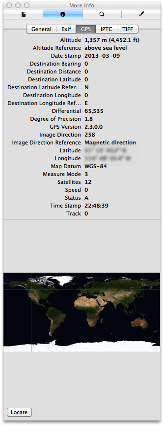
Canon GP-E2 GPS Receiver
Preview.app GPS Info Pane illustrating the plethora of geotag data added by the Canon GP-E2
At the moment I do not have a Garmin, Magellan, or other GPS receiver. As a Canon user my first option is the Canon GP-E2 GPS Receiver. The GP-E2 is a hotshoe mountable GPS receiver that is specifically designed to work seemlessly with Canon’s current line-up of EOS cameras. Thankfully, that includes my EOS M.
With the GP-E2 mounted on the EOS-M, photos are tagged with latitude, longitude, and direction of shot (thanks to a digital compass) the moment each photo is written to the camera’s SD or CF card. The GP-E2 also has a log mode which periodically writes location data to its own memory.
GP-E2 battery longevity is essentially a non-issue. On a single AA battery it can log every 15 seconds for up to 39 hours. If I shot four hours a day, I could get 9 days out of a single Ni-MH rechargeable. 1, 5, 10, 15, or 30 second, and 1, 2, or 5 minute intervals are also available.
I won’t have to worry about daily logs filing up the device either. Using the default 15 second interval, 69 days worth of logs can be stored on the device. At longer intervals, up to 128 days worth of logs are kept. That is plenty of time to get back to the computer to backup the logs. When the device memory is full the oldest logs are deleted to free up space.
This all sounds great, but there are a few downsides to the GP-E2.
One, it is bulky. On professional or pro-consumer EOS bodies it won’t really be noticed, but it sticks out like a sore thumb on my EOS M, especially if I use the tiny EF-M 22mm pancake lens. Though, at only 81 grams, weight is not a problem. Also, it can be used off-camera by attaching via the DIGITAL ports with either the supplied 25 cm or 1.5m cables.
Two, it is expensive. At $350CAD, the price is as high as the GPS satellites it communicates with. For $259CAD I can get a great stand-alone Garmin GPS that has almost all the features of the GP-E2 and then some (more on this option in a minute).
Three, while tagging photos in-camera on the EOS is super simple, using the logs to tag images from non-EOS cameras is a bit of a pain, to say the least (again, more on that later on).
Other GPS Receivers
As I mentioned above, the Garmin eTrex-series is very enticing. I have investigated the eTrex 30. It is relatively compact, which makes it a good option for travelling. If I had one, I would also use it while backpacking, canoeing, and mountain biking.
As a GPS logger, a device like the Garmin eTrex 30, would work essentially the same as any of the smartphone apps available, with one exception. A stand-alone GPS receiver is going to have substantially better battery longevity — 25 hours on two standard AA batteries, according to Garmin.
Where Am I? (Pun Intended)
Yesterday, I decided I would not get the Canon GP-E2 or a Garmin eTrex. I decided I would play around with iOS loggers for a little while longer.
Today, I changed my mind. My credit card company thanks me, I’m sure.
After purchasing the GP-E2, I took it home and put it through its paces. Though happy with the final results, I had a frustrating time getting it to do all that I wanted. Rather than keep that suffering/knowledge to myself, I decided I would share so others might have an easier time of things. Beneficence or catharsis — you decide.
Canon GP-E2 GPS Receiver Hack-a-thon
For the price I paid for the GP-E2, I rationalized that it would have to be a fully-capable device. It had to do the following, or I would consider returning it:
tag images on my EOS camera while mounted on the hotshoe;
easily log tracks, and allow tagging of images from my other Canon cameras;
allow exporting of track logs for use in other software if I choose not to use the Canon’s MapUtility;
and finally, allow tagging of photos from non-Canon cameras (contrary to the marketing material).
Geotagging Is For Techies
Canon MapUtility GPS Track
I’m a pretty sophisticated guy. I was a CTO and VP of Technology in a former life. At least I think I know computers and gadgets. However, it took several hours of Googling and goofing around before I was able to do all the things I wanted with the GP-E2.
First, the Canon MapUtility that comes with the GP-E2 isn’t as bad as most reviewers would have you believe. (Heck, it is not as bad as most software Canon produce.)
There is a gap in the GP-E2 manual though — they don’t actually tell you how to connect the GPS unit to the computer. So, let’s start there (I assume you’ve installed the included MapUtility software already).
Loading GP-E2 Log Data Onto Your Computer
If you are using the log mode of your GP-E2 you need to get the log onto your computer:
First, plug a mini-USB cable (which Canon does not supply) from your computer into the DIGITAL port on the GP-E2.
Then, turn the GP-E2 mode switch to ON.
Next, launch MapUtility.
Finally, import your logs. In the upper left of the application window, select the “GPS log files” tab. At the bottom of said tab, there is a button with a grey box and a blue arrow. Click this button to import your logs from the GPS device (you can also perform this operation using the File menu).
Congratulations, you now have your logs. What to do with them?
If you have photos shot with a Canon camera during the log timeframe, then you can simply drag them into MapUtility and have them automatically geotagged. Like all other geotagging utilities, MapUtility simply matches the time the photo was taken with the corresponding time in the log and assigns the most relevant location to your photos.
For example, I went outside to shoot some photos with my EOS M with the GP-E2 installed. I had the GP-E2 in LOG mode. As I shot photos on my EOS M, they were immediately tagged with location and direction data. I also had my PowerShot S110 along. While the GP-E2 was logging, I shot a few photos with the S110.
Back at my computer, I imported the geotagged EOS M photos and the non-geotagged S110 photos. I loaded the S110 photos and the GP-E2 log into MapUtility, and voila, the S110 photos are now geotagged.
Skirting Canon’s Proprietary-ness
What if you want to use your GP-E2 logs outside of MapUtility? Maybe you want to use the map features in Lightroom instead. Or, what if you want to use your GP-E2 logs in MapUtility, but with a non-Canon camera?
In these cases you will need to either, a) get your logs out of MapUtility; or b), get MapUtility to play nice with your non-Canon photos.
This is where things start to get messy.
Exporting and Translating the GP-E2 Logs
First, getting your logs out of MapUtility.
If you select a log in MapUtility’s “GPS log files” tab an enticing button becomes available which offers to “Export file for Google Earth”. Unfortunately this button does not do what you want it to. It exports a KMZ GPS track file which is stripped of any and all timestamp information. This KMZ can be converted into a KML file, and then into a GPX file, but your geotagging software will not be able to use the GPX file to match photos via date and time alignment.
This is where I found myself banging my head on my desk and preparing to return the GP-E2. At that moment however, I happen to open iPhoto, which I don’t use that often, and which really only contains my iPhone Photo Stream.
In a mapping sort of mood, I clicked on iPhoto’s Places. I saw a map plotting where each of my recent iPhone photos had been shot — on four continents in just five months! I was a bit taken aback and a bit impressed.
As I looked at a map, I saw a pin at a location where I didn’t recall taking any iPhone photos. I clicked the pin and saw photos of my wife huddled in her sleeping bag in the back of my pick-up truck a few hours before we started paddling down the White River last September. I clicked other pins, in strange or distant places and memories started flooding back. I never drive down that side-street, I thought. And then I saw pictures of my wife rolling our canoe towards the river on a crazy urban adventure. I don’t mind saying I had tears in my eyes.
I wanted to be able to explore all my photos that way. I was more determined to make the GP-E2 work for me. I had figured out how to tag photos from any Canon camera, EOS or not. Maybe I didn’t want to use MapUtility, but I could.
I decided to make one more attempt at exporting the GP-E2 for use in an alternative geotagger.
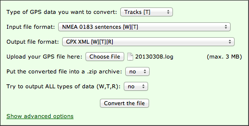
At the bottom of a forum thread I had already read, I re-examined a post that I had previously glossed over. I had already found the location of the log files on my computer and taken a look at them. They were in plaintext which was promising. The post I found made things clearer. The Canon GP-E2 is an NMEA-0183 compliant device. There is an excellent free utility available — GPSBabel — that can convert NMEA files to GPX. I quickly tried out the on-line version of GPSBabel and found myself with a lovely GPX file.
I loaded the GPX file and some sample photos into GPSPhotoLinker, and lo and behold I had geotagged photos.
So in short, to convert your GP-E2 logs to GPX format:
import your logs from the GP-E2 into MapUtility as described above;
located the imported logs on your computer (on a Mac they are in /Users//Documents/Canon Utilities/GPS Log Files, on Windows try C:/users//Documents/Canon Utilities/GPS Log Files);
use GPSBabel to convert the log file from NMEA-0183 to GPX.
On OS X, when you download and install the GPSBabelFE.app GUI, then the command-line executable binary is located at /Applications/GPSBabelFE.app/Contents/MacOS/gpsbabel. If you use the command-line version of gpsbabel, the conversion command will look something like:
If you use the on-line version of GPSBabel then the conversion form should look something like this:
Using Canon MapUtility to Geotag non-Canon photos
But what if I want to use Canon’s MapUtility to geotag non-Canon photos rather than exporting the GPS track log to another program? Well, I figured that out too.
Map Utility simply uses the EXIF “Make” tag contents (the name of the camera manufacture stored in each photo when it is produced) to restrict geotagging to photos taken with Canon cameras. Lame. Are Canon afraid that users will mess up existing goetags from other manufactures? Maybe, but this restrictions seems useless.
I used OS X Terminal.app and ExifTool to read the contents of of the “Make” tag on a sample photo…
exiftool -Make Non-Canon-Photos-Folder/photo1.jpg
Make : Panasonic
…temporarily changed the tag contents of a bunch of photos to “Canon”…
As you can see, with exiftool you can easily batch manipulate EXIF data. You are not limited to JPEGs. ExifTool works with almost any file format that can contain EXIF, IPTC, etc.
Also, in the exiftool command you have the option of specifiing a single file as your source, a directory of files, or a list of files identified using wildcards.
In the above examples, the original files are renamed and kept as backups, but you can turn off this behaviour.
And finally, ExifTool can be used to geotag your photos using the data from your GPX or NMEA log files, allowing you to skip the MapUtility altogether. I think I’ll be working on a script to automate this soon.
If you are not comfortable using the command line, then I’m sure there is a GUI utility out there for you. Unfortunately Adobe Bridge does not let you modify EXIF camera data such as the “Make” tag. Not sure about Lightroom.
Conclusion
I’ve always loved cartography, globes, and paper maps. Maybe this is why I am so late to the GPS game. Except for navigating with digital maps on my phone, which I use when travelling in foreign cities, I’ve not used GPS much.
Last year, on a canoe trip, while navigating a huge lake, we got turned around and disoriented (well some of the group got disoriented). I knew which way we were supposed to be going because I photographed the sun rising that morning and I knew which way was North. We were supposed to be heading North. At that moment we were heading Southwest. The low autumn sun and the monotonous topography had confused people. One person had a handheld GPS receiver along and they simply confirmed the position I gave them. You see, GPS (technology) isn’t everything.
In the world of digital photography, however, I’m finding that GPS can be an interesting tool for documenting, remember, and telling a story.
This is what I have learned so far about geotagging. Well, actually just about getting photos geotagged in the first place. There is a lot still to be learned.
In Search of the Holy Grail of Mobile Photo Editing
I occasionally use iPhoto on iOS to clean up pictures to share while I am on the go. That is, if I am using an image from the built-in camera app or uploaded from my Wifi-capable Canon PowerShot S110. If I shoot something with Hipstamatic I usually just share the shot without any editing, and then clean it up later on my Mac in Photoshop if there is something I want to change or improve.
I’ve been travelling a lot recently and I’d like to have a fully mobile, professional-quality, photo processing solution with me on the road. Usually I do all my post-processing on my desktop Mac after returning home from a trip. But for longer trips, I’d like to being to do some post-processing on the go. For example, I’m going to Europe for two months this spring and will only be taking my cameras, iPhone, and iPad — no laptop (well, I don’t own one anyway). Normally, I don’t even carry my iPad while travelling, but this time we will mostly be staying with friends and family, so I don’t mind lugging it along.
There is one serious limitation to using an iOS-only post-processing photography workflow — there are no RAW photo editing iOS apps. While the iPad can import RAW files via the camera adaptor kit, there is no software available on iOS with which to take full advantage of the RAW camera data. (BTW, Macworld has a nice article about using the iPad in your photography workflow.) The holy grail would be the equivalent of Lightroom or Adobe Camera Raw on iOS.
In the absence of the holy grail, I decided to compare a few iPad photo editing apps to assess there strengths and weaknesses. My basic evaluation criteria was to what degree I could use each app to do my basic post-processing operations:
color balancing;
contrast adjustment;
selective dodging and burning (lightening and darkening for you new-school photographers);
cropping;
vignetting or de-vignetting;
sharpening;
black and white conversion;
batch processing; etc.
The ability to apply filters or effects was secondary in my evaluation. I didn’t even consider sharing capabilities. Again, I’m looking for something I can use to make my images look as good as possible (100%) using only an iPad (or iPhone), so I can shoot, edit, and share professional-quality photos I can be proud of while on the road.
The Apps
Photos
The built-in Apple Photos app has some editing features, so let’s start there. The tools at our disposal are: rotate, enhance, red-eye (reduction presumably), and crop. The crop tool is useful, as is rotate for those times when your cameras orientation sensor gets confused (looking up or down at an extreme angle). But rotate only works in 90° increments so it does not work for straightening slightly crooked photos. The improvements offered by the enhance feature are minimal (basic contrast correction as far as I can tell). I can’t speak to the quality of the red-eye feature as I so rarely use flash that my subjects never have the chance to get red-eye. That, and the fact that my wife blinks a lot, so even if I use a flash, hers eye are probably going to be closed anyway. (Pro tip I learned from Steve McCurry who shot the last roll of Kodachrome ever manufactured and who needed to make every one of thirty-six exposures count: give your subject a countdown from 3 to 1, tell them to pre-blink on 2, and then take the picture on 1).
iPhoto
iPhoto was the first serious photo editor released for iOS. And in many ways it is still the best. The UI is a bit confusing and clunky, but generally usable. The functionality is excellent and for a $5 upgrade over the built-in Photos app you get an advanced straightener; contrast and saturation correction sliders; a crop tool with free, constrained, or ratio modes; local adjustment brushes; and effects including gradient neutral density, vignette, black and white, vintage, toning, etc.
I try to get things right in camera as much as I can. Correct composition and crop. Proper white balance and exposure. But I still consider images just out of the camera to be about 75% complete. With iPhoto I can elevate that to about 85% complete.
Photoshop Touch for iPad is quite a capable photo editor. On the one hand it supports layers, which can be a good or bad thing depending on how you look at it. I do very little compositing. On my Mac I, when editing photos, I using Photoshop layers almost exclusively for adjustments tweaks after doing most processing in Adobe Camera Raw. The layers feature in Photoshop Touch is just in the way. Now if I could add adjustment layers, I’d be a fan. But not yet.
One of the tools I use a lot on my Mac, be it in Adobe Camera Raw or in Photoshop, is the curves adjustment tool. This goes way back to my days as a scanner operator in pre-press. Thankfully, Photoshop Touch has curves and levels adjustment tools.
Photoshop Touch’s crop and rotate tools are superior to iPhoto’s due to the fact that you can enter numerical adjustments. Skew and reflect tools are also available. There is a comprehensive choice of selection, drawing, cloning, and touch-up tools. I can’t say much about the supplied effects, except that there are some.
With Photoshop Touch I feel I can get done about 90% of what I usually do on the desktop (accepting the fact that RAW processing is missing).
Snapseed
Snapseed, by Nik Software (a Google Acquisition), is an innovate app with a large suite of both basic tools and powerful effects. The UI is unique among apps I have tried, but is highly usable once you understand the basics. It has almost all the features of Photoshop Touch minus layers and the drawing and selections tools. And in a lot of ways the Snapseed offering is better. It has a nice Structure function in its Details suite (equivelant to Adobe Camera Raw’s Clarity function). I often prefer to use this type of local contrast enhancement instead of making global contrast changes (which I usually do with curves).
For basic photo post-processing, Snapseed seems like it could get me to 93% completeness. There are still several things missing though.
In particular, a histogram would help to ensure whites and blacks are not being clipped and make overall analysis easier.
The white balance tool leaves something to be desired. Why can’t they just offer an eyedropper for sampling neutrals?
The effects suite of Snapseed is better than any I have seen elsewhere. For the occasions when I want to get a little messy this is going to be my go-to app. One of the reasons that the effects are so good is that they are all parametrically driven. Every aspect of an effect can be adjusted.
This brings me to a suggestion that would make this a 95% app. Since all the adjustments and effects are parametric, having the ability to store personal presets would be amazing. Well, in the mobile app world this would be amazing. In the real world, the ability to store presets and batch process images is a necessity. So far I have not seen any iPad/iPhone app with such essential capabilities, with one exception. Which brings us to B&W Lab.
B&W Lab
Between 5 and 10% of the images I shoot I end up converting to black and white (or some sort of monochrome).
More photographers should explore black and white. Just because most digital cameras capture color images all the time, does not mean this is the best way to represent a scene or the photographers vision. When the photo is about shape, line, texture, or structure, it would probably be a more powerful image if rendered in black and white.
B&W Labs is the best app I have found for making black and white conversions on the iPad. It surpasses Snapseed’s Black and White suite. In Beginner mode there are very usable presets provided. Additionally, after you choose a starting filter you can modify every parameter of the preset via sliders. (The method of choosing a starting point in Expert mode is a little different). There is even a useable Tone Curve tool. You are limited to five handles on the curve, but that is more than enough for most situations. Performance is little slow, but not horrendous.
B&W Lab allows you to load the settings from any previously edited image into the current session. The feature, labeled History, is a little counter intuitive as are most of the UI elements. I’ve gotten used to the idiosyncrasies though and have no problem making great black and white conversions with this app. If they could allow you to batch apply History settings, then this app would be amazing. A histogram wouldn’t hurt either.
For black and white processing only, this app actually gets me about 98% completeness.
Image Blender
Image Blender is a little different from the other apps reviewed here, designed purely for compositing two images together.
The art of multiple exposure is almost lost in this era where every click of the shutter button results in a separate image file. In the age of film, creating multiple exposures was easy. Most cameras had the option to cock the shutter without advancing the film. Other cameras, like my 4×5 field camera, required the photographer to change film after each shot, and if they didn’t they could keep exposing the same piece of film over and over. (There used to be studio techniques involving multiple strobe flash bursts, one after the other, that required the ability to do in-camera multiple exposures. Alas, those techniques are lost to us digital photographers.) But I digress.
Much like Photoshop Touch layers, Image Blender allows you to set the blending mode between two images as well as the opacity of the top image. The output file always has the resolution of the smallest input file (not a problem if both inputs are the same size). Image Blender also has some masking features that I haven’t played around with yet.
Image Blender wouldn’t ever be my first choice for general post-processing of course. That’s not what it is designed for. But if I want to make a conceptual multiple exposure from two images, I would probably use it over Photoshop Touch layers. And if I need to make an illustration or banner for a blog post, I might use its masking features, although I might just go to the more familiar Photoshop Touch instead.
Conclusion
All of the main photo editing apps mentioned here — iPhoto, Photoshop Touch, Snapseed — were released over a year ago. That’s not to say nothing new is happening in this space. These apps are actively being maintained with updates coming out about quarterly. They keep getting better, but in my view as a photographer, looking for a professional mobile editing and workflow solution, there is still a lot of room for improvement. Whichever developer first releases a RAW processor with camera profiles and lens correction capabilities is going to make a lot of money.
In terms of display quality, processor power, and connectivity, I still believe in the promise of the iPad as a professional, mobile, post-processing solution. But at the moment, even after editing and sharing some of my creations while on the road, I will still be going back into Adobe Camera Raw and Photoshop on my Mac to re-edit images in an effort to eek out those few remaining percentage points of quality. Nothing but 100% will do.
Samples
For each app reviewed, I used an image from my iPad camera as a starting point and pushed the software to see what it could do. In iPhoto and Photoshop Touch, I just tried to improve upon the output of the iPad’s camera. I didn’t necessarily do the same operations in each app. I just used the tools at hand to maximize the image’s potential (not that it was a great image to begin with). I did the same in Snapseed, but have provided here a sample of one of the Vintage filters instead. The B&W Lab and Image Blender samples are self explanatory, I hope.
Original from iPad cameraiPhotoPhotoshop TouchSnapseed with Vintage filterB&W LabImage Blender
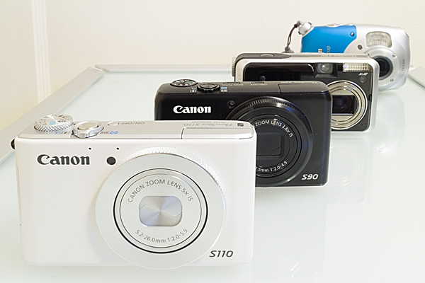
I was probably the last to hear about it as I don’t really pay too much attention to news or announcements regarding compact (point-and-shot) cameras, but on January 7, Canon announced a very sleek looking little package they are calling the PowerShot N.
Like any camera (even pro-DSLRs) the Canon Powershot N has a few “flaws” (the built-inLED light — one cannot call such thing a flash — is a joke), but overall I like that they are pushing the concept of what a compact camera can be.
Aesthetically it is a cross between my Canon Powershot S110 (with the lens ring functionality) and my EOS M (with its round-edge squared-off body and strap mount posts). I absolutely love the symmetrical layout. A tilting screen always makes me nervous (durability), but is also a big aid in off angle viewing.
In fact, the way you can operate the camera controls and shutter from the lens rings, and hold the camera at waste level is very reminiscent of shooting with a twin lens reflex camera. Waist-level shooting is actually the best position for shooting street photography. It is a very stable and compact position (especially when the camera is tensioned off of a kneck-strap) and very stealthy (you are not holding a camera up in front of your face saying, “Hey look at me — I’m taking your picture!”)
Waist-level photography compared to eye-level photography as illustrated in the BlackBird Fly Camera manual
It sounds like Canon are striking the right balance between serious camera and mobile photography accessory. I quite enjoy having Wifi on my Powershot S110, especially as I have not been travelling with a computer or even an iPad lately. The ability to photo-blog, or keep family up-to-date via my iPhone while still using a quality camera is very much appreciated. I also really like the PowerShot N’s ability to charge via a USB cable. A wall mounted charger is just one more thing to carry and you are not likely to have it with you when you really need it. It would be really special if the PowerShot N would automatically back-up files to the cloud when plugged in to a power source, the way iOS does with Photo Stream (this saved my butt in Argentina when I had my iPhone 4 stolen by pickpockets on the metro — I didn’t lose a single Hipstamatic because they had all been backed-up to my iCoud Photo Stream).
Personally, even with a go-everywhere, slide-in-my-pocket compact camera, I put RAW storage and Manual mode on my list of criteria. These are the reasons why I use the PowerShot S110. For the PowerShot N, RAW storage wasn’t mentioned in Canon’s press release, so maybe it will be included, but I have my doubts. If everything else was incredible, I could work with Program mode, but Manual mode would be so much better, especially as this is being positioned as a “creative” camera. To be creative you need control and that just doesn’t mean just having a half-dozen toy camera filters available.
I think I have enough camera’s to satisfy all my wants and needs at the moment, but I’m still interested in trying out the PowerShot N when it becomes locally available.
Read the Press Release and get the camera specifications over at the dpreview.com (the best photography review site in my opinion).
I’ve been testing several calibration tools for correcting digital camera images in a RAW workflow. These tools are designed to help set-up exposure and white balance, create camera and lighting specific colour profiles, and/or automate the processing of image batches.
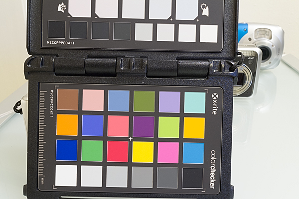
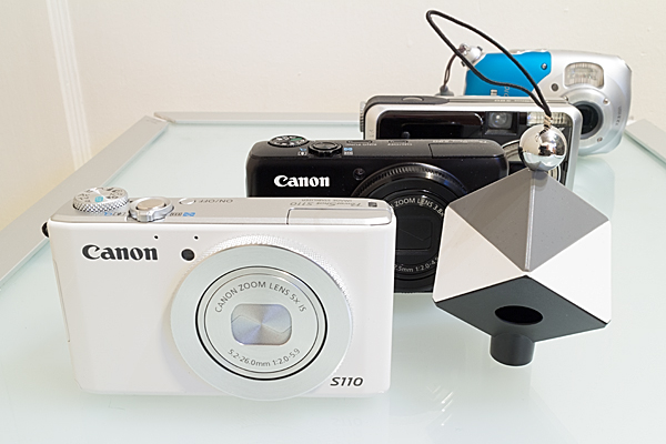
ColorChecker Passport
The first tool is the ColorChecker Passport by X-Rite. This ColorChecker Passport is a folding plastic calibration target with three panels: 1) color target, 2) creative adjustment target, 3) neutral white balance target. I won’t go into full details here about how to use the ColorChecker Passport. Check out the X-Rite site for an excellent and straight forward how-to video. I’ll just provide a very quick overview of its functions. The colour target is used in conjunction with the ColorChecker Passport desktop software to create custom camera calibration profiles specific to your camera and lighting conditions. The creative adjustment target allows you to apply warming or cooling adjustments in post-processing. The white balance target helps you create an in-camera custom white balance during your shoot. All the targets are valuable in a RAW workflow. The white balance target is also valuable for a JPEG workflow.
I wish an 18% grey card was included for setting exposure. I know most people use the camera histogram for setting the exposure, but I get the sense that most camera histograms plot what would appear in a processed JPEG, and do not represent all the data available in a RAW file. I could be wrong, but I often find it difficult to evaluate critical whites based solely on the histogram. In my experience a good old 18% grey card gets me the exposure set faster and more accurately.
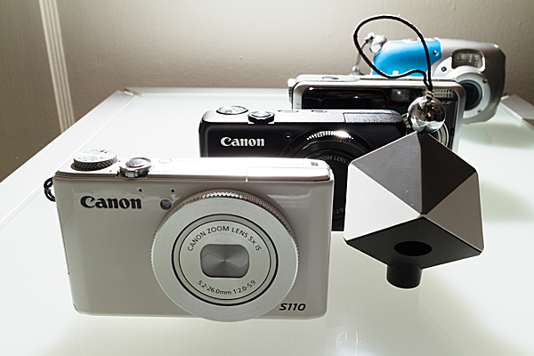
SpyderCUBE
The second tool is the SpyderCUBE by DataColor. I recently had to upgrade my old Spyder2 monitor calibration hardware as its software is no longer supported as of OS X Lion. I also wanted to upgrade my printer calibration tool so I splurged and purchased DataColor’s SpyderSTUDIO bundle which includes the Spyder4ELITE display calibrator, the SpyderPRINT output calibrator, and the SpyderCUBE camera calibrator, all packaged in an attractive and functional case.
The SpyderCUBE is a small (approximately 2 x 2 x 3 inch) device with the following features: 1) chrome ball for capturing and evaluating specular highlights; 2) two 18% grey facets for evaluating exposure and white balance (most likely in post-production as the facets are practically too small to us in-camera); 3) two white facets for evaluating highlights; 4) black facet for evaluating shadows; 5) black light trap for evaluating the black point; 6) tripod mount and small lanyard which provide options for placing the device in your set-up shots.
DataColor also produce a product called SpyderCHECKR which is similar to the ColorChecker Passport color target and which works with the SpyderCUBE. The ColorChecker Passport is a smaller physical package and provides greater functionality than the SpyderCHECKR. It would be nice to see a side-by-side comparison of the two products to judge the results.
Again, I’ll refer you to the DataColor site for full details on how to use the SpyderCUBE.
The Results
For color correction, there is no doubt that the ColorChecker Passport will give you better results than the SpyderCUBE. However, there are times when the SpyderCUBE will shine and outperform the ColorChecker Passport. In particular, the SyderCUBE seems to handle non-frontal lighting situations better than the ColorChecker Passport. With very strong side-lighting or back-lighting the ColorChecker Passport becomes unusable, but the SpyderCUBE still generates very usable (perhaps essential) information for processing such images. With such dramatic images colour is usually not as critical as modelling, so getting the highlights and shadows right is more important than ensuring subtle and accurate colour rendition.
Both of the devices are compact enough that there is really no excuse not to carry them in your camera bag. At this point, I consider them complimentary and will use one or the other as the situation dictates. I plan to take them with me on a two week journey to Argentina and I’m interested to see how they perform in the field (and with my wife patiently waiting for me to get the shots done so we can go shopping).
All of the samples provided below were processed in Adobe Camera Raw (CS6) with perspective correction applied in Photoshop. ACR lens correction was also applied.
ColorChecker Passport – Soft Frontal Lighting
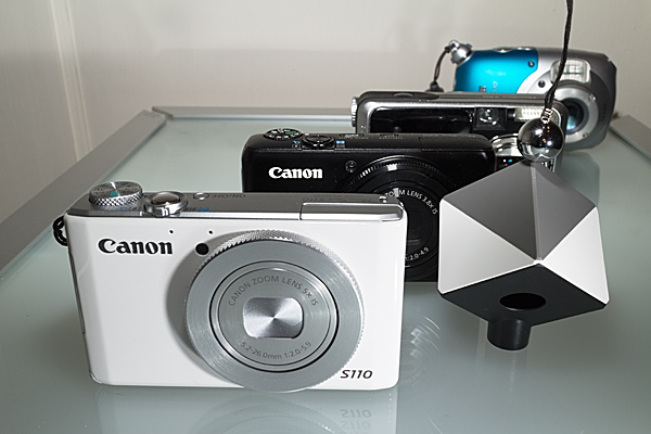
Canon EOS M, EF-M 22mm ƒ/2 @ f/16, 20 seconds, tungsten lighting, exposure set with 18% grey card
In-camera custom white balance was set using the neutral white balance target, but final white balance was set using the neutral square in the top row seen at the edge of the frame. A custom colour profile was created using the ColorChecker Passport desktop application and applied to the image. White and black points were set to minimize clipping.
SpyderCUBE – Soft Frontal Lighting
Canon EOS M, EF-M 22mm ƒ/2 @ f/16, 20 seconds, tungsten lighting, exposure set with 18% grey card
Note how the black shadow facet on the bottom of the cube caught a lot of reflected light from the glass table. I used the black camera surfaces to evaluate shadow detail instead. Other dimensions (whites, highlights, white balance) were adjusted as per DataColor’s instructions.
SpyderCUBE – Backlit
Canon EOS M, EF-M 22mm ƒ/2 @ f/11, 1/60 second, dual Canon Speedlights set to ETTL exposure with manual ratio adjustment
All dimensions (whites, highlights, blacks, shadows, white balance) were adjusted as per DataColor’s instructions. Additional curve contrast adjustments were performed after black and white conversion.
SpyderCUBE – Side-lit
Canon EOS M, EF-M 22mm ƒ/2 @ f/11, 1/60 second, dual Canon Speedlights set to ETTL exposure with manual ratio adjustment
All dimensions (whites, highlights, blacks, shadows, white balance) were adjusted as per DataColor’s instructions. A graduated neutral density adjustment was performed to lighten the image from left to right to correct for side-light fall-off (the side Speedlight was quite close to the right edge of the frame). Additional curve contrast adjustments were performed after black and white conversion.
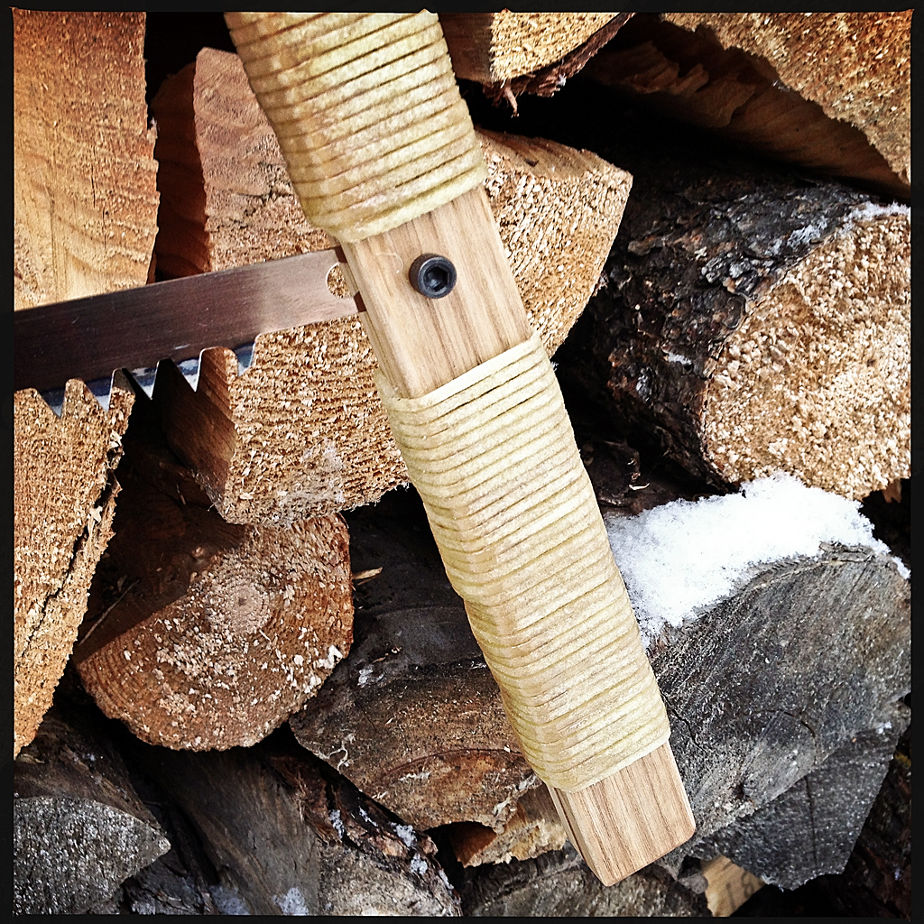
I’ve seen a few nice handmade bucksaws on the internet recently and decided I’d make one.
I used a 21″ blade from an ugly metal commercial bucksaw as the basis of my saw. I had a small piece of ash that just yielded the frame parts I needed. I chose maple for the tensioning toggle because it is dense and strong and I had some thin scrap laying around from paddle making. I used some leather cord for the tensioning string.
The milling of the wooden parts was was quite straight forward with the design’s simple straight lines. The longest time was taken trying to decide how to make the blade mounts. I had several ideas, but the most straight forward seemed to be just to tap the handles to take a hex socket cap screw. The screws are easily tightened and loosened by hand, and even without using a hex key are quite secure when the blade is under tension. The crossbar is attached to the handle pieces with blind mortise and tenon joints which were quite fun to cut. The lower grip saw kerf (made by the bandsaw but only the top portion of which is needed to hold the bucksaw blade) is filled with a 3/32 inch strip of cedar which provides a nice accent (visible in the bottom of the close-up photo of the grip).
The upper and lower grips of the long handle are wrapped with rawhide cord using what The Ashley Book of Knots terms common whipping. This is the first time I have used rawhide on a project and am glad to have added it to my repertoire. (I bought some more ash to make a pair of wood and rawhide snowshoes!)
The maple toggle was simply decorated with a wood burning pen. All the wood parts are finished with linseed oil. The leather tensioning cord is coated with beeswax (for improved weatherproofness) and tied into a loop using the double fishermen’s knot. The rawhide handles are sealed with three coats of Helmsman’s spar urethane.
The saw quickly and easily breaks down into a small, light package. I have some raw canvas that I am going to dye and which I will use to make a storage roll for the bucksaw. I’ll post pictures of the broken down saw and tool roll after it is complete.
My sister is a button fanatic. She has a huge button collection, and many of her creations prominently feature buttons, either functional, or as decoration. Her blog regularly features button finds, and because of her I am always keeping my eye out for button related stuff.
When I came across a short but excellent article over at Ped’s & Ro describing an experiment in making buttons from leather, I was intrigued. The process seamed simple and the result elegant — the key ingredients of any good design. I decided to try my hand at creating some of my own leather buttons.
Please read the Ped’s & Ro blog for the detailed instructions. I will just add a couple of tips here regarding cutting out the buttons and finishing.
It is difficult to cut smooth curves in leather at the best of times. Combine thick leather and a small radius circle and you are just asking for trouble. The standard solution would be to use a round punch to create the button shapes, but typical round punches only go up to about 1/2″ in size, which is only good for smaller buttons. I didn’t have a round punch this size, and didn’t want to buy one for this exercise, so I economized and used my 1/2″ strap-end punch to make the circles (the “circles” are just really short 1/2″ straps!) I made some 1″ buttons with my 1″ strap-end punch, but it’s curve is not perfect so the buttons are not absolutely round.
I subsequently found (and purchased) a (rather expensive) versatile large punch set at Lee Valley (several punch sizes can even be used concentrically to create washers, etc.) The Lee Valley round punch set includes dies for cutting 3mm to 30mm holes. A good find.
I suppose there is no law that says buttons must be round, so if you are without a punch you could try other shapes.
I burnished all the surfaces of my buttons quite a bit, using gum tragacanth and a wooden edge slicker. The result is a smooth finish, but the process is a bit tedious given the small buttons and my big fingers.
After the buttons dried I finished them with a satin acrylic coating to protect them from the elements and hopefully keep them smooth longer.
I used one set of buttons on an insulated flannel shirt that I bought last fall. I wear this shirt all the time — outside in moderate weather, and inside on cold days. It’s great for slipping out to get some wood for the fireplace, etc. There was only one problem with this shirt — the original buttons were a tad too small and became undone whenever I moved, breathed, or the wind changed direction. The replacement leather buttons are a perfect fit, stay closed the way they are supposed to, and complement the existing leather accents.
I will definitely be making more leather buttons and working on refining the process.


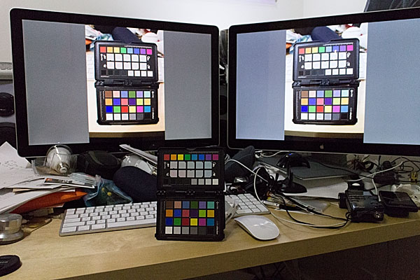


 In my case I am using Spyder4Elite and I set the target white point to 4800K and the target white luminance to 60 candela (brighter than my room, but the darkest my monitor will tolerate) in the Expert Console (see the screenshot). Alternatively, you can use the calibration tool in the Displays panel in System Preferences (turn on Expert Mode) on OS X. In my experience a hardware calibrator is easier to use and more accurate, but visual calibration using Apple’s Display Calibrator Assistant is acceptable.
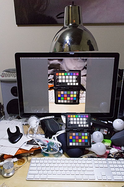


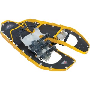
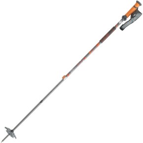


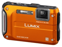 This should be the future of geotagging. Every camera should have a built-in GPS receiver and Wifi. These microchips are cheap.
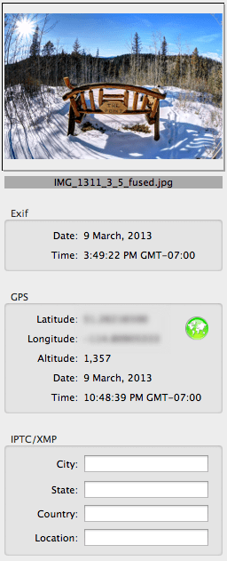
 If your camera does not have built-in GPS and/or you do not want to use your smartphone as a GPS logger, then you have two other options: use a stand-along GPS receiver that can log tracks and export those logs to your computer (e.g., a Garment eTrex); or, buy a dedicated external GPS receiver that is designed to work directly or indirectly with your camera model.